Miss part one? Find the introduction–and Caitlin’s credentials–in last week’s article. We’re diving right into Red and Green this week, starting with Aggravated Assault
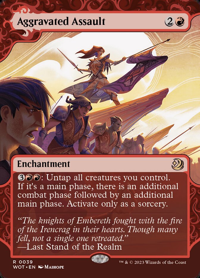
Caitlin: Very comic book-y, almost anime.
Rob: Definitely, suggested by the swooping lines of the background. The active background with the dramatic fore really draws out the contrast.
Caitlin: It’s very different from a lot of the other cards we’ve looked at–those are a combination of midcentury children’s literature and medieval tapestries, and this is more–swoosh-y, for lack of a better word.
Rob: Swoosh-y.
Caitlin: You’re the writer, you come up with a better word.
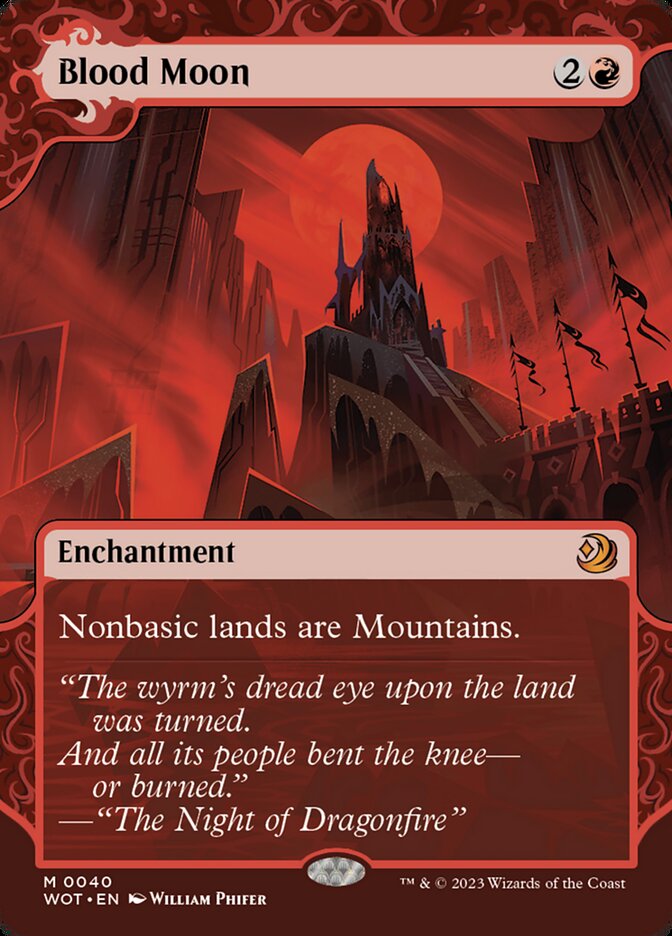
Caitlin: Not really reminiscent of a children’s book, unless there’s a kids’ version of Dracula.
Rob: Or a novelization of Bloodborne. Is there?
Caitlin: What? No.
Rob: Alright, I’m writing a pitch. A Child’s Garden of Eyes.
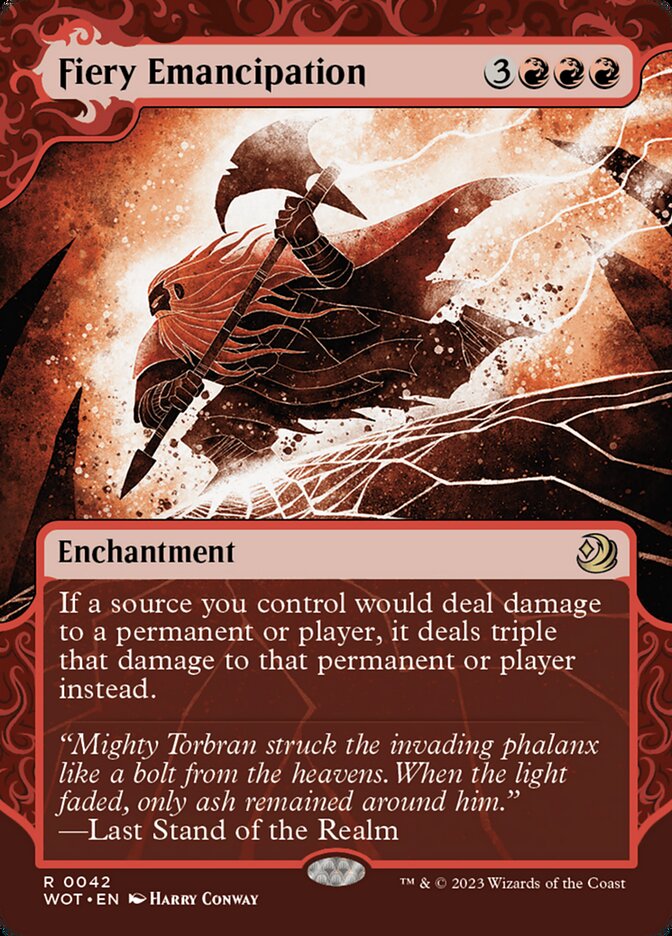
Caitlin: I love this. Wow.
Rob: Yeah, Harry Conway’s incredible, and this art especially pops–
Caitlin: –there’s so much detail, but it’s all so clear.
Rob: Brilliant move to highlight Torbran in the lightning. Really makes the detail legible at such a small size.
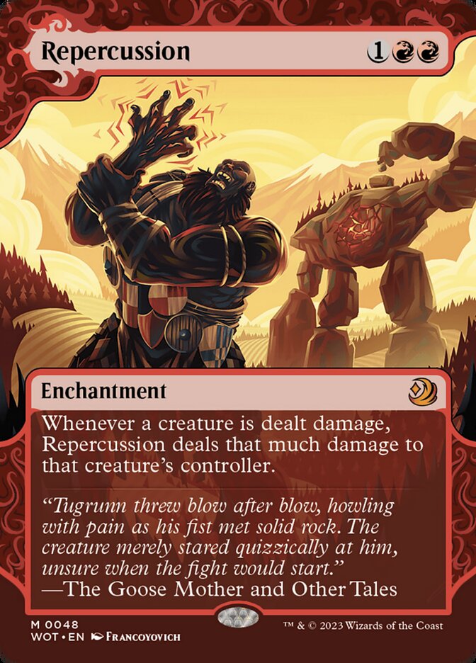
Rob: A literal cartoon, with radiating pain lines and everything.
Caitlin: That fits, though–if fairy tales are instructive fables meant to educate and entertain, I can’t think of a better updating for them than Looney Tunes.
Rob: I mean, that’s fair. How many fairy tales or cultural myths did Looney Tunes adapt? Dozens, right?
Caitlin: The colors in this are incredible.
Rob: Yeah, it’s a different giant than in Francoyovich’s Land Tax, and the style is softened a bit from the almost industrial realism of that piece, but the golden background [suggests a commonality]. The dark blue colors with blood red and golden highlights is such a great way to take this–Red’s passion infiltrating a moody scene that’s also directly humorous. I love that the giant is still menacing–note the number of shields he’s claimed from slain knights to repurpose into a girdle–but that he’s met his match in the golem.
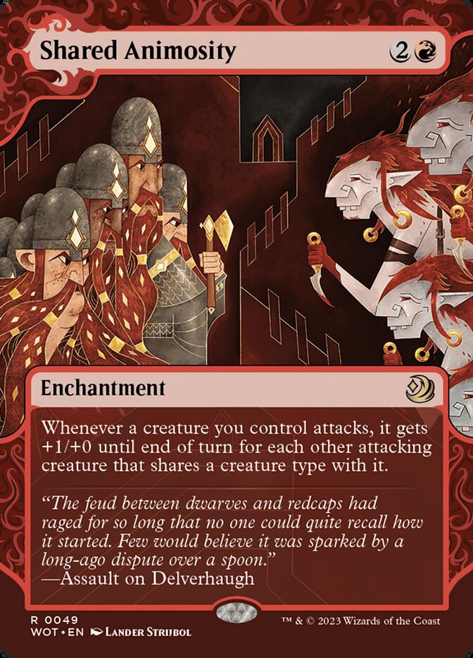
Caitlin: Love the curved geometry of the figures versus the stark flatness of the background and castle walls.
Rob: The darker side of children’s literature. This is propaganda. Look at how the redcaps or hobgoblins are presented–inhuman, identical, both threatening and laughable. A really well-executed piece, and I’m not critiquing the artist, because I think it’s a great choice, but yeah, this is from the dwarves’ p.o.v. for sure.
Caitlin: I need you to get off Twitter.
Rob: I’m off! For the most part.
Caitlin: This reminds me of The Secret of Kells more than anything.
Rob: A movie we wouldn’t have seen, save for Twitter’s recommendation. But yes–very geometric, but very smooth, still.
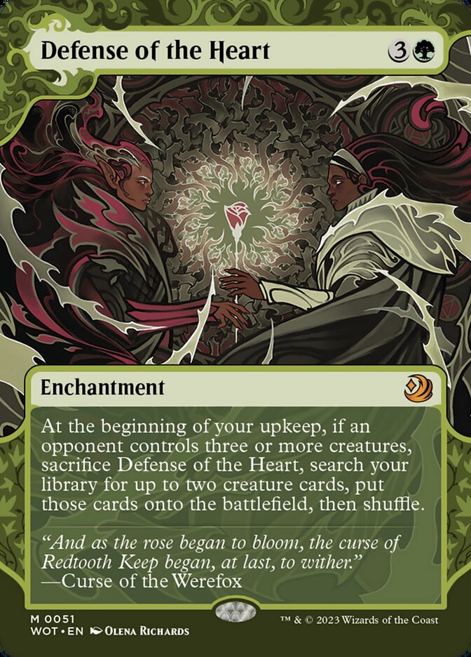
Caitlin: Gorgeous.
Rob: Yeah, very suggestive of a stained glass window, which Magic has been doing a lot lately. It almost always works for me. This is an especially fun one because the name, Defense of the Heart, originally referred to the Heart of Yavimaya. The original art is lovely, but it refers to a very specific event: Multani making an appeal to Urza, defending the sacredness of his forest’s heart. This latest art makes it more abstract and more concrete at the same time–two lovers teaming up against unfair odds. We’re not defending a place, but a state of being.
Caitlin: And the rose surrounded by brambles is as fairy tale as it gets. This is midway between a stained glass window and a really well-designed tattoo, or like a sharp-edged version of Edmund Dulac’s illustrations for Hans Christian Andersen’s stories.
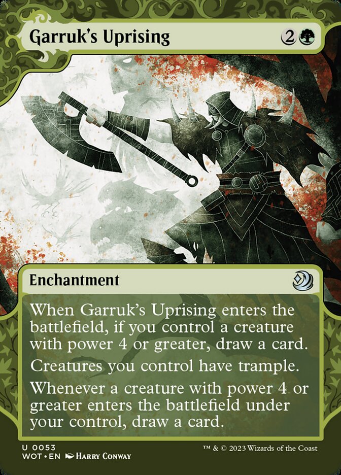
Rob: Exemplary. Harry Conway does these very angular, almost spider-y, portraits. His Sauron is my favorite, and this is his take on Garruk in his style. Garruk is an eight-foot barbarian, right, but in Conway’s version, he’s lanky and attenuated–notice the army of beasts shrouded in fog in the background.
Caitlin: I love it.
Rob: Great, because I bought two Conway prints yesterday. They’re going in the nursery. It’s almost Byzantine in how Garruk’s distorted, which is a common thread in Conway’s art–very stylized figures that emphasize either their physical power or their otherworldliness.
Caitlin: There’s a very dense sketchiness that I associate with British illustrators–Stephen Gammell or Jim Kay’s A Monster Calls, which is geared towards older kids, but is very, very fairytale-ish.
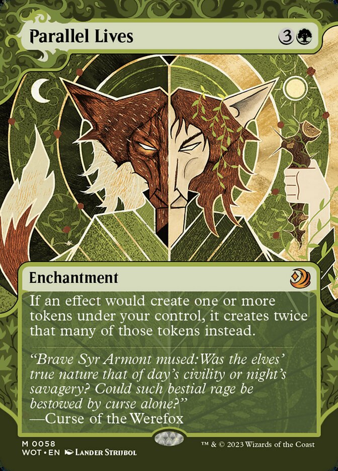
Caitlin: Back to Kells.
Rob: It’s Celtic-inflected, for sure. Actually, this reminds me of that saints books we have. (pulling book from shelf) Yeah. Stories of the Saints. Nick Thornburrow. Incredibly similar to the cover.
Caitlin: He’s amazing–really seems like a touchpoint for these cards. Very sharp lines, very strong colors, with fantasy creeping in.
Rob: There’s a lot of tension in British Catholicism between the fantastical and the godly worlds, yeah. Parochial folk traditions creeping into the cathedral and the Church getting worked into social rituals and so on.
Caitlin: Parallel Lives, in other words.
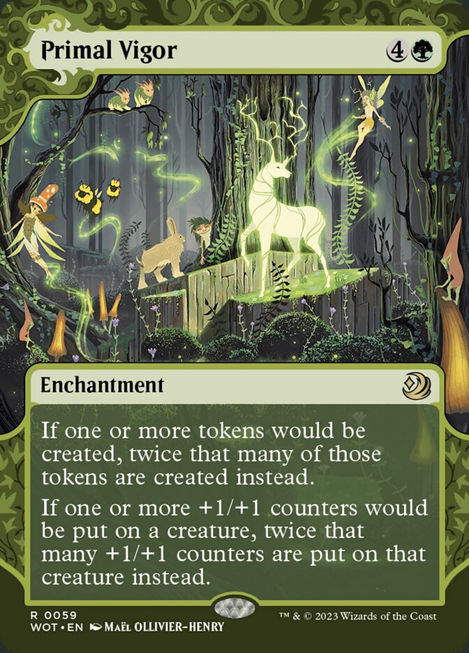
Caitlin: Oh, I know this one–a pretty direct reference to the famous French tapestry.
Rob: The Bayeaux tapestry?
Caitlin: No, the unicorn one–hang on. One of the panels is the unicorn in a corral, pinned down, that’s strongly reminiscent of this. The Unicorn in Captivity, that’s what it’s called. Also was the inspiration for The Last Unicorn.
Rob: Never saw it, but IMDB says Angela Lansbury plays a character named “Mommy Fortuna,” and I’ve never been more in.
Caitlin: This could slot right into that tapestry–very muted but strong greens, lots of detail, the spotlight on the unicorn, it’s gorgeous. I love the ferns.
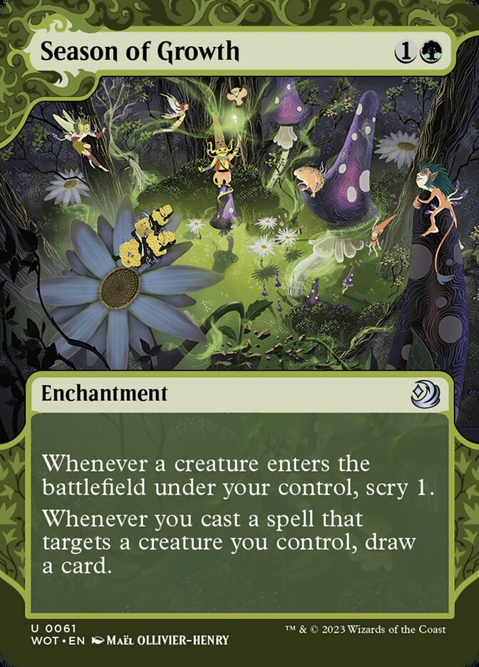
Caitlin: A different tone, but this reminds me of Midsummer Eve [by Edward Robert Hughes]. The golden light spilling out, the variety of little creatures and faeries–very midsummer, and very precious. Almost neo-Romantic.
Rob: Yeah, I can see it. A faerie ring, glowing in the center, but this has a more whimsical–or at least more actively whimsical, I guess you’d say–vibe. Also note that we are the observer, rather than having the observer in the foreground. Magic’s great about forcing us into that role, and this especially has the vibe of stumbling upon a secret fairy ritual that could turn sinister once they realize there’s an outsider.
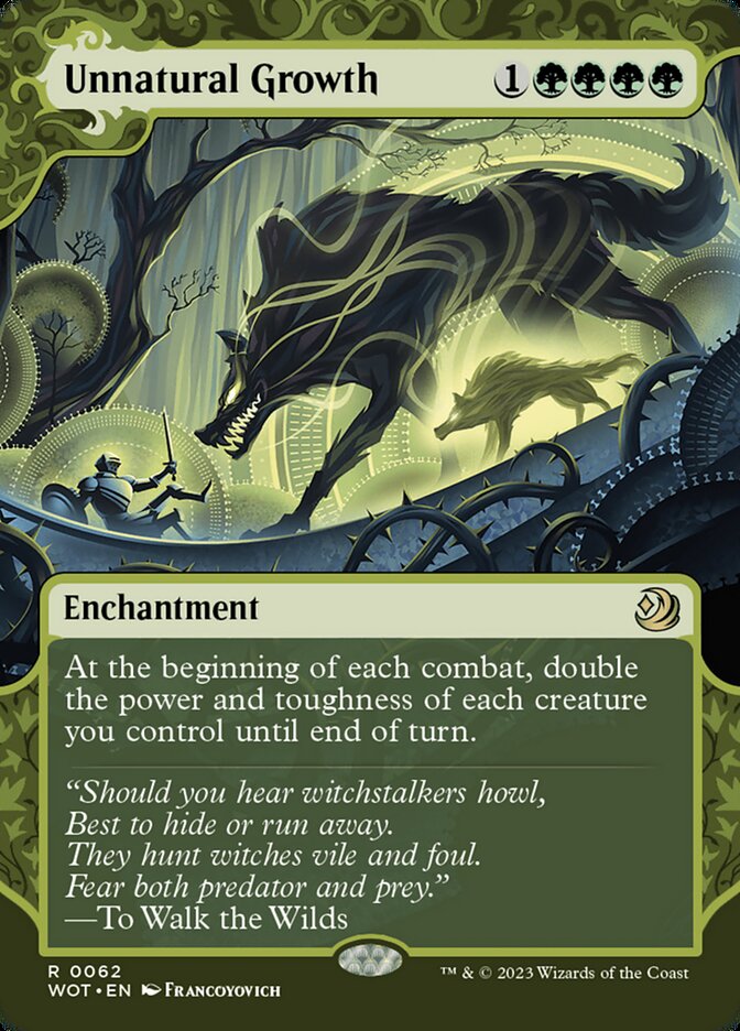
Rob: Our last Francoyovich.
Caitlin: The wheels or gears, or whatever you want to call them, they’re like mechanical haloes. Can’t get enough of it.
Rob: Yeah, it’s a very minimalist way to depict trees, and it’s masterful. It’s trees and lighting blooms, but it also, like you say, is suggestive of haloes. Pretty hard to divorce fairy tale iconography from Christian iconography when we’re talking European culture. Love how these nimbuses of greenish golden light can be trees or a radiating sense of power, depending on how the picture is composed.
Caitlin: Love the tension between organic and inorganic in it.
Rob: Yeah, that’s a common theme in Francoyovitch’s portfolio, right before “making Rob want to give him money.” So that’s basically the gamut. Anyone we’ve missed?
Caitlin: Well, I didn’t see much in the way of Gustave Dore or Warwick Goble, who have influenced so much of what came after for fairytales. It’s a lot more modern than I expected when you first brought this up–very midcentury American interpretations of fairy tales, not the Victorian style I expected. But you can see the influence of the Victorians, still–I mean, the lighting, the way the clothes look, the composition, gives me that cozy bedtime feeling. So I would say it’s successful!
I’m looking forward to moving on to the mechanical side of Wilds of Eldraine, which seems very rewarding and rich, but before we do, I wanted to give Wizards credit for taking a big–and successful swing–at a new aesthetic mode for the game and for bringing in independent artists. This was not meant to be an exhaustive discussion of the Enchanting Tales bonus sheet–with over 100 cards, there’s a full library of stories to pore over, and a wide variety of art styles to match. All are beautiful as independent works of art in the fairytale genre and as representations of famous Enchantments throughout Magic’s history.
We’ll close with a note: at a time when libraries are under attack, your local library is still an incredible resource, not just for children, and not just for the vast, civilization-spanning collection of literature contained within. Until recently, the local library was the first place people went to research, gather knowledge, and build communities, and it can be again. Visit your local library, if nothing else, for inspiration: the variety of literature, from the simplest board books introducing children to animals to the weightiest tomes of philosophical exegesis, and the panoply of styles, from book cover design to illustrations to woodcuts of exotic animals, can help you connect to the human need to create and to pass down knowledge. You should, despite the old adage, absolutely judge a book by its cover: people like me spend a lot of time making covers attractive and indicative of the book’s contents, and people like Caitlin spend even more time curating and tailoring the collection to better suit the needs of our communities.
Your library is one of the few places left in our country that operates exclusively for the public good, integrated into the community and serving the needs of all populations equally; it’s our duty to support them and avail ourselves of the free resources they offer us, from infant storytime to job counseling to summer reading programs. Your library grows with you, and it’s always there to provide you with stories in attractive packages, from your first gilt-edged fairytales to the texts that prepare us for our final departures. Here’s where you first learned to love books, and those books will be in the stacks long after you’re a collection of stories those left behind share with new generations.
Rob Bockman (he/him) is a native of South Carolina who has been playing Magic: the Gathering since Tempest block. A writer of fiction and stage plays, he loves the emergent comedy of Magic and the drama of high-level play. He’s been a Golgari player since before that had a name and is never happier than when he’s able to say “Overgrown Tomb into Thoughtseize,” no matter the format.

