Flicker and blink effects are staples of modern Magic design. The humble Flicker has spawned over a hundred designs. Blink was the WU archetype in Double Masters 2022 and both versions of Battle for Baldur’s Gate Limited were built around Blur. While we may one day go into the history of flicker/blink effects (and the fact that both terms are used interchangeably to describe Flickerwisp‘s delayed effect and Flicker‘s immediate one), today, we’ll discuss something different: texture.

A colorful twist
To begin, let’s define texture. It’s a bit of a catchall term I use to describe how variations on a theme can create different experiences. Channeling Moonsnare Prototype to interact with a creature yields a very similar result as casting Run Out of Town on it, but there are many subtle differences. Moonsnare Prototype is immune to Counterspell, vulnerable to Stifle, triggers Ragged Recluse, and is in the graveyard before its effect resolves, none of which is true for Run Out of Town. Those distinguishing factors often don’t affect the game, but they can create meaningful distinctions and slightly change the minutiae of how the cards function. That’s texture, and those two cards have lots of textural differences.
But texture can be a lot simpler. Blur is functionally identical to Acrobatic Maneuver, except one is blue and the other is white. It feels like such a tiny difference—the cards do the exact same thing! But their colors create different frameworks the cards must work within—another form of texture. In general, white is much, much better than blue at playing to the battlefield. It has both better cheap creatures (which makes it able to cycle Acrobatic Maneuver faster) and a wealth of cheap creatures like Inspiring Overseer whose strong enters-the-battlefield effects make it facile to generate card advantage. Blue has cheap creatures and enters-the-battlefield effects too, but in general it has to work a bit harder to get value from blinking than white does.
Of course, there’s also context. In almost every format with a blinking theme, it’s in white-blue, where one color provides more of the ETB effects and the other the blinking. In practice, it doesn’t matter as much which color gets to flicker in Limited, so the textural difference is quite small—but that’s not as true in Constructed, where you can build Blur decks that don’t contain white.
Color-based texture is a great starting point because it’s an extremely familiar distinguishing factor to anyone who’s played even a bit of Magic. For our next step, we’re going to go broader.

Flexibility, floor, ceiling, and cost
As previously mentioned, there are over a hundred Magic cards which flicker or blink. Ephemerate is likely the most powerful of all, though Felidar Guardian is one of the only able to win the game on the spot (in conjunction with a Saheeli Rai or Kiki-Jiki, Mirror Breaker. Most are far weaker than those two, but every single one has textural differences that make them unique. Let’s compare Blur to two of the simplest similar iterations: Cloudshift and Ghostly Flicker.

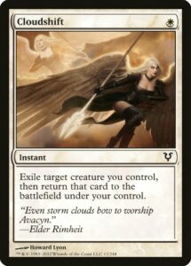
Cloudshift is one of the simplest possible executions of flickering (okay, if you set aside its nonstandard templating that lets it turn Threaten into Control Magic.) The card only flickers, so you need to get a card’s worth of value from the flickering to justify its inclusion in your deck. Generally, this means your deck contains many creatures like Pondering Mage that give you back a card’s worth of value or that your opponent’s deck has many removal spells like Murder that you can effectively counter by Cloudshifting in response. If neither is true, you probably should keep Cloudshift out of your deck.
Cloudshift is the most focused card of the three we’re examining. All that it does is flicker, so you must ensure that flicker can be meaningful if you’re putting the card in your deck. However, if Cloudshift is good—especially if it’s good against removal—its cheap mana cost means it doesn’t constrain your ability to cast spells while holding it up. To put that in more designery parlance, Cloudshift has low flexibility (it only does one thing), which means it has a low floor (you run the risk of it being a useless card), and has a low cost to hold up (one mana isn’t a lot to not spend).
Blur has higher flexibility—because it both flickers and draws a card, you don’t lose card advantage if you can’t cast it on a creature like Pondering Mage or in response to an opponent’s Murder. That gives Blur a higher floor, since it’s still fine if you have any creatures. It also gives Blur a higher ceiling, since in the best cast scenarios, you get two cards worth of value (while Cloudshift only provides the one). However, Blur loses to Cloudshift by having a much, much higher cost to hold up.
Ultimately, Cloudshift is better in a deck that really wants to flicker things because it’s so easy to use and needs to flicker well to justify its inclusion. Blur‘s higher flexibility means it doesn’t need to go in quite as dedicated decks, but its higher cost makes it a bit worse in dedicated decks.

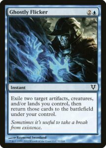
Now that we’ve defined all our terms, let’s go faster. Ghostly Flicker has the exact same cost as Blur, is even more focused than Cloudshift and and has an even lower floor (the tripled cost means you really need to get value from your investment of a card and three mana). The main difference between it and Blur is the ceiling.
I invite the reader to take a minute and ask themselves which card has a higher ceiling.
Seriously, if you’re at all interested in card evaluation or game design, give it a try.
(I’ll wait here.)
(And add a bit more text just to prevent you from scrolling too quickly and letting my answer affect your thought process.)
Between two cards, Blur undoubtedly has the higher floor. You’re all but guaranteed to get one card’s worth of value as long as you have one creature. In most use cases, flickering a creature for value is worth a card, so you’re getting similar value for two flickers as you are one flicker and one card draw. But in the best case scenarios, where a card’s ceiling is defined, Ghostly Flicker absolutely wins.
There are creatures like Mulldrifter and Fury whose enters-the-battlefield generate multiple cards worth of value—that’s better than you’ll ever get from Blur. And even when you’re only get a card’s worth of value, a deck built around flicker would probably rather flicker a Mnemonic Wall and a Shriekmaw or Bear’s Companion repeatedly than keep drawing random cards. In most cases, the distinction of highest possible ceiling isn’t going to come up (and Ghostly Flicker‘s lower floor will definitely come up more often), but all that minutiae is what creates textural differences between cards.
As a bonus assignment, I invite the reader to compare Blur with Illusionist’s Strategem. In what ways do their floor, ceiling, flexibility, and cost differ? Beyond that, which of these four designs do you personally enjoy the designs and play patterns of most? I live for that sort of discussion, and if you’re excited about game design or Magic design, you might just be, too. But for now, I’m happy to hopefully leave you with a couple helpful design analysis tools in the tool belt.
Zachary Barash is a New York City-based game designer and the last commissioner of Team Draft League. He designs for Kingdom Death: Monster, has a Game Design MFA from the NYU Game Center, and does freelance game design. When the stars align, he streams Magic (but the stars align way less often than he’d like).

