Good morning friends, and welcome back to another Grand Art Tour here in the Mirror Gallery on Hipsters of the Coast. While today is preview day for the much-awaited Double Masters 2022, we must take a look at magic’s latest release, Commander Legends:Battle for Baldur’s Gate before it’s too far in the rearview mirror. This set revisits the Forgotten Realms that first appeared in Magic last summer, by way of the popular game series. While perhaps a bit more niche than the previous compilation, it adds a lot of exciting characters and artwork to the Magic oeuvre.
This article is the latest iteration in my Grand Art Tour series, which began back in 2019. I was inspired by New York Magazine art critic Jerry Saltz’s 2010 article entitled “A Grand Tour, a story that took readers through the museums of New York City that Saltz visited that summer. Within it he highlighted some of his favorite paintings from around the city, and in that same fashion I’ve chosen my favorite works from around this set. I’ll tell you why I think it’s important you see them beyond the card and at full resolution, and what that image means in the larger sphere of Magic: The Gathering artwork. Today’s version is a bit different, and I have only done this a handful of times in the past; instead of my usual dozen pieces this article will have six themed entries, captioned in a bit greater detail than normal and pulling together some absolute standouts from the bevy of brand new art.
Open the gates! This is the Commander Legends: Battle for Baldur’s Gate Grand Art Tour.
Set Standouts: Tasha, the Witch Queen by Martina Fačková & Cloak of the Bat by Dominik Mayer
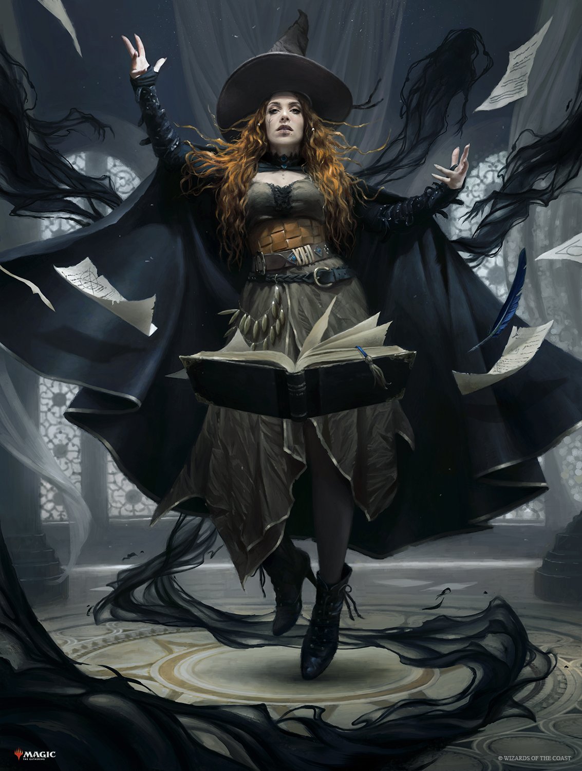
Tasha, the Witch Queen by Martina Fačkova. Digital.
Sometimes you see a piece of art, and you just know it’s different. And you go back to it over and over again. It’s mesmerizing, and just one step above.
I first wrote about Fackova during my Kaldheim Grand Art Tour, and mentioned there she would be an artist to watch. Her Return Upon the Tide was the title piece of that article, and Tasha, the Witch Queen reprises that role in Baldur’s Gate as a most outstanding illustration. Her command of the human figure is among the best we see in Magic, and the subsequent ability to bring those figures to life is all but unparalleled. The expression we see is that of fellow Magic artist Marta Nael, who has become this legendary face of the Forgotten Realms. Together they have made Tasha as real as you and I, from a faraway land but rendered as if she could step through the frame, a piece of imaginative realism we are so very lucky to see in this game. This is far and away the most impressive work of the entire set, and perhaps even of the year thus far.
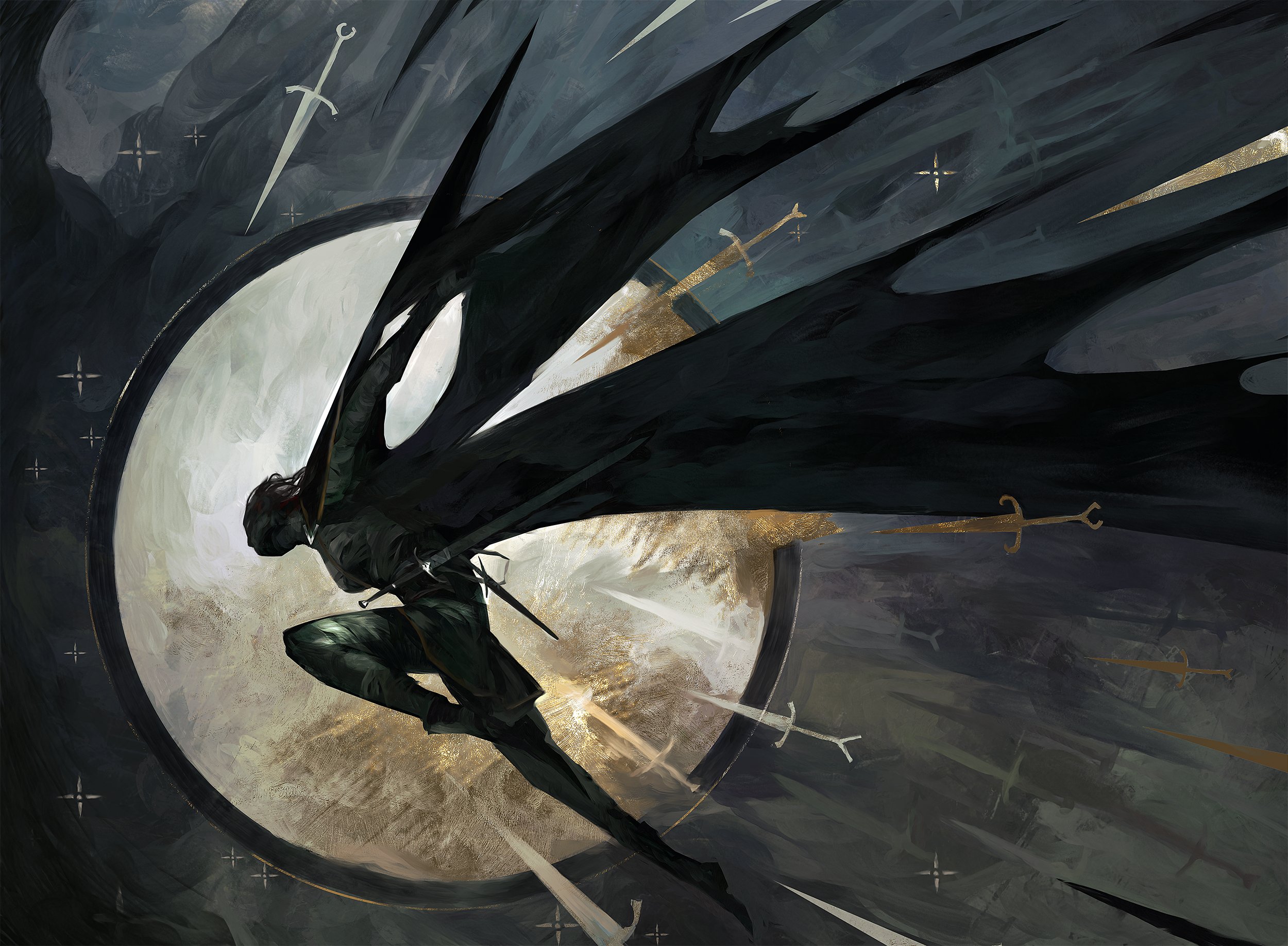
Cloak of the Bat by Dominik Mayer. Digital.
Dominik Mayer has solidified his presence in Magic: The Gathering over the last few years, and his geometric abstraction has unforgettably impressed itself as a mainstay of the modern Magic set. He began as inclusion in the alternate art showcases, first in Zendikar Rising and then the Strixhaven Mystical Archive. That uniqueness has translated now to main set artwork, and his Cloak of the Bat brings this rare and Wondrous item of D&D to the game of Magic in breathtaking stylization. A cloaked figure evades attack against a moonlight backdrop, legibly moving through the frame while also begging a closer look. It’s graphic and simple and beautiful, all the while being rich in concept; all the things that Mayer’s art does best.
Plains, Two Ways: Plains by Bruce Brenneise & Plains by Titus Lunter
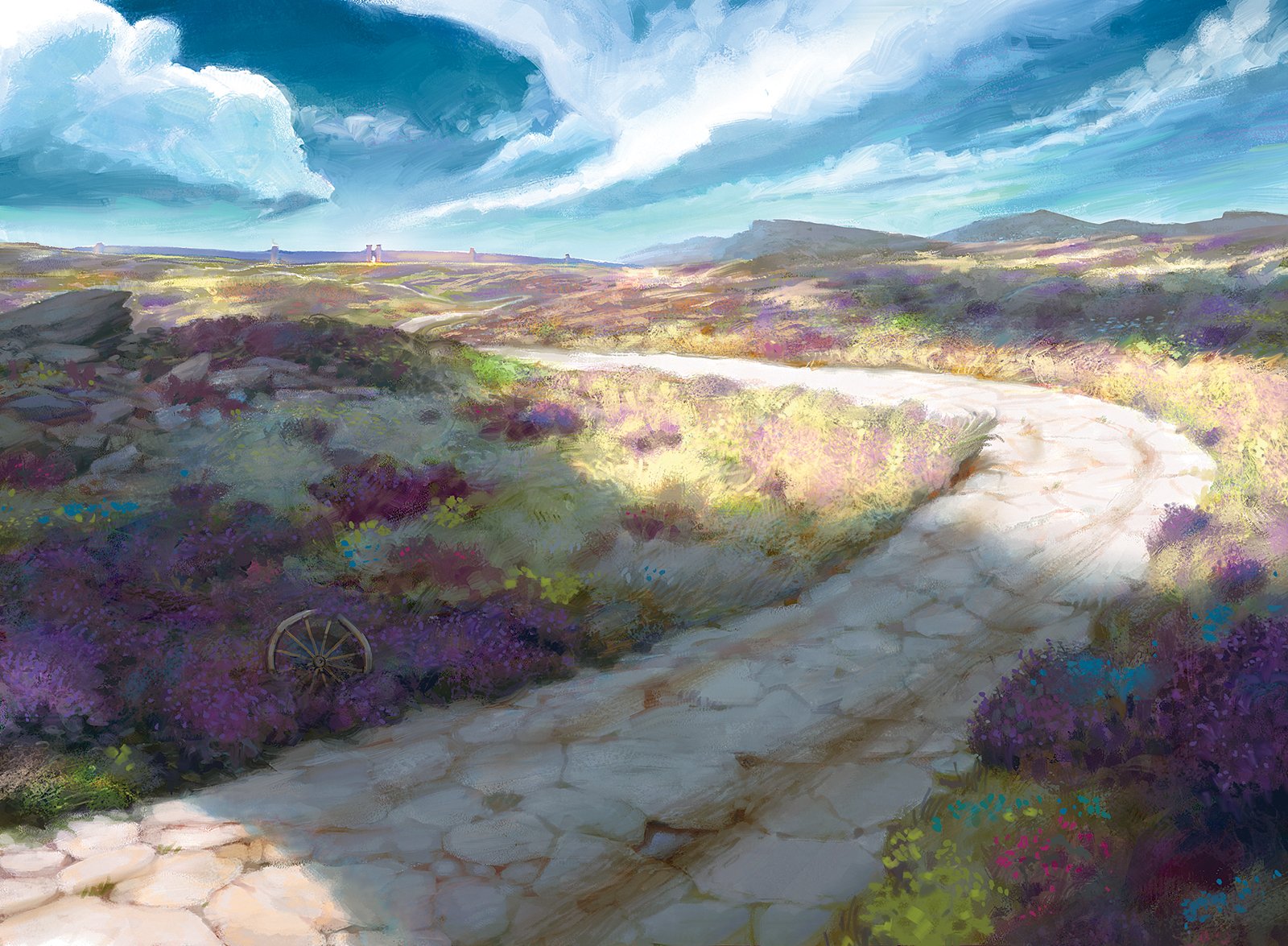
Plains by Bruce Brennaise. Digital.
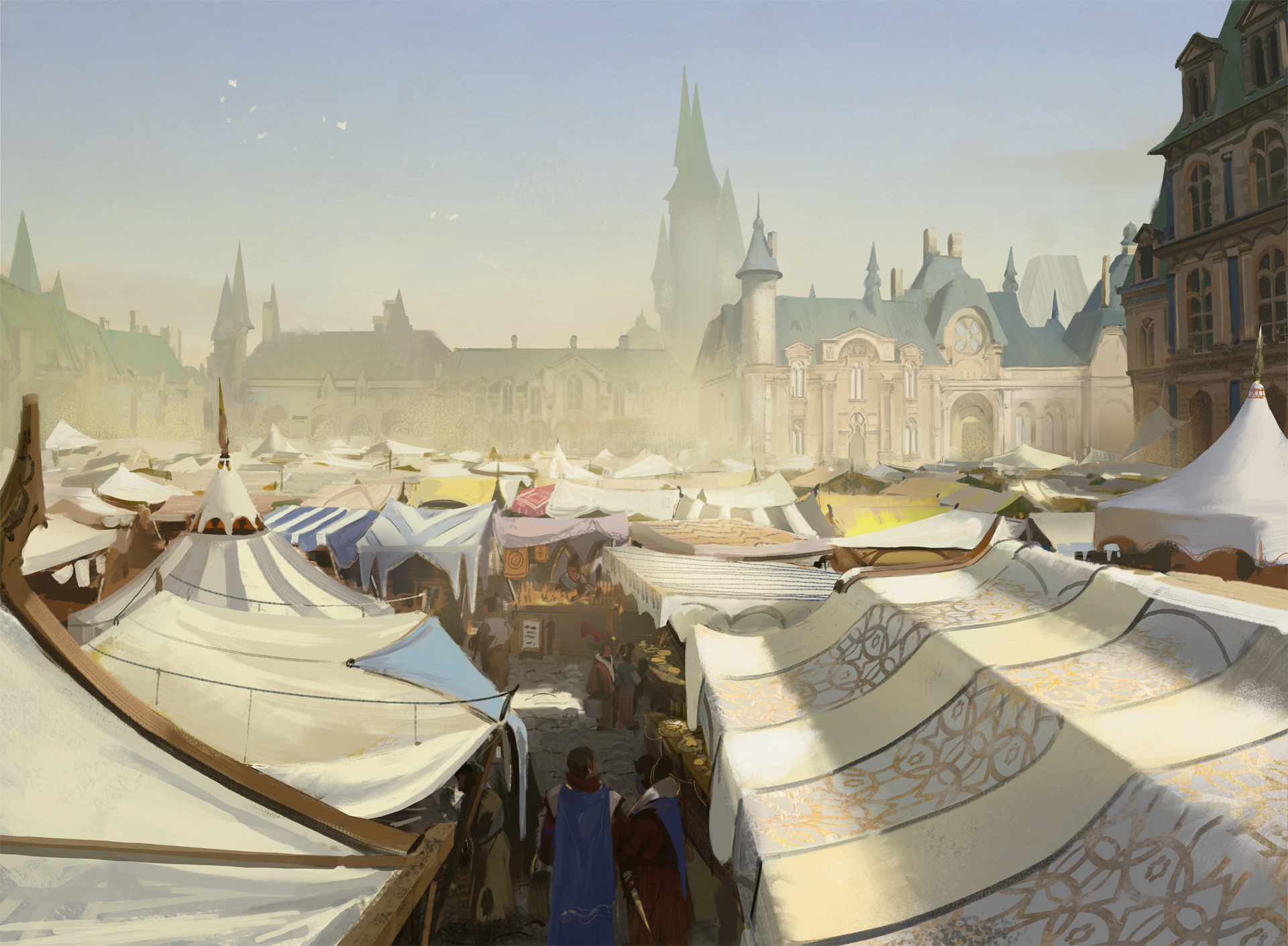
Left: Plains by Titus Lunter. Digital.
My regular readers know that I have a particular affinity for basic lands. I think they are some of the strongest storytelling components in the entire game, perhaps even more so than the Commons. Strong basic lands are instrumental to telling a complete story within a set of illustrations. These two Plains, by Bruce Brenneise and Titus Lunter, give us the dichotomy of worlds we encounter in exploring in and around Baldur’s Gate, emulating the First Level of Detail of what a visitor to this fantasy land would expect.
Brenneise gives us the “Rugged Heath,” those wide open spaces outside the city gates, and the road less traveled across the Forgotten Realms. The sun stretches across the plains, and the cast shadow gives it a dynamism often missing in these landscapes. As fields of color lead your eye down the road to your destination, it’s again that feeling you could just as well be in Elysium.
Lunter’s “Marketplace” Plains does the opposite and provides the opposing point of view, as we’re now deep inside the city, trading serenity and silence for the hustle and bustle of the mercantile midway. I love the perspective looking over the tents: we still get a bird’s eye view of the city’s interior, but it’s as if we’re prepared to dive right into the thick of it all. Being able to literally see above and below let’s us take it all in, and see exactly where we’ve landed on this journey.
Over the River & Through the Woods: Mountain & Forest by Lucas Graciano
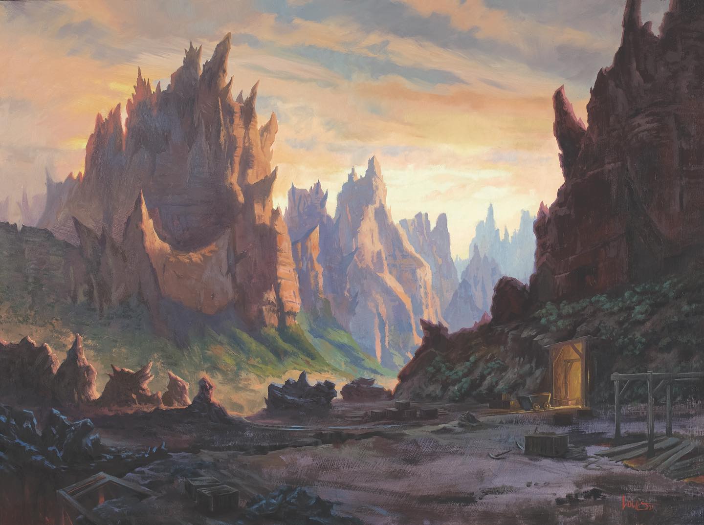
Mountain by Lucas Graciano. Traditional.
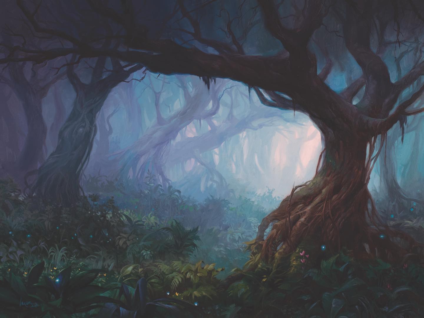
Forest by Lucas Graciano. Traditional.
Continuing our basic land sojourn brings us to these two works. Graciano is a Magic: The Gathering veteran, nearing ever closer to 150 illustrations for the game, and he’s now illustrated both a Mountain and a Forest for the first time. Unlike his previous basic lands that had to be very setting specific, these afforded a bit more flexibility. The artist has leaned fully into the art historical roots of the 19th century Hudson River School romantics that captured the American West. Graciano mentioned on Facebook that he was fresh off a trip to Zion, and this inspiration and personal experience is what injects the realism into these pieces. It makes these fantastical locations he’s created feel like we could walk right into them, because he as the artist, in a way, did that very thing.
Side Note: Art Directors, he’s now only a Plains away from a full cycle of basics. Would love to see it. Maybe next year?
Ink is the Way: Justine Jones, Pedro Potier, & Jeff Miracola
Ancient Silver Dragon by Pedro Portier, Digital; Neera, Wild Mage by Pedro Portier, Digital; Raphael, Fiendish Savior by Justine Jones, Traditional; Nine-Fingers Keene by Justine Jones, Traditional; Miirym, Sentinel Wurm by Jeff Miracola, Traditional.
The Classic Rulebook Showcase first debuted in last summer’s Dungeons & Dragons: Adventure in the Forgotten Realms, and was the first time that ink work purposefully appeared as the final finished art on a Magic card. These showcase artworks have returned once again for this latest adventure, both from folks of the last set like Justine Jones and Pedro Potier, as well as some new inclusions, like longtime Magic artist and known inker Jeff Miracola.
These ink illustrations help to capture the nostalgia of D&D from days gone by, from the simplest spot illustrations of early monster manuals to the highly detailed black and white renders of the earliest character sheets. And whether traditional, digital, or a mix of both, they evoke the feeling that these are unique and of a different world entirely. From Potier’s fabulous figures to Jones’ insane level of detail, they’re a brilliant addition, and I love that these folks are back to share their skill with the game once again.
Something Old, Something New: Displacer Kitten by Campbell White & Blur by Dave Greco
One of my favorite dichotomies in a set of Magic: The Gathering is that veteran artists, who have done dozens of cards, work right alongside folks who are brand new to the game. Campbell White is quickly closing in on 100 cards for MTG, and Dave Greco, while a veteran of the industry, join’s Magic’s roster for the first time with one of my favorite works in the set.
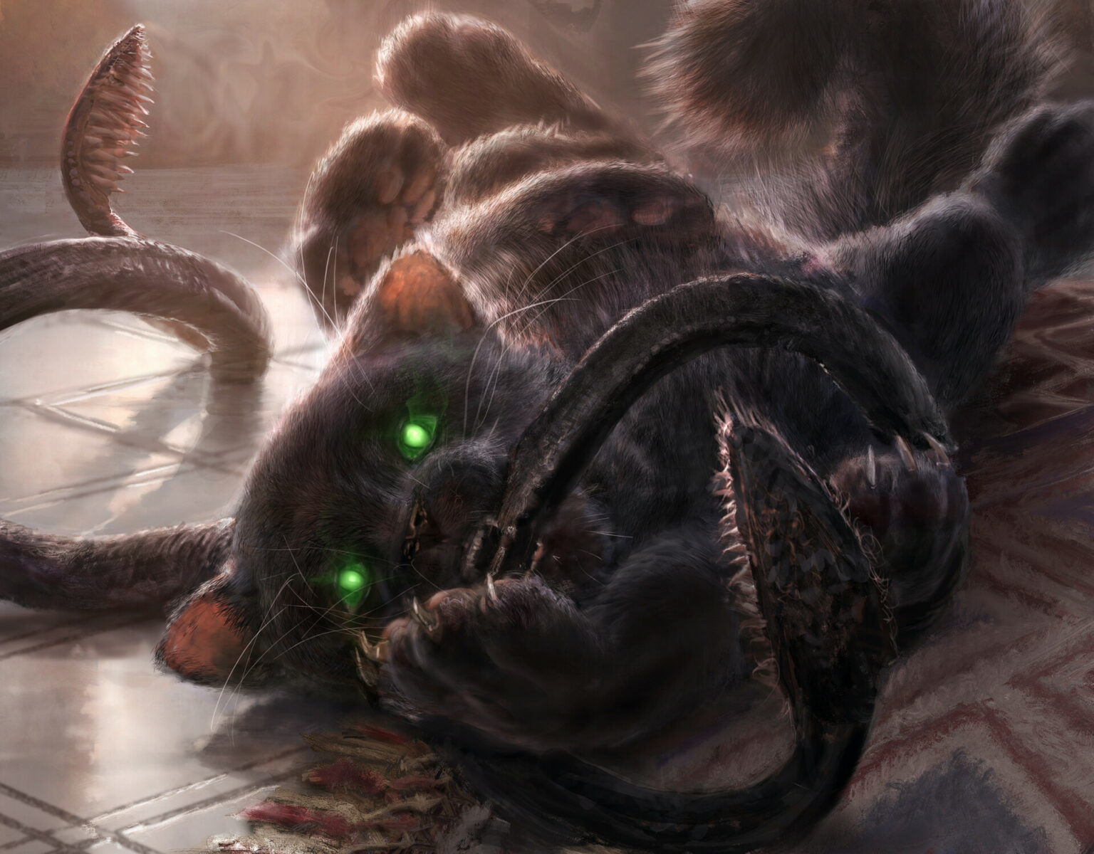
Displacer Kitten by Campbell White
This is a classic example of why I love seeking out art to look at in full size: there is always more than meets the eye. These details are easily missed when looking at art smaller than the palm of your hand. White spoke to the complexity of the illustration in the auction posting for the original sketches
“Managing to compose an all black critter that has 6 legs, a tail, two tentacles, and is covered in fluffy fur meant a lot of attention to value control and rim lights to make sure he didn’t become one big black blob with glowing eyes at card size”
It’s hard to notice these triumphs at card size, but looking at full resolution, you can see the absolute attention to detail to make sure that this work did not sacrifice legibility for design elements. The light streams from an unseen window in the background and bathes our subject in soft light, and the artist uses that sunlight to highlight both shape and texture, letting us see both outline and detail of a very complex image. The longer you look the more involved (and adorable, let’s be honest) the work gets, and you realize this is no ordinary illustration.
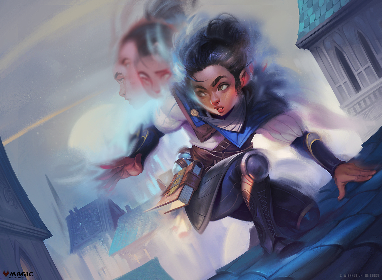
Blur by Dave Greco. Digital.
Greco, now a Senior Visual Development Artist at Blizzard, has been in the industry as a concept artist and freelance illustrator for close to two decades. His first appearance in Magic comes in Baldur’s Gate with five cards, but this, the first shown, is my favorite among them. The illustration tells a story, and it’s unmistakable what’s happening. Who would have ever thought a card called ‘Blur’ would be perfectly legible? It was no easy feat I’m sure, but its simplicity and charm has not gone unnoticed. Greco noted on Twitter that he began playing Magic himself in 1994. Those early cards and artwork inspired him to make art, and we now see an artistic dream fully realized. Welcome to Magic, Dave!
Wrapping Up
We’ve traveled far and wide, but here ends the glimpse into what I consider some of the standout artwork of Commander Legends: Battle for Baldur’s Gate. Among these works we’ve seen strong storytelling, out of this world rendering, and an impressive consideration of legibility even in the face of challenging prompts and complex criteria. There was a LOT of art that made up the main set and Commander releases, and the folks that nailed it, both shown here and otherwise, really went above and beyond.
But while this set did indeed have some of the highest of highs, it was not without its flaws, and for the first time in a long time, it felt as if more art than average was not of the kind and quality we’ve come to expect in Magic.
The next Mirror Gallery article will dive back into the Secret Layers of Secret Lair, covering the June Superdrop that just released this week, and then my guess is we’ll be back on the Grand Tour circuit to take a look around Double Masters 2022. There’s a lot of product (and a lot of art) in the pipeline, so make sure you swing back every other Thursday here in the Mirror Gallery to see what’s happening in the world of Magic art.
Remember, to see original #mtgart and other #vorthos related things, follow me on Twitter. Feel free to ask questions or retweet to continue the conversation. Thanks and see you next time!
Donny Caltrider has been playing Magic since 2002 and collecting original Magic art since 2017. He has an M.A. in Museum Studies from Johns Hopkins University and enjoys telling stories about art, objects, and the intersection of fantasy with real-life. You can find him on Twitter talking about #mtgart, museums, and other #vorthos related goodness. Follow along and continue the conversation!

