Cover image: Death’s Shadow by Magali Villeneuve
I’m a veteran crow-eater, so I don’t have any qualms admitting that I’m a Secret Lair convert. When first announced, I pushed back against the new business model; but in the two years since, I’ve warmed up to it based on performance. We’ve gotten art styles that we’d never see in a full set, boxed sets dedicated to charitable causes, and artist spotlights that serve as a patronage system for Magic’s most famous artists.
Aesthetically, I’m all in, although I do still have lingering philosophical qualms. I’m wary of what printing direct-to-consumer box sets represents for the long-term health of local games stores and outright dislike the predatory marketing of the Lair system, but it’s clear that Wizards is happy with the Secret Lair model and intends to continue using it. Aside from the minuscule foil bubble, it doesn’t cost more to print a copy of Bitterblossom than it does to print an Enormous Energy Blade, and it’s part of Wizards’ laudable commitment to reprinting cards. Magic is an absurdly pricey game if you’re at all interested in staying competitive. That’s not likely to change completely, but you can currently snag a playset of Tarmogoyfs or Misty Rainforests for what one copy cost three years ago.
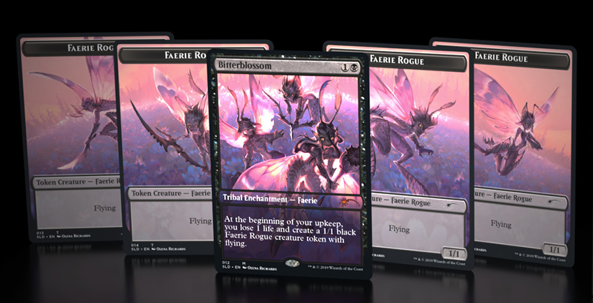
Aside from acquiring cards for cheaper, Secret Lairs offer a customization tool that mirrors those in modern video games, where skins are an easy way to harvest cash from players. Magic has embraced this model wholeheartedly, to what I would argue is the game’s benefit. I’m on record as saying that Magic has never been more aesthetically appealing than it is now. Traditionalists can run original-frame Thoughtseizes and Scalding Tarns, while those who are drawn to alters and pop art can run their Secret Lair versions, and those who are more cost-conscious can simply build with the cheapest version.
Art choice wasn’t a real part of Magic until the Zendikar boom. Prior to the 2010’s, your option was “draft booster version” or, in rare cases, “Player Rewards alt-arts.” Now, you have showcase versions, extended art versions, and official Wizards of the Coast alters in Secret Lair. It’s the variety of art styles that won me over. I grew up on alt comics and [adultswim], so the garish neons of some Secret Lairs tap into my aesthetic preferences pretty directly—the Wizard of Barge oozes, the latest Roman Klonek drop, etc.
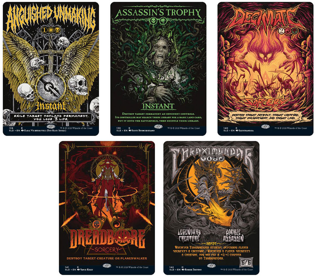
To be perfectly frank, I love ugly cartoons, and I’m drawn to wholesome ultraviolence and grand guignol grime—Evil Dead, MÖRK BORG, Berserk, etc. Secret Lairs don’t quite hit that level of playful maximalism, but the variety of art styles is refreshing—from hyperrealistic to whimsical to outright cartoonish—and Wizards’ willingness to experiment with what a “Magic card” looks like has never been more directly observable than now.
New Capenna is giving us alternate cards straight out of the Art Nouveau movements with a subversive hint of Socialist Realism—note how the alt-art Commanders are styled as conquerors and static icons of a gleaming city. There’s a dialectic tension within the look that that truly works for New Capenna. The decadence of the Gilded Age as represented by the commercial Art Deco/Art Nouveau styles contrasted with the pseudo-naivety of idealized propaganda mirrors the triumph of conniving demons over angels, even while the plane remains aesthetically indebted to both.
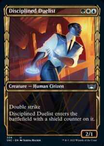
It’s no coincidence that the first official previews included Serena Malyon’s Disciplined Duelist, which has the blocky dynamism of Art Deco and the propagandistic self-assurance of New Deal-era Public Works art. It’s a fabulous fusion of several aesthetics that perfectly ties New Capenna, a new world, to familiar tropes of 20th century art, thus introducing us to the world in a single 2.3” x 1.8” box.
Magic’s recent expansion of its artistic parameters also has accessibility benefits: by mixing up the frames, Wizards can tweak the user interface of cards without having to commit to a full M15-style updating. In my Modern deck of choice, I run a couple of Neon Dynasty full-art basics for easier searching off a fetchland, borderless Scavenging Oozes and Grist (and soon Collector Ouphe) in the sideboard, along with Strixhaven Inquisitions, and retro frame Ignoble Hierarchs and Thoughtseizes in the main deck to very slightly improve my mulligan decisions.
Full-art cards, judiciously employed, mean you can search for key cards more easily, in much the same way that players have run white-bordered cards for easy tutoring in years past. It’s a small thing, but every incremental advantage counts when a Top 8 placement is on the line (or Top 64 in my case). It also, of course, affords Wizards the opportunity to sell you the same cards all over again.
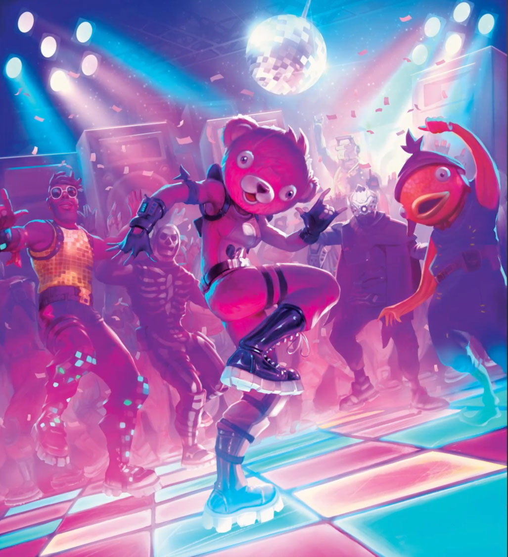
In their role as a commercial tool, art options also serve as a market diagnostic: Wizards is able to see what sells and thus tailor future releases to audience preferences. We can speculate on the results of that market research, even if we don’t have full access. For one thing, we’re seeing more sci-fi and future-tech art than ever, from the cyberpunk world of Kamigawa to the chrome-and-feathers of New Capenna to the intergalactic carnival of Unfinity. I don’t play Magic for Getaway Cars and spaceships and aug-tech jellyfish-circuit boards; I play Magic because it’s the second-greatest game of all time and chess doesn’t let you summon Zombies and Goblins. But, even during the game’s densest period of high-tech and sci-fi, Wizards still caters to players like me. We’re returning to Dominaria twice this year; and while I expect The Brothers’ War to be closer to the sci-fi end of the spectrum, it’s likely to be the crystalpunk sci-fi of powerstones and exoskeletons and titanic golems.
By updating the art of often-reprinted cards like Threaten and Shock, Wizards can give us insight into a new world while tying it to a simple, universal card we’ve seen many times before. In contrast, by depicting warped Magic tropes we’ve become accustomed to, Wizards can create a sense of uncanny unease, as in Amonkhet’s masculine Angels. In some cases, it can result in a complete reinterpretation of the card, as in Death’s Shadow from the recently-announced Magali Villeneuve Secret Lair.
Howard Lyon’s original art, back in Worldwake, was a technically impressive and moody piece—it depicts an avenging monster mirroring the body language of a warrior, cast in spiky shadows and orange light, a visual warcry. In stark contrast, Villeneuve’s Shadow is a ministrant, attending to the battered body of a dying or dead warrior. Death’s Shadow, up until now, was not a tender card—it’s a blunt tool that takes advantage of the quirks of Modern to be the largest threat possible for the least amount of mana.
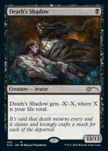
Now, with Villeneuve’s art, we’re no longer the defiant warrior the Shadow clings to; we’re a broken and fading form that Death brushes against in our final extremity. It doesn’t just change the flavor of the card; it changes how it feels to employ the card. We’re not a berserker, sacrificing our life so we can power up our symbiotic Avatar, but a broken failure, relying on a protector to get our revenge from the threshold of death. Magic is a power fantasy—I will never call down lightning against my foes in real life, but I sure have done it hundreds of time in Modern—and this updated Death’s Shadow forces us to reconsider who has the power.
Death’s Shadow’s creature type has always been nonrelevant. Grixis Shadow doesn’t tend to run Cavern of Souls and it’s not like Plague Engineer set to “Avatar” has ever come up. If you’d asked, I probably would have predicted “Horror” over “Avatar”—I’ve only occasionally dallied with Death’s Shadow. It took Magali Villeneuve’s reworking of the concept to make me retain that it’s an Avatar, closer to Scion of Darkness than Childhood Horror.
Magic is voracious when it comes to art needs. In 2021, we saw over 1,600 unique cards, as well as a host of Secret Lairs, Strixhaven Mystical Archives, “bonus cards” in Secret Lairs, etc. Working with Wizards is a goal for many speculative realist artists for a reason: they pay, they tend to continue relationships, and they get your work in front of millions of eyes. That’s a mercenary way of seeing things, sure, but the outcome is positive all around: players are given more options to match their personal preferences, artists are compensated for their imaginations and labor, and Wizards can claim award-winning art and foster decades-long relationships with artists.
The Secret Lair system, with its more flexible art direction, has employed artists I’ve followed on social media for years, but never expected to see in the game I love, and has deepened my connection to the game. As I said, I’ve never been a committed Death’s Shadow player, but Magali Villeneuve’s doleful tableau has made me reconsider—now all we need is a Secret Lair: Ragavan drop, and I’ll pick up the deck immediately.
A lifelong resident of the Carolinas and a graduate of the University of North Carolina, Rob has played Magic since he picked a Darkling Stalker up off the soccer field at summer camp. He works for nonprofits as an educational strategies developer and, in his off-hours, enjoys writing fiction, playing games, and exploring new beers.

