Good morning everyone, and welcome to the Mirror Gallery here on Hipsters of the Coast for the second iteration of Choosing Commander Art! I can’t believe it took three years to return to this series, but I’ve finally made it back. When IX was on the horizon a few weeks ago, I decided to carve out a few hours to finally build a new Commander deck (yes, my first in three years), this time built around a piece of art I added to my collection in the middle of last year:
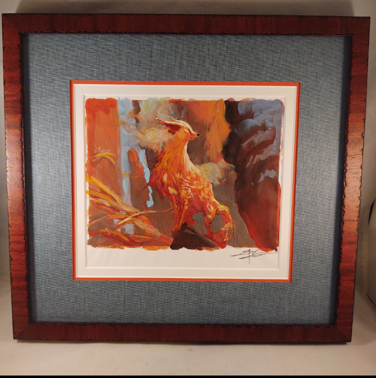
Zirda, the Dawnwaker (Color Study) by Jesper Ejsing. Traditional.
As a Commander, Zirda, the Dawnwaker can do a lot of broken and powerful things, but I wanted to build her a bit differently. I like to balance my decks, to play competitively but also for a bit of fun, and with the capacity to do strange things. I’ve crafted Zirda to do just that, to speak softly but carry a big stick, and with consideration to certain art, printings, foils, and a handful of other customizations.
A brief disclaimer: there is nothing wrong with any of the art I did not choose. My choice doesn’t mean an artwork or printing is any better. These decisions are a glimpse into my decision-making process, based entirely on my personal art and aesthetic preferences. Because of the visual impact of card frames and foiling, some cards will include every printing of the card and not just the different versions of art. This is not a comprehensive list of my entire deck.
You’ll see my choices are determined by a bit of everything, from my favorite artists to pure nostalgia and everything in between. Because this deck is in its early stages, many of these choices reflect what I’m planning in the future, and not necessarily the deck as it stands today. With that all out of the way, are you ready? Let’s Choose Commander Art!
Lands
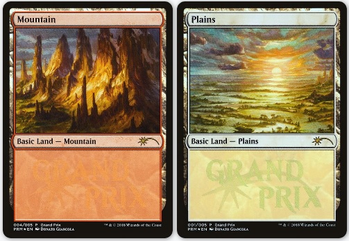
Zirda is from Ikoria, and while I do love the basic lands also painted by her creator Jesper Ejsing, for this first version I’ve chosen two of my favorite basics in the entire game: the Plains and Mountain from the Grand Prix Panorama by Donato Giancola. I own the pencil sketch for this work and it’s the first time I’ve gotten to run the lands in a new deck. I’ve an entire set of these in foil and signed by the artist, so for the foreseeable future these will be my basics.
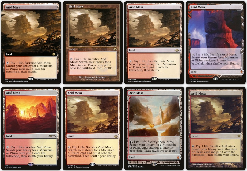
Picking a version of Arid Mesa is one of the toughest decisions, and one I’ve not completely squared with yet. Ryan Yee’s Expedition is downright gorgeous, and Adam Paquette’s reimagining equally so. And yet there is still something about the Swanland original, especially now in the retro frame, that seems to be a good fit. This one will take more time to choose.
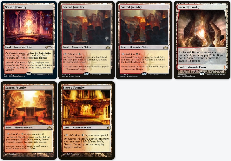
The original Ravnica Shock Lands hold a very special place in my heart, as it was the one of the first sets I played in Magic where I actually felt like I knew what I was doing. The OG Sacred Foundry by Rob Alexander is gorgeous in foil, and grabs the shock slot in this deck.
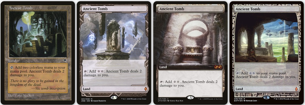
Ancient Tomb provides another impossible decision right off the bat—can you tell I have a penchant for landscapes?. For now I’ve got the original art but in Mystery Booster printing in the deck, as Howard Lyon’s Expedition is currently at home in another deck. But that means I should probably work towards the Paquette Expedition in this one then, right?
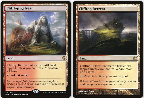
Both renditions of Clifftop Retreat capture their plane effortlessly: the history filled ruins of Dominaria on the left and the looming mystery of Innistrad on the right. I like them both, but for now I plan to run the Avon version from Innistrad: I just love that light breaking through the clouds.
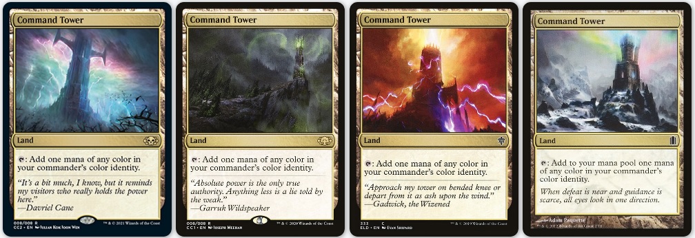
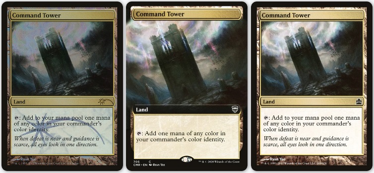
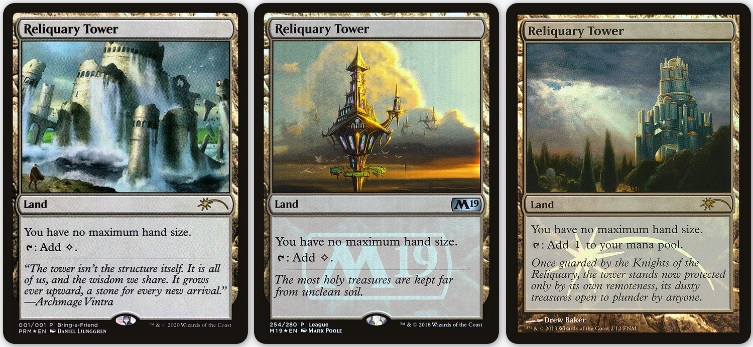
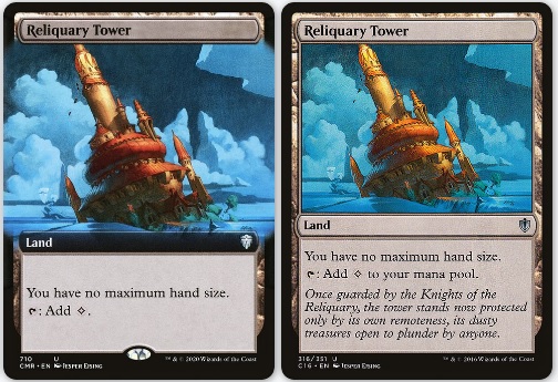
Two lands that are all but auto-includes in every Commander deck, the Two Towers (Command Tower and Reliquary Tower) have seen more variations in the last few years than in their entire history. Until such a time as a Commander Collection: White or Commander Collection: Red gives a themed artwork, I’ll be running Ryan Yee’s classic, now available in an awesome extended art frame. And for Reliquary Tower, a signed promo version by Drew Baker, through the new full art treatment of Jesper Ejsing’s original art is sorely tempting to pair with its Command Tower counterpart.
Creatures

One of my favorite cards, I’ve written about the Solemn Simulacrum artwork at length. The nod goes to Donato as the original sketch for this artwork hangs on my wall, and is the epitome of the two genres in which the artist works.
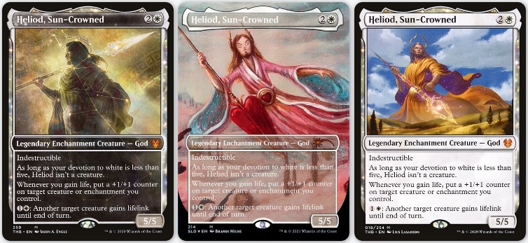
Jason Engle did an incredible thing for Theros Beyond Death, and I’m stoked to find a home for some of the alternate art he created. His constellation version of Heliod, Sun-Crowned gets the constructed spot.
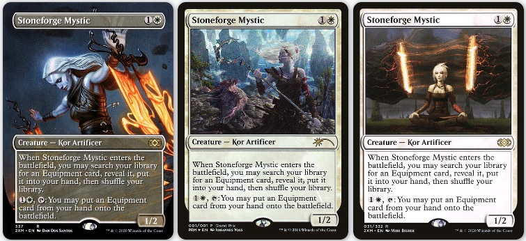
Dan Dos Santos’ new artwork for Stoneforge Mystic is one of my favorites from last year’s Double Masters. While I don’t own one yet, a full art foil seems like just the ticket for a deck that wants to find swords and smash.
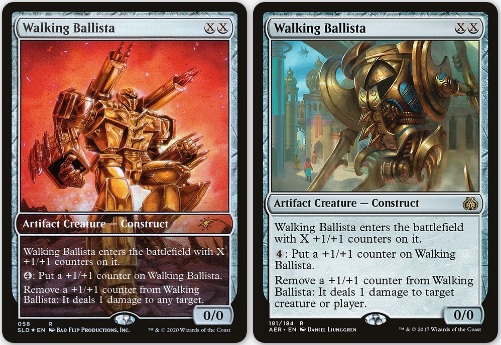
I have been a champion of the alternate art stylings of Secret Lair since its inception, and in many cases will grab one of these from my collection binder whenever I can. Walking Ballista by Ken Christiansen of Bad Flip is too cool for school and ready to go pew pew.
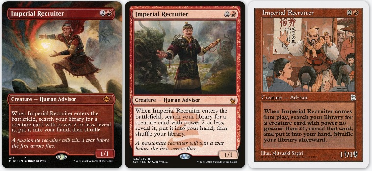
I just recently added Howard Lyon’s new version of Imperial Recruiter to my Grenzo, Dungeon Warden deck (peep Kiki-Jiki in the background), which means Zack Stella’s initial reimagining of this Portal: Three Kingdoms card can bump right on over here. There’s a Judge Promo version as well, a foiled issue of the P3K art, and perhaps that will head into whatever I make next.
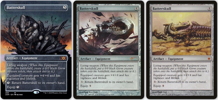
I’ve fallen deeply in love with Igor Kierlyuk’s art over the last few years, and this Grand Prix Batterskull promo is just one example of the vast range of his artistic talents. It’s strong and thematic and in your face. And shiny. I love it.
Artifacts
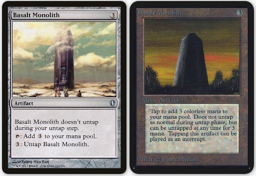
Basalt Monolith is the engine that Zirda is known for, the generator of infinite mana. I’m going new school and in foil for this one, that way the combo can pop off in pure style.
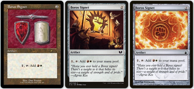
Dan Frazier had the opportunity to reimagine the Ravnica Signets a la his original Moxen for this year’s summer Secret Lair, and they’re some of my favorite cards to have come out in 2021. As soon as this version of Boros Signet lands, it’ll head directly into this deck.
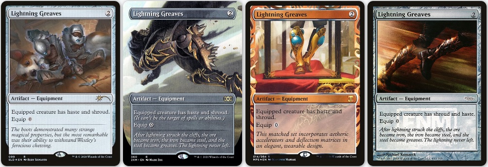
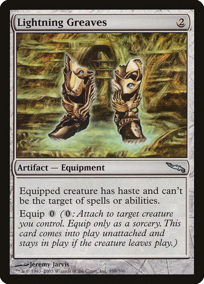
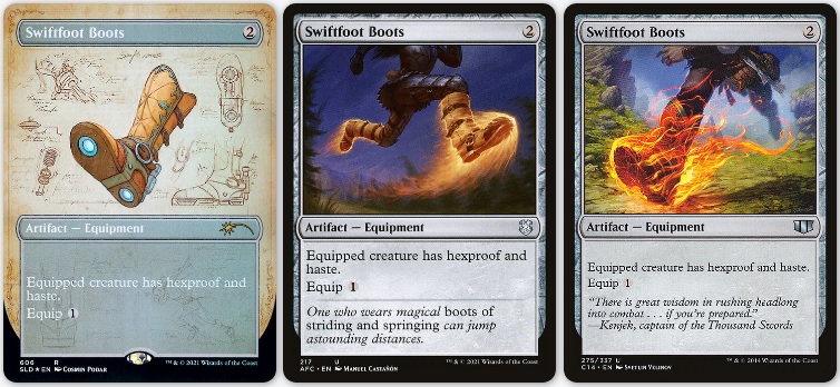
Another round of auto-include cards, for Lightning Greaves I’ll look to add one of Mark Zug’s new full-art cards from last year’s Double Masters. And for some new boot goofin’ I’m planning to pick up the new Swiftfoot Boots schematic artwork by Cosmin Podar. These are downright cool, and I’m hoping he’s done even more than we’ve seen already.
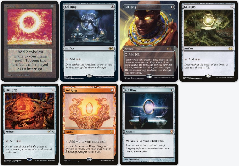
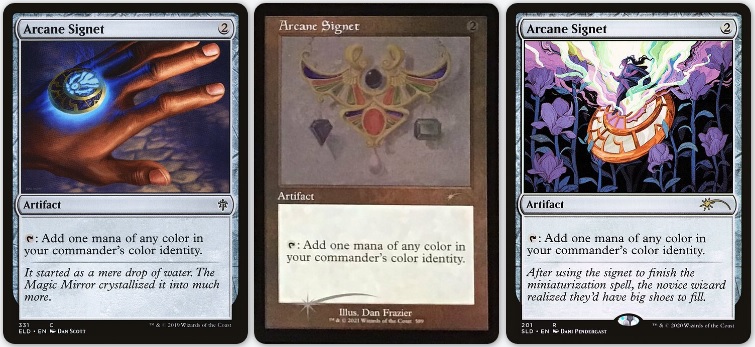
Like Command Tower and Reliquary Tower, Sol Ring has also gotten several more options over the last 24 months. The MagicFest in a Box from Channel Fireball landed me a foil new art Sol Ring by Mark Tedin, and it’s just the right palette and aesthetic for this deck. For Arcane Signet, Dani Pendergast takes it away no contest. I absolutely love her artwork and what she brings to the game.
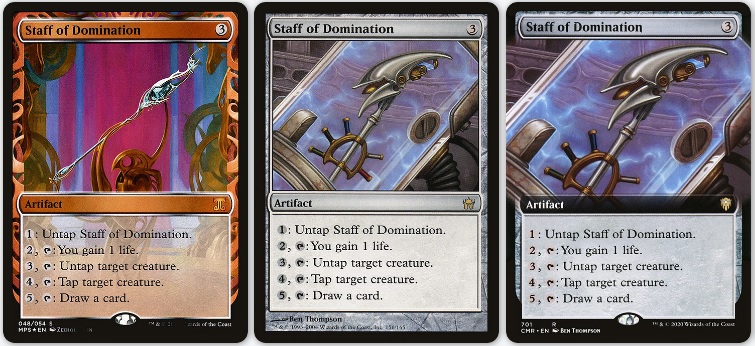
There are still not a lot of options for Staff of Domination even though it sees a lot of play. I have yet to see the new extended art in person, but I’m thinking that may be the choice given the continually rising price price of the Masterpiece Invention series.
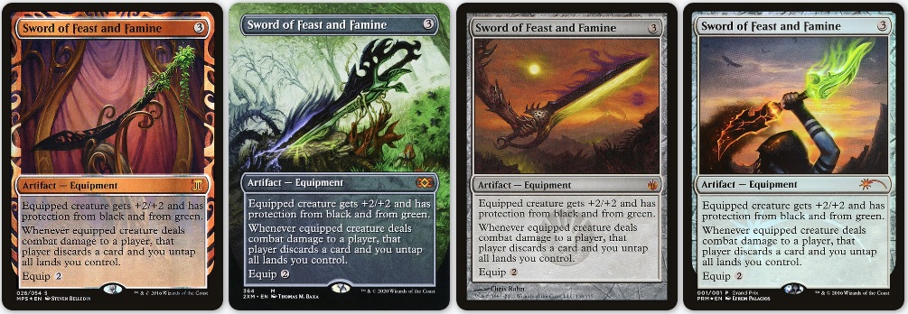
Just like above, given the option with no limit on fundification, I’m choosing the Masterpiece Kaladesh Invention version of Sword of Feast and Famine, but Tom Baxa’s brand new sword is a beautiful piece from a legendary artist too. I wouldn’t be upset with either!
Enchantments, Instants, and Sorceries
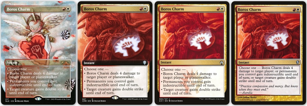
Back on my Secret Lair BS, I have Brandi Milne’s foil Cherub version of Boros Charm in the deck as it stands. I’d like to see one of the extended art Boros-branded versions too, but for now we’ll stick with some fun alternate antics. Watching someone get blown out by a baby is too fun.
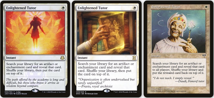
Aaron Miller’s Enlightened Tutor is one of my favorite Magic artworks, period. I’m more than excited to have a deck to run a copy in.
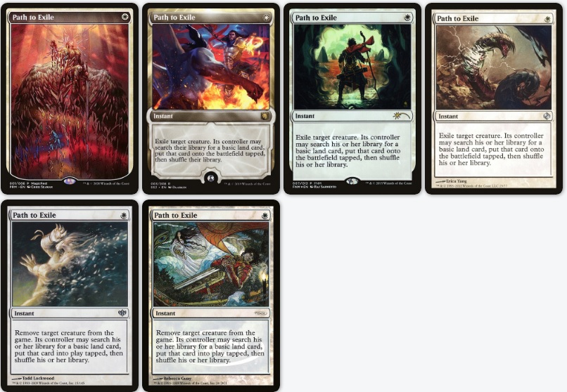
The aforementioned MagicFest in a Box also came with a foil, full-art Path to Exile by Chris Seaman. While I often don’t run textless cards because they can be challenging for folks to remember (myself included), this one is an exception.
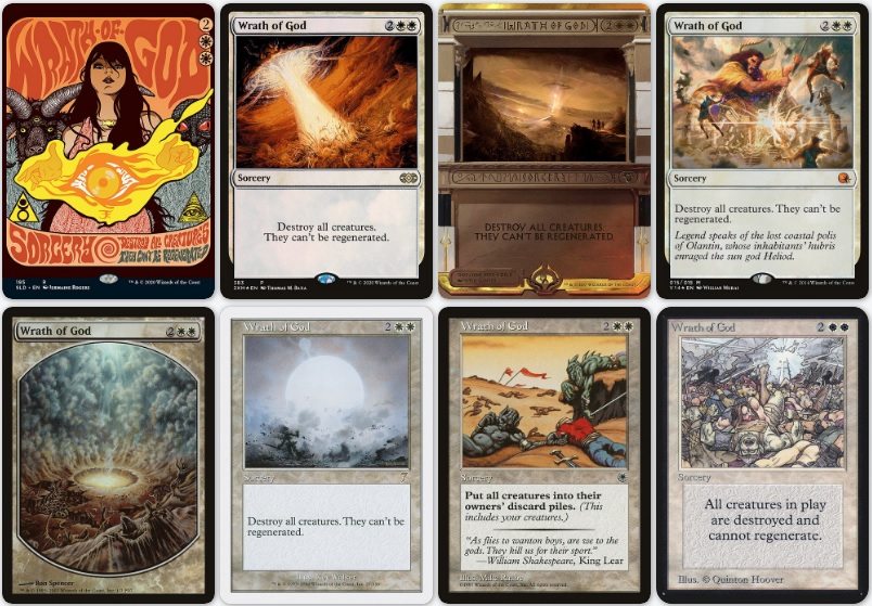
Wrath of God presented another impossible decision, especially between the first three. The brand new art by Jermaine Rogers is the perfect palette for this red and white deck. Tom Baxa’s Wrath promo marked his return to the game in his signature style. Titus Lunter’s Amonkhet Invocation is everything that the set and series aimed to be. And I got my butt kicked by the Kev Walker art more times than I can count. This goes in the group with Arid Mesa. Still very much TBD. (Editor’s note: The Portal version has the best flavor text of any Magic: the Gathering card ever printed.)
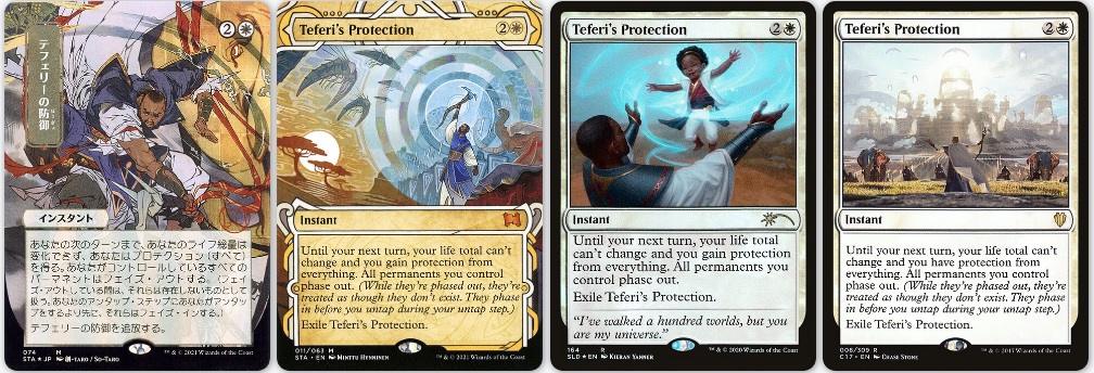
Teferi’s Protection went from one art choice to four in the last year alone, and I love what Minttu Hynninen did for the Strixhaven Mystical Archive. I love the style of that entire subseries, and this is one of the only options to get one in the deck.
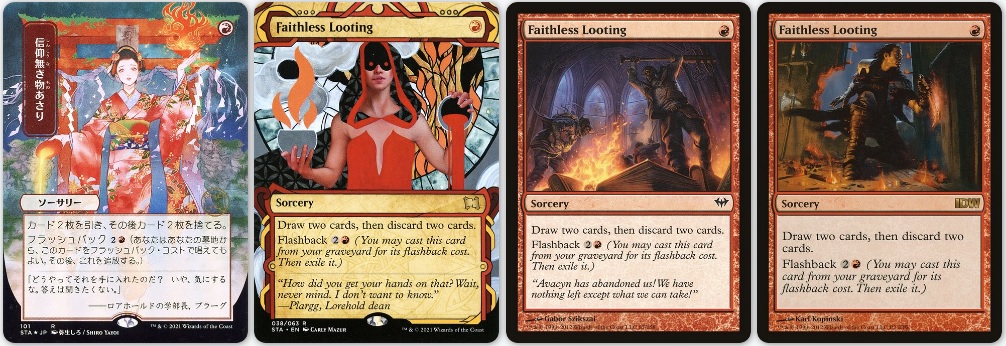
The late Dack Fayden, greatest thief in the Multiverse, is on the Faithless Looting IDW comic promo. In his memory, he grabs the final Choosing Commander Art slot for this article. Rest in Peace.
Future Considerations
I’ve mentioned it briefly throughout, but looking ahead I’d like to acquire the Kaladesh Invention Masterpiece versions of a lot of these cards where possible. Though I played during this set, I wasn’t buying much product and thus didn’t collect these when I absolutely should have been. It’s maybe my favorite frame design in the history of Magic with fabulous artwork from some of my favorite artists. If anything, this deck will prompt me to search some of them out.
The other option that became increasingly prevalent because of the volume of lands and artifacts was the retro frame treatment, something very new but seeming very popular since it’s re-introduction in Time Spiral Remastered. I have several cards with the retro frame in as placeholders, which will determine whether or not they fit the look and feel of what I’m going for the more I play the deck. I began playing in Onslaught, just before the frame change, so while it feels weird to call something from my childhood retro, here we are.
Wrapping Up
I hope you enjoyed this second foray into Choosing Commander Art. It was an absolute blast to write, and incredibly practical and crucial to my deck-building process. I don’t get the chance to build something very often, so when I do I like to do it up big, with all my favorite foils, artworks and artists. It’s a privilege to get to share that with you all. If you enjoyed this please do let me know on Twitter, and I’ll try to make it at least a yearly thing moving forward.
Looking ahead, the next time we’re in the Mirror Gallery it’ll be time for the Innistrad: Crimson Vow Grand Art Tour. This set has blown me away so far, and I think you’re all in for a real treat as we take a closer look at some of the beautiful creations crafted around the Crimson Vow. I’ll also have a smorgasbord of Art Market Minutes beginning next week, so stay tuned for those as well!
Remember, to see original #mtgart and other #vorthos related things, follow me on Twitter. Feel free to ask questions or retweet to continue the conversation. Thanks and see you next time!
Donny Caltrider has been playing Magic since 2002 and collecting original Magic art since 2017. He has an M.A. in Museum Studies from Johns Hopkins University and enjoys telling stories about art, objects, and the intersection of fantasy with real-life. You can find him on Twitter talking about #mtgart, museums, and other #vorthos related goodness. Follow along and continue the conversation!

