Good morning, and welcome back to Masterpiece Theater here on Hipsters of the Coast. Today we begin Marvel Masterpieces Parallels, a brand new series exploring Upper Deck’s Marvel Masterpieces from 2016-2020.
I’ve spent the better part of the last six months delving into the most recent 2020 set by Dave Palumbo. As I neared its completion, I became curious about how his work would connect to the two “modern” Masterpiece sets that came before him. The 2016 set was done by Joe Jusko, artist of the first Marvel Masterpieces set in 1992 and he was tapped for the first installment of the rebirth of this series. In 2018, Simone Bianchi followed in his footsteps and completed his own Marvel Masterpieces set, replete with new characters, new Battle Spectra scenes, and an entirely different stylistic take on the Marvel universe. And then in 2020, Dave Palumbo took the reins and once again gave the world a brand new take of these very special characters.
Each of the three sets are completely unique, which is the intent of the Marvel Masterpieces. One artist completes the entire set, putting an artist’s style in the full spotlight. Jusko’s look is classic comic book, with all the muscle, color, and vibrancy of the sets from the 1990s, just reimagined for today. Bianchi is more contemporary: darker, grittier and using bold blacks and colored outlines to make his characters distinctly stand apart. Palumbo falls somewhere in the middle: his big, bold brushstrokes give a painterly feel to the genre, and bring balance to the modern Masterpieces. His rendition is something that trading cards have never seen.
Across the three sets and excluding the Battle Spectra series, there are 42 characters that each of the three artists painted, and several characters have multiple depictions within a given year, giving us quite a bit to look at. Over the next few months we’ll look at more than 175 artworks from the last three iterations of Marvel Masterpieces, compare and contrast each artist’s creation, and learn some pretty cool stuff direct from the artist’s themselves along the way. This series isn’t about picking the best work, but rather talking about why each is a Masterpiece in its own right, and how these works function as a family of premier illustrations both within and across their respective sets.
I thought it only fitting to begin with my personal favorite superhero. I’m your friendly neighborhood art writer after all, and this is Marvel Masterpieces Parallels: Spider-Man.
Spider-Man: A Brief History
Spider-Man was created by Stan Lee and Steve Ditko, and first appeared in Amazing Fantasy #15 in August 1962. It’s a landmark work in comics, and the original artwork for this issue now resides in the Library of Congress. Stan Lee tells a story about how Spider-Man first came to be that you can watch in this interview from the 2017 UCLA Extension Commencement Speech.
The new hero was created as an imperfect teenager named Peter Parker, bitten by a radioactive spider and imbued with the powers to climb walls and shoot webs alongside superhuman strength and agility. However, the original idea for Spider-Man was deemed by Lee’s publisher “the worst idea he ever heard” and as such was placed in the last issue of a publication that was going to be discontinued.
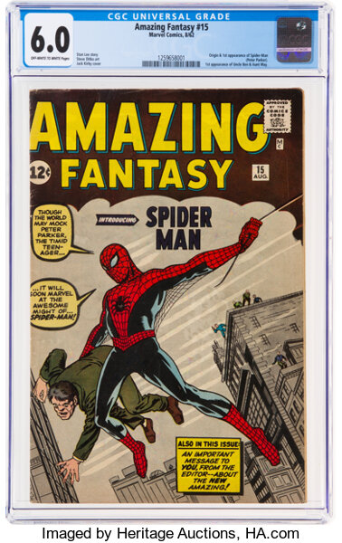
Amazing Fantasy #15 (August 1962). Image: Heritage Auctions
A few months later when the sales figures returned, it was revealed Spider-Man was a smash hit success, and the rest is literally history. The Amazing Spider-Man #1 came out in March of 1963, and the hero has seen publication consistently under a variety of titles since then, continuing to appear in comic books and film to this day.
Spider-Man appears on eight different individual cards across the three Masterpiece sets: four in 2016, two in 2018, and two in 2020. Let’s take a closer look:
Spider-Man: Parallels
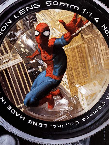
Spider-Man (Canvas Gallery) by Dave Palumbo, 2020
We’ll start with perhaps my favorite work from the entire 2020 Masterpieces set, the Canvas Gallery Spider-Man by Dave Palumbo.
The idea of “getting a photo of Spider-Man” dates back to the early comics, when Peter Parker made his living photographing himself and selling the images to J. Jonah Jameson at the Daily Bugle, and that’s exactly what Palumbo gives us. The camera, as if webbed to a wall, snaps Spidey as he flies upward from the city below. And the camera lens? It’s period appropriate. Palumbo is an aficionado of vintage cameras and lenses, and made sure to choose a lens that Parker could have actually used when he would’ve been taking photos in the 1960s. How cool is that?
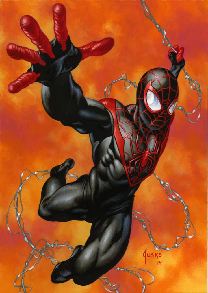
Ultimate Spider-Man by Joe Jusko, 2016
We see a similar composition in Jusko’s Ultimate Spider-Man from 2016, painted six years before Palumbo and Card #1 in his set from that year. Jusko notes in his book that he wasn’t familiar with the costume until he was tasked with painting it, and this is the only time across the three sets we see Spider-Man in the newer “Ultimate” black and red suit. He reaches out to the viewer as he swings in, almost as if saying, “Stand back, I got this.” moments before heading off the page.
Spider-Man swinging through New York seems second nature to our eye, but how can an artist capture that idea of flying?
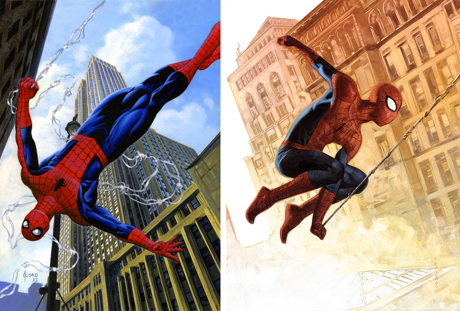
Left: Spider-Man (Base) by Joe Jusko, 2016. Right: Spider-Man (Base) by Dave Palumbo, 2020
We see that very feeling of weightlessness captured in the Base cards from 2016 and 2020, the pit in your stomach created just before you dive down the first hill of the rollercoaster. Spider-Man’s motion is effortless here, and in both we have no point of reference to where the ground might be. In Jusko’s work he’s half somersault, and in Palumbo’s our hero seems to float between time and space against the sunrise.
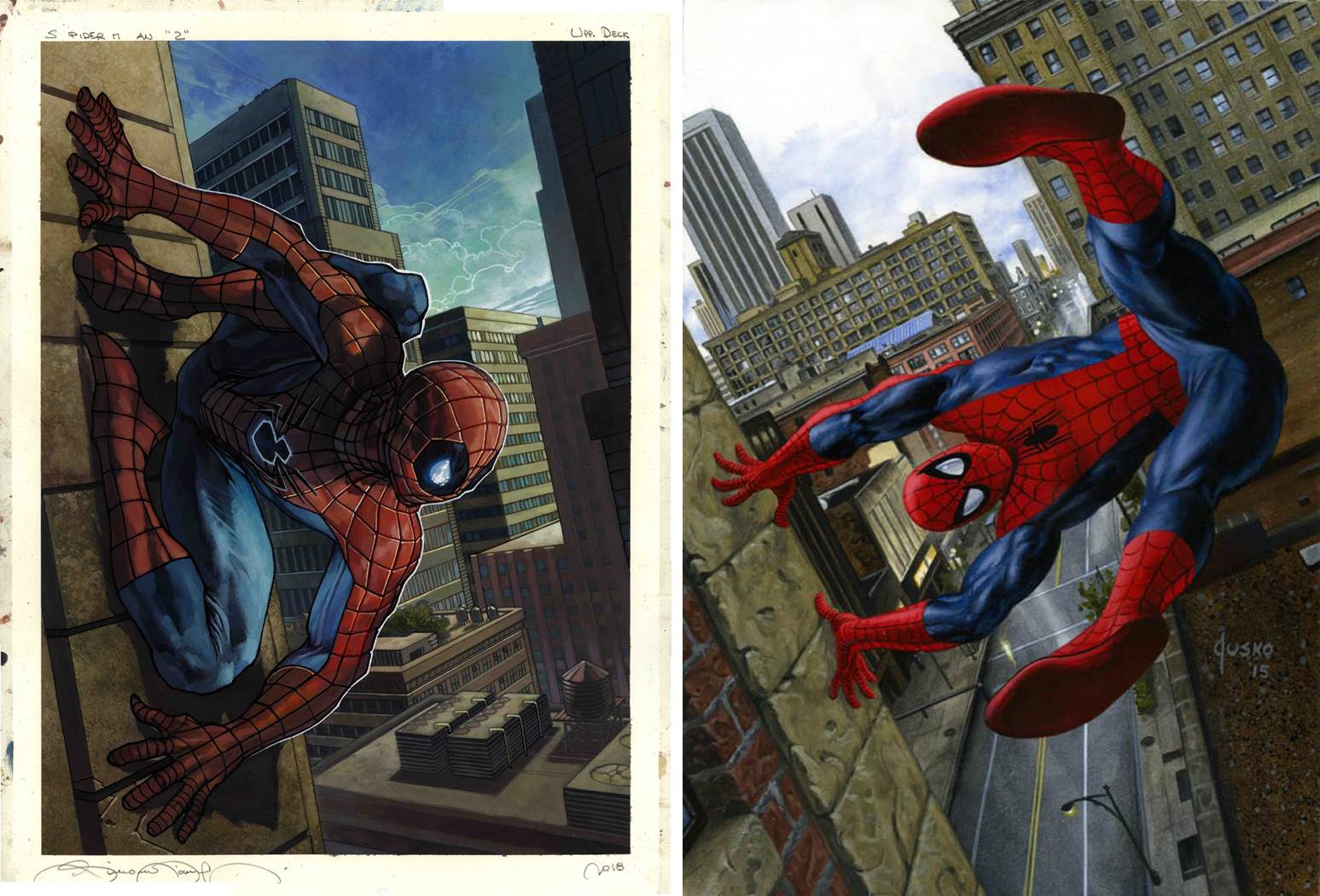
Left: Spider-Man (Canvas Gallery) by Simone Bianchi, 2018. Right: Spider-Man (Holofoil) by Joe Jusko, 2016.
Not only can Spider-Man fly through the sky, but he can also stick to walls, and if we place Bianchi’s 2018 Canvas Gallery and Jusko’s 2016 Holofoil variant artworks side by side, it creates almost a Before and After scene. High above the city streets he can hold fast, and capture that moment right before lift-off. Note Bianchi’s white outline around Spider-Man; this literal highlight makes him “pop” off the background of buildings. And another fun fact from Jusko’s book reveals that his city background is derived from an actual photo of Rochester, NY; we’ll take more about the importance of reference in artwork, but in short, to make something look and feel real, it has to be grounded in real life. That’s what’s happening here.
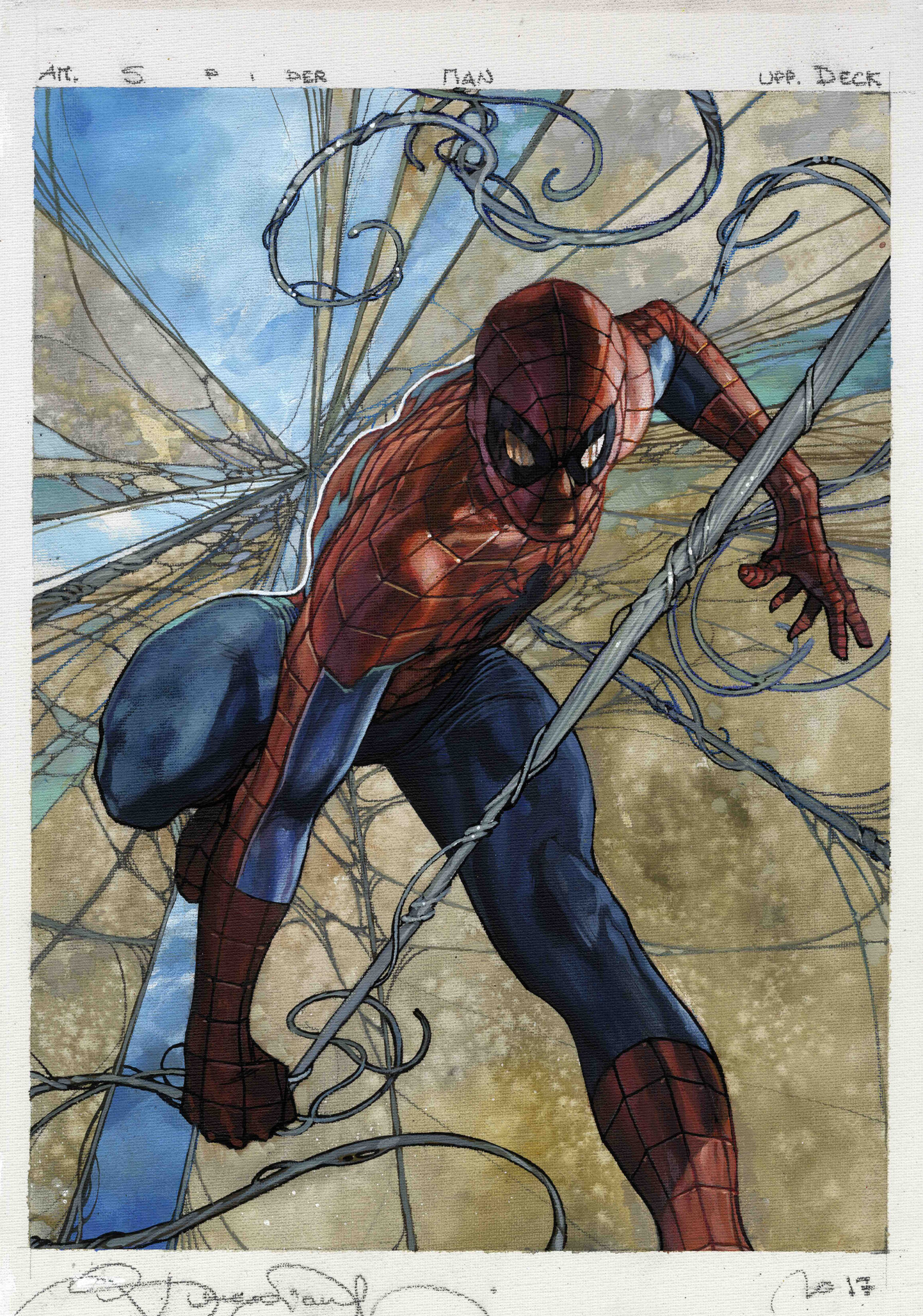
Spider-Man (Base) by Simone Bianchi, 2018.
Continuing our pseudo-story, the 2018 base card of Spider-Man gives us the superhero “sticking the landing,” so to speak, that moment of impact and classic power pose, but appropriately with web in hand. We’ll see Bianchi use these thematic, patterned backgrounds throughout this series, and this one fittingly appears as both a web or rising buildings, depending on how you look.
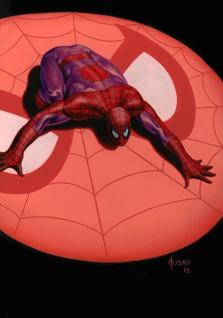
Spider-Man (Canvas Gallery) by Joe Jusko, 2016.
We’ll end today with a work as unique as the one we began with, the 2016 Canvas Gallery that shows Spidey crawling across the Spider Signal. The dark background is not something often seen across these sets, but effectively “turns on” the spotlight in this particular case: a light in the darkness. As far as I know this is one of the few depictions of the Spider Signal in trading cards, and the only time it appears in a Marvel Masterpieces set.
Wrapping Up
So there we have it, our first Marvel Masterpieces Parallels that places all eight of the Spider-Man images across the three modern Marvel Masterpieces set within the same context. Each is a bit different and serves it’s own artistic function, but all seek to capture the same traits and ideals of this hero, and show the breadth of creativity that comes from three distinct artistic visions.
Looking forward, we’ll stay in the Spiderverse and have a closer look at the villains and foes ‘ol Spidey might encounter while fighting crime, with nearly 20 artworks in that article across the three sets. As a reminder this column is now a monthly feature, and that article will hit Hipsters of the Coast mid-May. In the meantime, you can keep up with all things Marvel Masterpieces 2020 by following me on Twitter. Feel free to ask questions or retweet to continue the conversation. Thanks and see you next time!
Donny Caltrider has been playing Magic since 2002 and collecting original Magic art since 2017. He has an M.A. in Museum Studies from Johns Hopkins University and enjoys telling stories about art, objects, and the intersection of fantasy with real-life. You can find him on Twitter talking about #mtgart, museums, and other #vorthos related goodness. Follow along and continue the conversation!

