Good morning, and welcome back to the Mirror Gallery here in Hipsters of the Coast. We’ve gone through the full preview of Strixhaven, and that included the set’s Showcase series, the Mystical Archive!
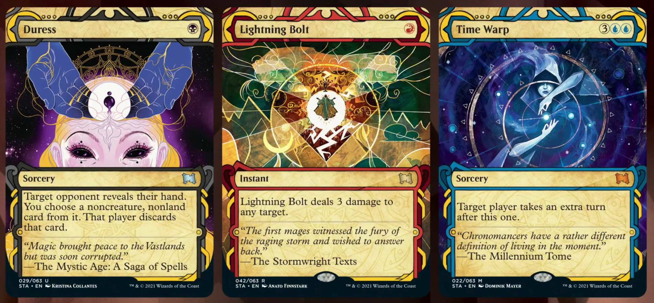
The Mystical Archive resides in the Biblioplex on Strixhaven, a forbidden section of the great library that houses the manuscript for every spell in the Multiverse illustrating the first time it was cast. These artworks mimic the illuminated manuscripts of the medieval world, and bring that stylization from days long gone to Magic. Illuminated manuscripts began to appear in the late Middle Ages as things began to be produced on paper, and the “illuminations” ranged anywhere from fancy border to those large first letters at the beginning of a page you see in movies. They also included miniature illustrations on the outside edge of within the text that functioned as storytelling vehicles to supplement what the person may be reading. It’s in this space these Magic illustrations seek to mimic and the Mystical Archive serves that same function, to illustrate a narrative of some of the most important spells in Magic’s history.
This article will explore more than a dozen of the Mystical Archive artworks, all from artists new to Magic and tapped for this undertaking because of their unique style. Pull up a chair, turn on your library lamp, and let’s unfurl some of the artwork of the Mystical Archive!
Rovina Cai
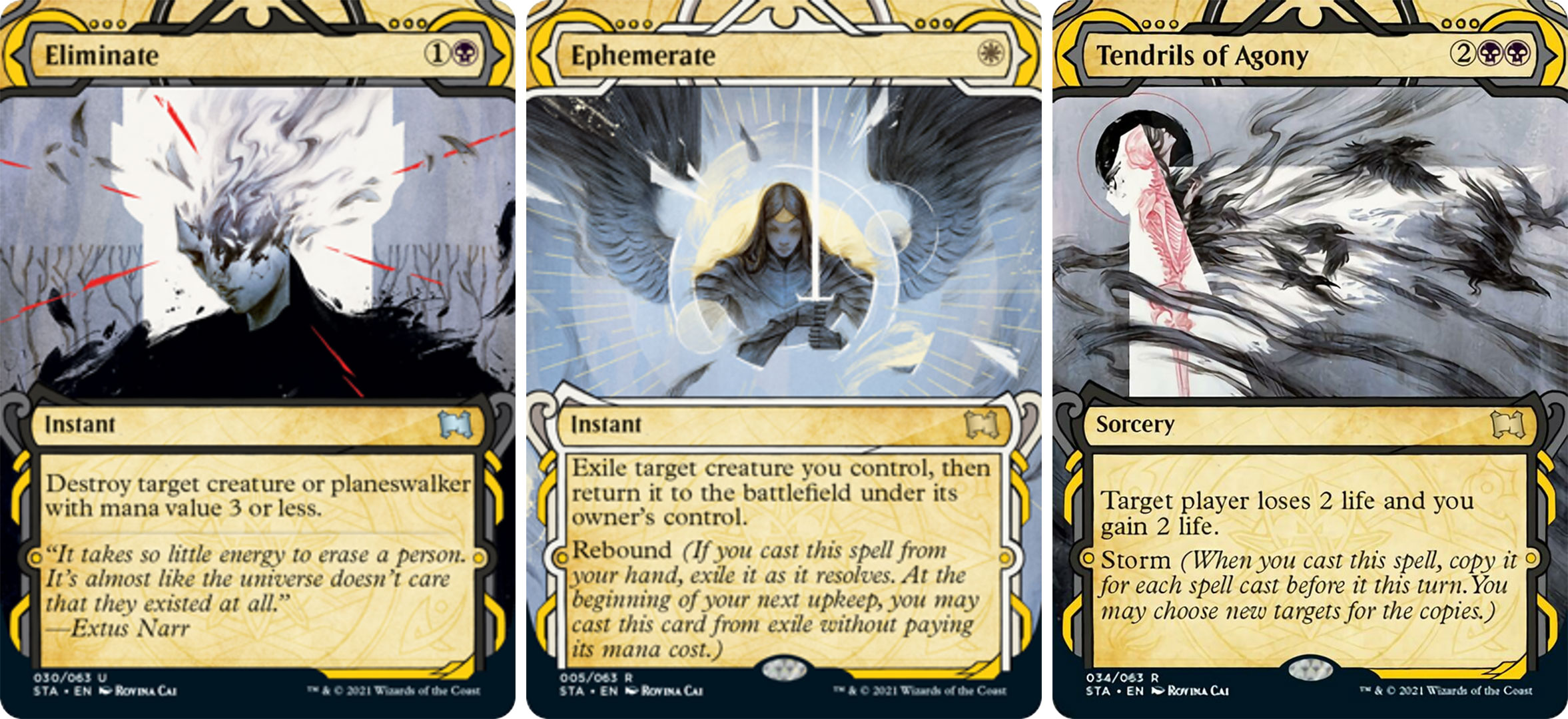
Rovina Cai is a freelance illustrator from Melbourne, Australia. I first heard her name almost exactly a year ago when she took home the Spectrum Gold award, one of the highest honors in imaginative realism, for her work Ivywood. She’s now made her Magic debut, and brought that same eerily beautiful style to the game in three cards: Tendrils of Agony, Ephemerate, and Eliminate. Before we dig deeper, I asked her about her experience in creating these works:
“The style guide for the Mystical Archives cards called for images that look like they’re from an ancient spell book, in the spirit of medieval illuminated manuscripts. I thought this was such a cool idea, and a really interesting if unexpected direction to go in for Magic art. The AD (Tom Jenkot) was super enthusiastic about the concept, and gave me a lot of creative freedom, which made the assignment a joy to work on. I’m thrilled to finally be able to share this art after keeping it secret for a year!”
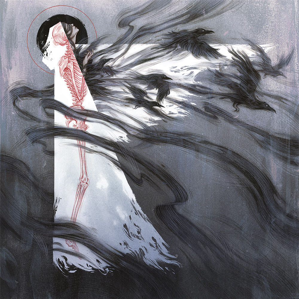
Tendrils of Agony by Rovina Cai. Digital over pencil.
Her process is mesmerizing, and she’s shared a recap of her digital layers with full GIFs on Twitter that show how she goes from rough idea to pencil sketch to final artwork. Check out how important that original pencil drawing is to the final work in her process post on Twitter.
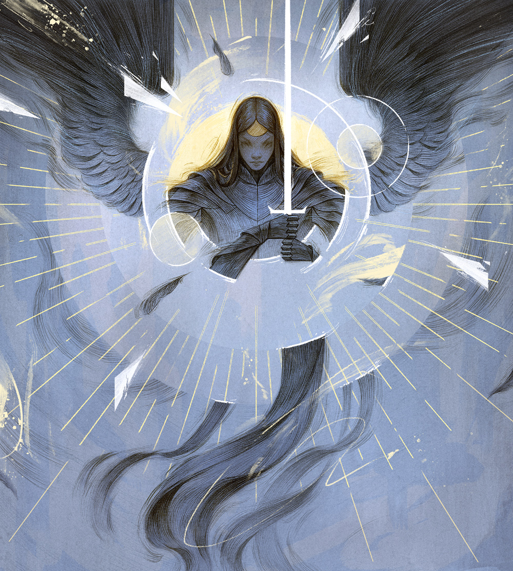
Ephemerate by Rovina Cai. Digital over pencil
She also shared something similar for Ephemerate as seen above, and it’s just wild watching the layers build upon her original ideas rendered in graphite to this final form.
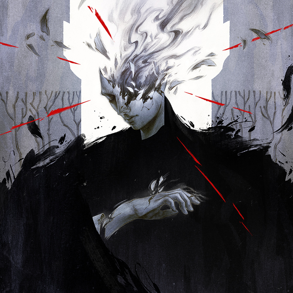
Eliminate by Rovina Cai. Digital over pencil.
Her last card is Eliminate, and I think it sums up just how hard my mind has been blown exploring her artwork. She’s mentioned on Twitter that she has a year’s worth of Magic art in the hopper, so there’s more to come from her in the near future. In the meantime, you can see more of her artwork on her website. She is one of the great artists of the genre and has now come to Magic; you all best keep a lookout. Welcome to Magic, Rovina!
Matthew G. Lewis
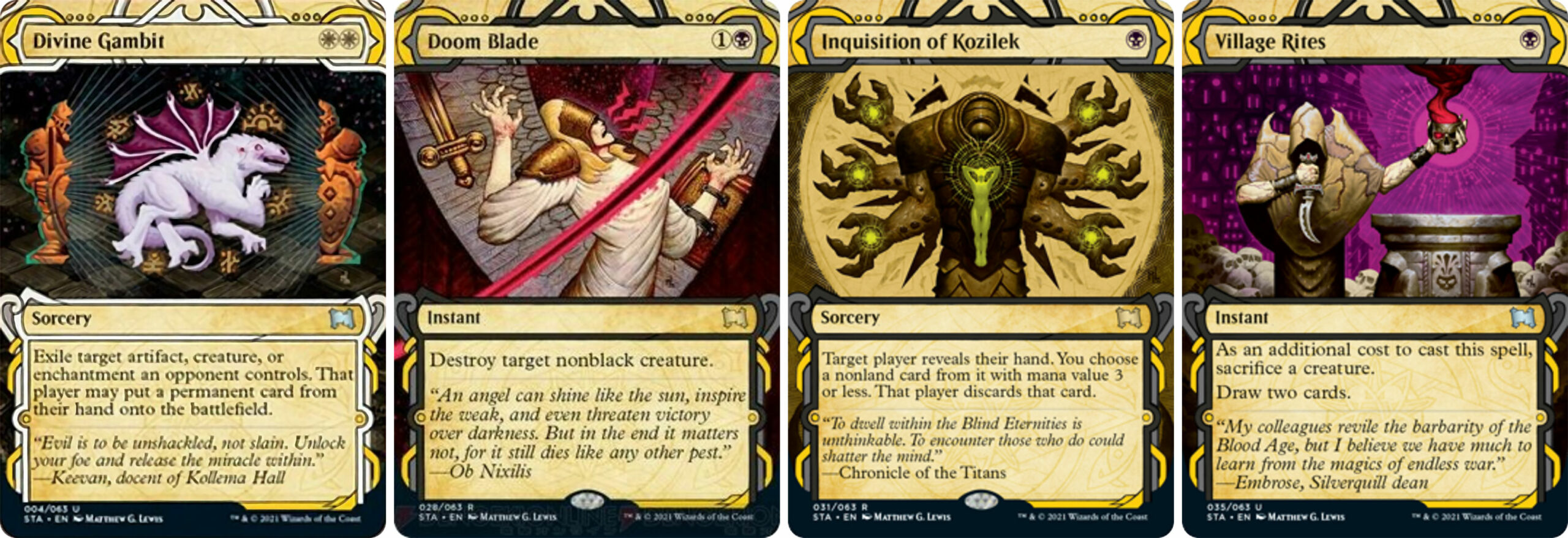
Illuminated manuscripts are nothing without the occasional touch of the macabre, and that’s the space that Pacific Northwest-based artist Matthew G. Lewis occupies within the set. He brings a hauntingly beautiful grotesque grandeur to this card series in his four cards: Inquisition of Kozilek, Doom Blade, Village Rites, and Divine Gambit. Let’s take a closer look.
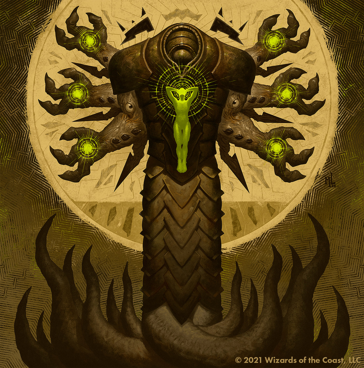
Inquisition of Kozilek by Matthew G. Lewis. Digital.
An ancient rite of the Eldrazi titan depicted, a doom unfolds. I love this composition, the symmetry, and colors; I literally can’t wait to play with this card.
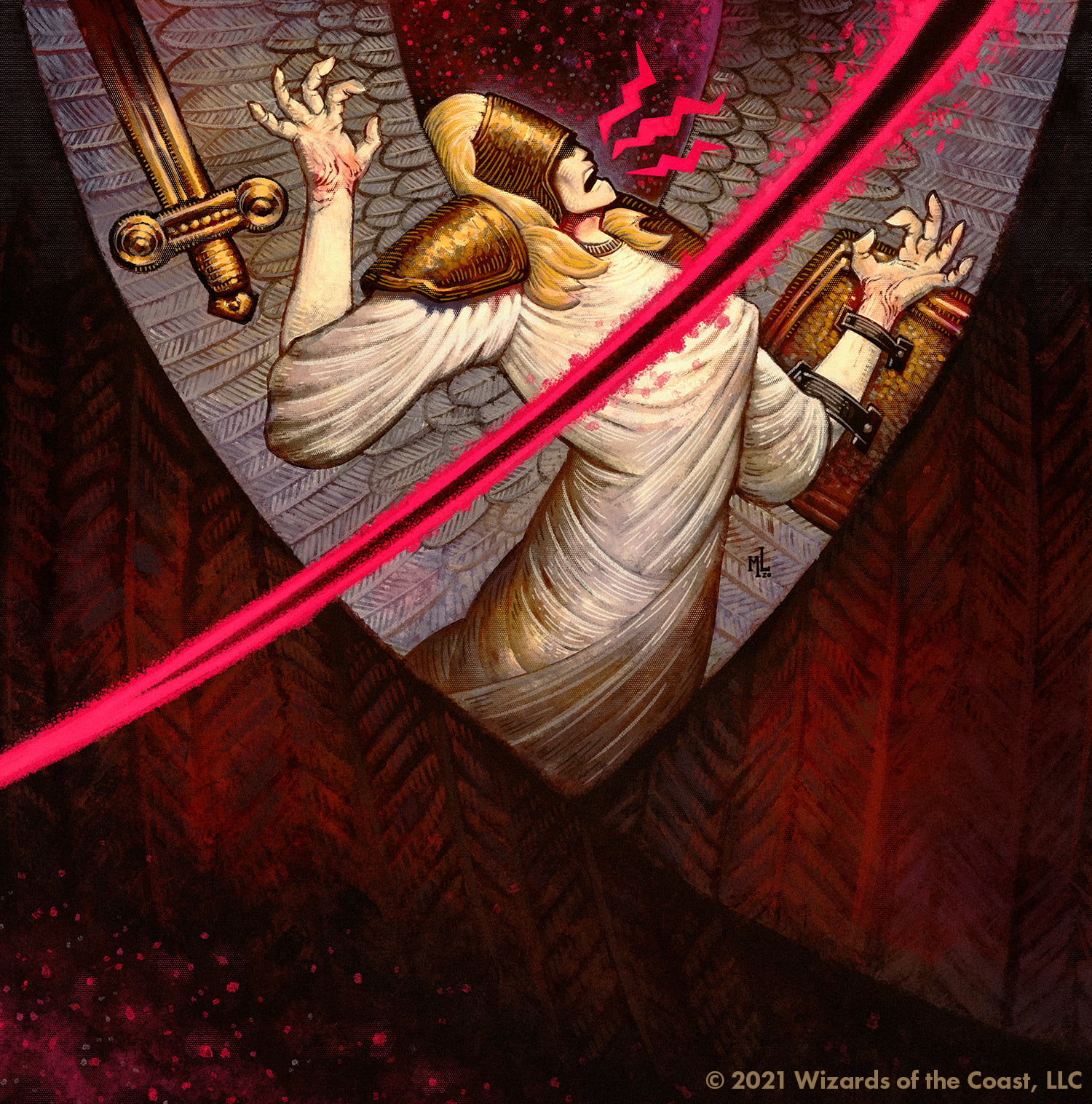
Doom Blade by Matthew G. Lewis. Digital.
An otherworldly blade drawn forth and we know not whether it originated from Heaven or Hell. Those appear to be demon’s wing surrounding our cleaved character; it’s far too late for them now.
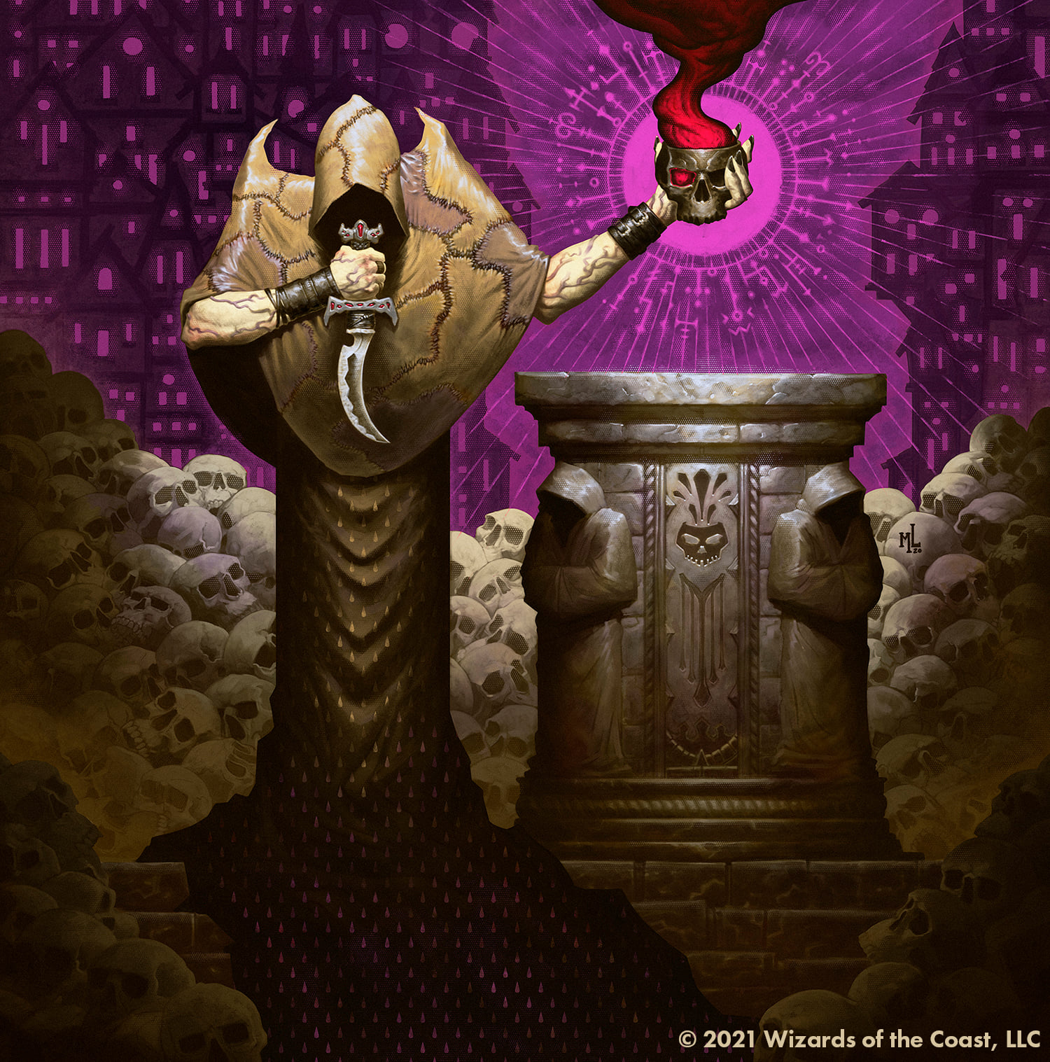
Village Rites by Matthew G. Lewis. Digital.
Pay attention to the lighting that shines from above, on both the figure and the pillar: we’re somewhere deep below the surface, and it makes this scene feel tight, claustrophobic. Don’t miss the background either: this is not the first time this incantation has been spoken
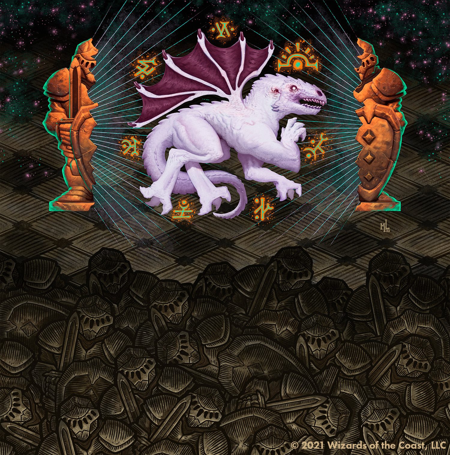
Divine Gambit by Matthew G. Lewis. Digital.
A demon bursts forth from a chessman, as if a prophecy is unfolding before our very eyes across a field of battle. This composition is simple and smart, but still has the complexity needed to tell a story at card size and full size: I want to know even more about what’s going on here, and that’s a narrative victory.
Lewis was both reflective and grateful when asked about his newest venture here in MTG, and you can feel the emotion in his words:
“I’m excited and humbled to be included amongst so much talent on the Magic roster. I grew up with D&D and Magic. So, having my name on a card is a childhood dream realized. And, working with AD Tom Jenkot at WOTC on my Mystical Archive cards was a fantastic welcome to the Magic fold.”
Lewis’s style collates perfectly into the darker side of Magic art, and I don’t think this will be the last time we see him. Check out his website to see more of his work, and again welcome, welcome Matt!
Alexis & Justin Hernandez (Glowing Raptor Studios)

Alexis and Justin Hernandez are an illustrative power couple from California, found online as Glowing Raptor Studio. Together they contributed five cards to the Mystical Archive, and they appear as if pulled right from the pages of a 14th Century volume, as bright and bold and beautiful as the day they would have been first drawn. They’ve done an incredible job of incorporating the legacy of Magic art into these contemporary illustrations, and we’re going to look at their five cards slideshow style to zoom into all the incredible little details they’ve included.
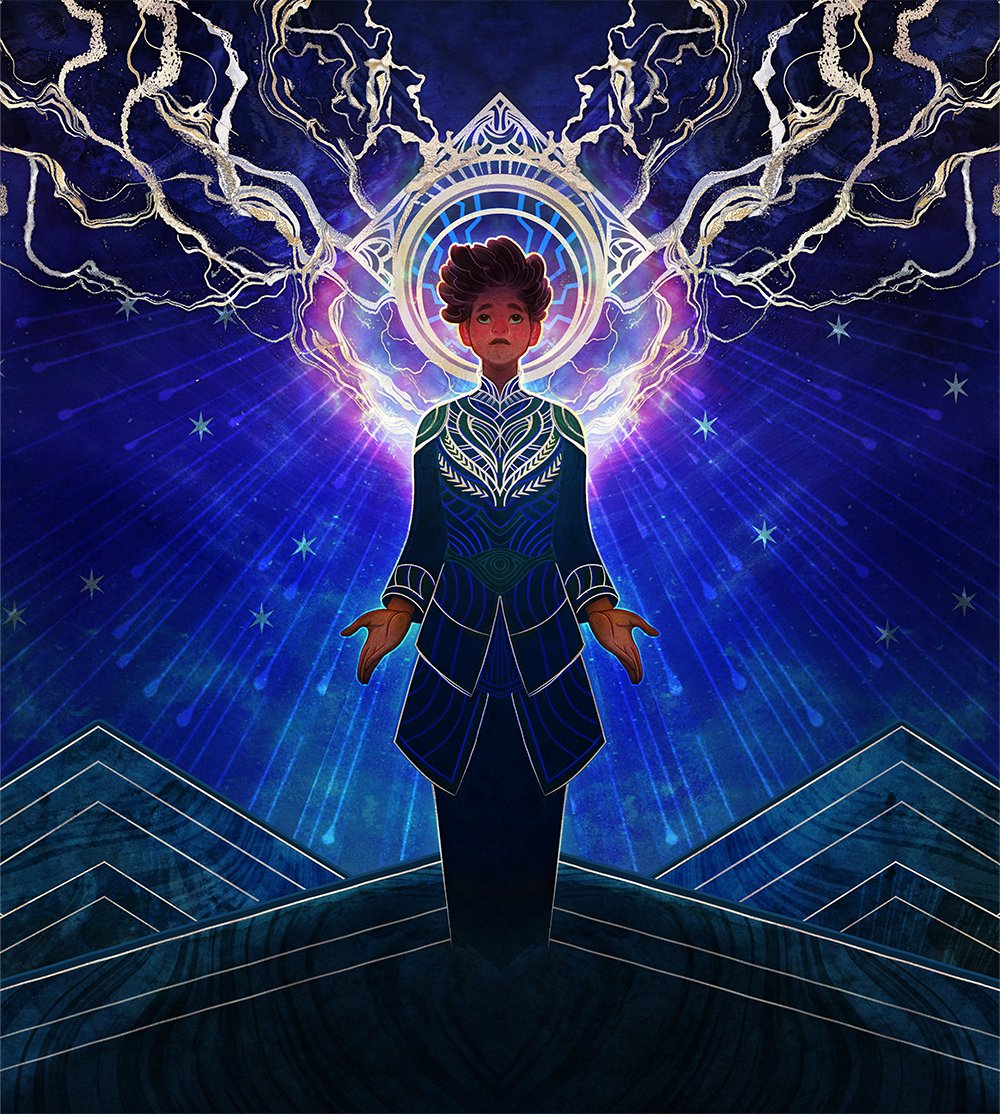
Brainstorm by Alexis & Justin Hernandez. Digital.
I love what they’ve done with the lightning here. It’s reminiscent of the Brainstorm depictions that have come before it, and yet it captures the idea entirely in their own style.
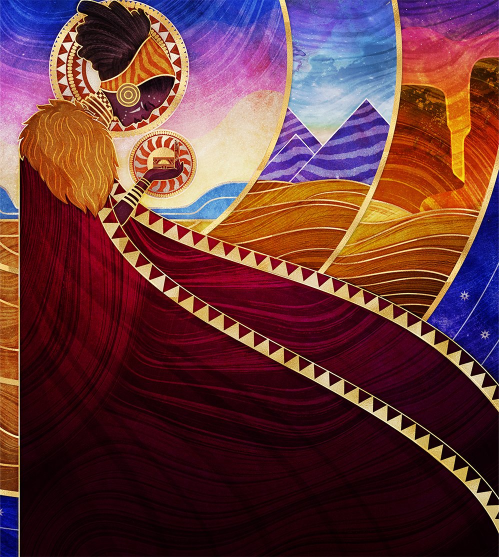
Gift of Estates by Alexis & Justin Hernandez. Digital.
An almost storybook interpretation of the original Foglio art, look at the combination of pastel color and patterns found throughout the piece. Every single area in the painting has had the utmost consideration in making it both a unique element and cohesive to the whole.
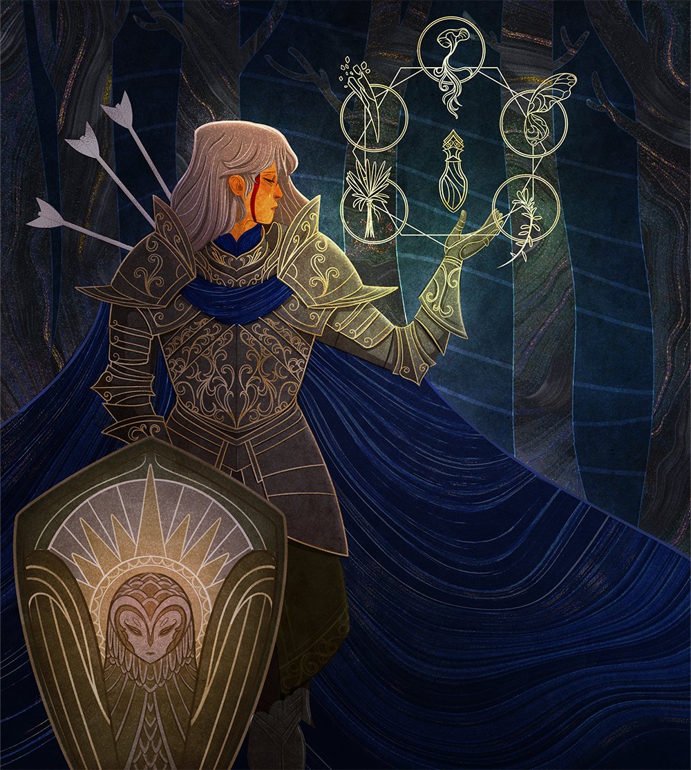
Revitalize by Alexis & Justin Hernandez. Digital.
Just look at the fine details here: on the armor, in the runes, and the face of that brilliant barn owl-faced shield hidden by the text box. I wish we could see that shield on the card!
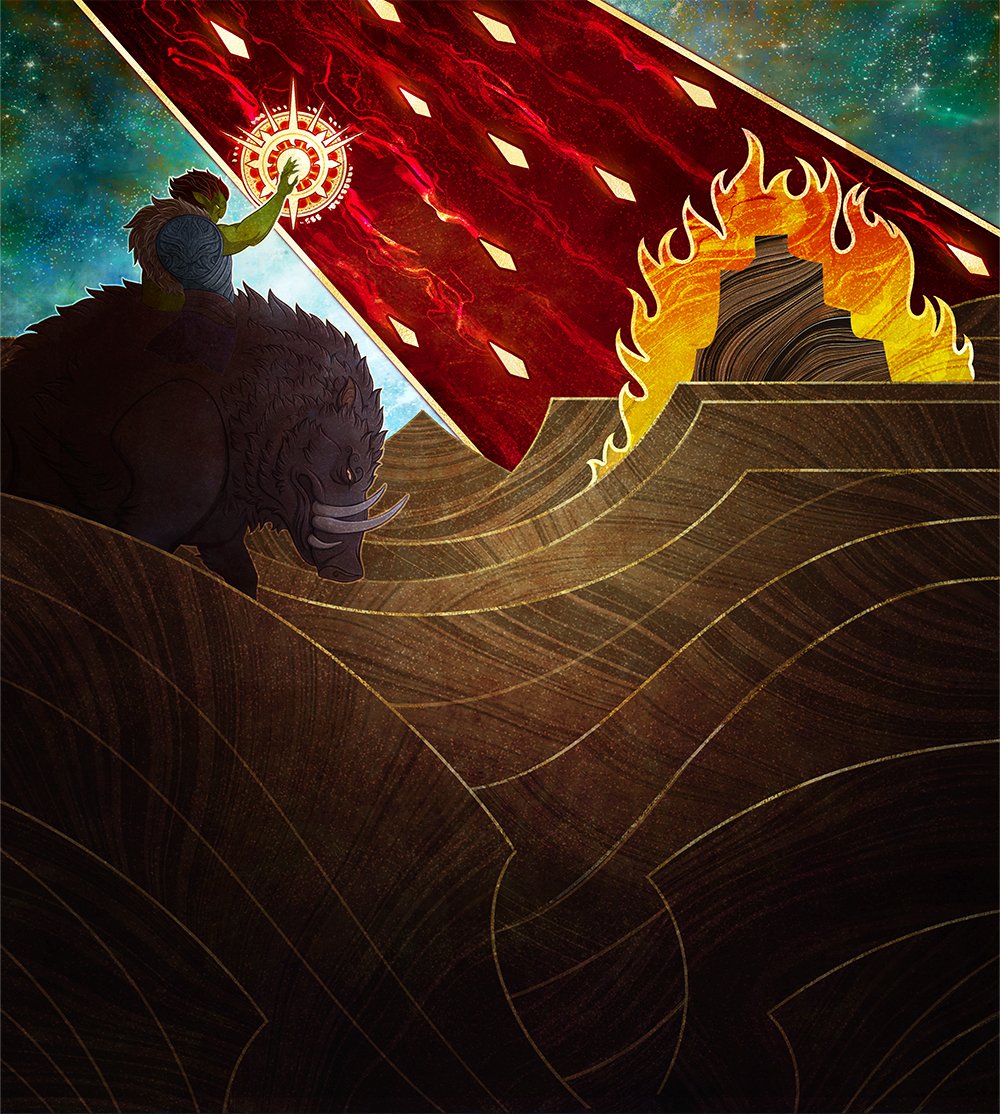
Stone Rain by Alexis & Justin Hernandez. Digital.
This is the story of Stone Rain as it would have been illustrated in narrative fashion, as the orc brings down ruin upon the far away city. This was exactly the point and purpose of the illuminated manuscript, and out of the more than dozen Stone Rain artworks over the years, perhaps the one that tells a story the best.
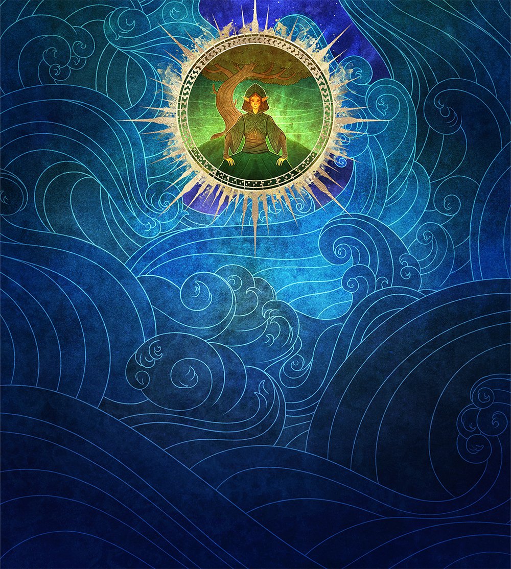
Weather the Storm by Alexis & Justin Hernandez. Digital.
A new take on a fairly new card, this is an artwork you can both feel, as the waves undulate around the elf, and hear, as they crash upon her protective barrier. The full artwork for this is overwhelming, just as it should be, but keeps a sense of serenity at the same time.
Before we move on, I asked them how they felt about this new journey. They said:
“Getting to illustrate for Magic: the Gathering isn’t something we thought would ever happen. We grew up playing the game, but our art differs stylistically from what traditionally tends to go on Magic cards. We’ve been really delighted to see our work so well received by fans, because working on it, and being able to do so together, was a dream job.”
Welcome Alexis & Justin, this is some truly brilliant work. I hope this isn’t the last time we get to see you on MTG.
Benjamin Ee
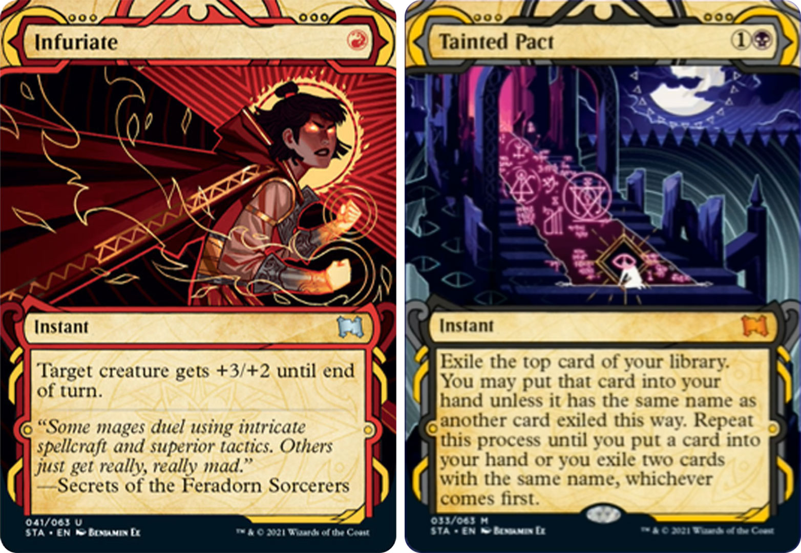
Benjamin Ee is a Melbourne, Australia-based illustrator and art director who has infused some serious storytelling in his two artworks for the Mystical Archive. His two pieces, Infuriate and Tainted Pact, are very different; one a zoomed-out scene of a sad sojourn, and the other a graphical rendering of what could be a contemporary classical portrait.
I asked if he could tell us more about what we’re seeing, and if there was anything we might not see at card size. He gave us the scoop on both works, beginning with Infuriate:
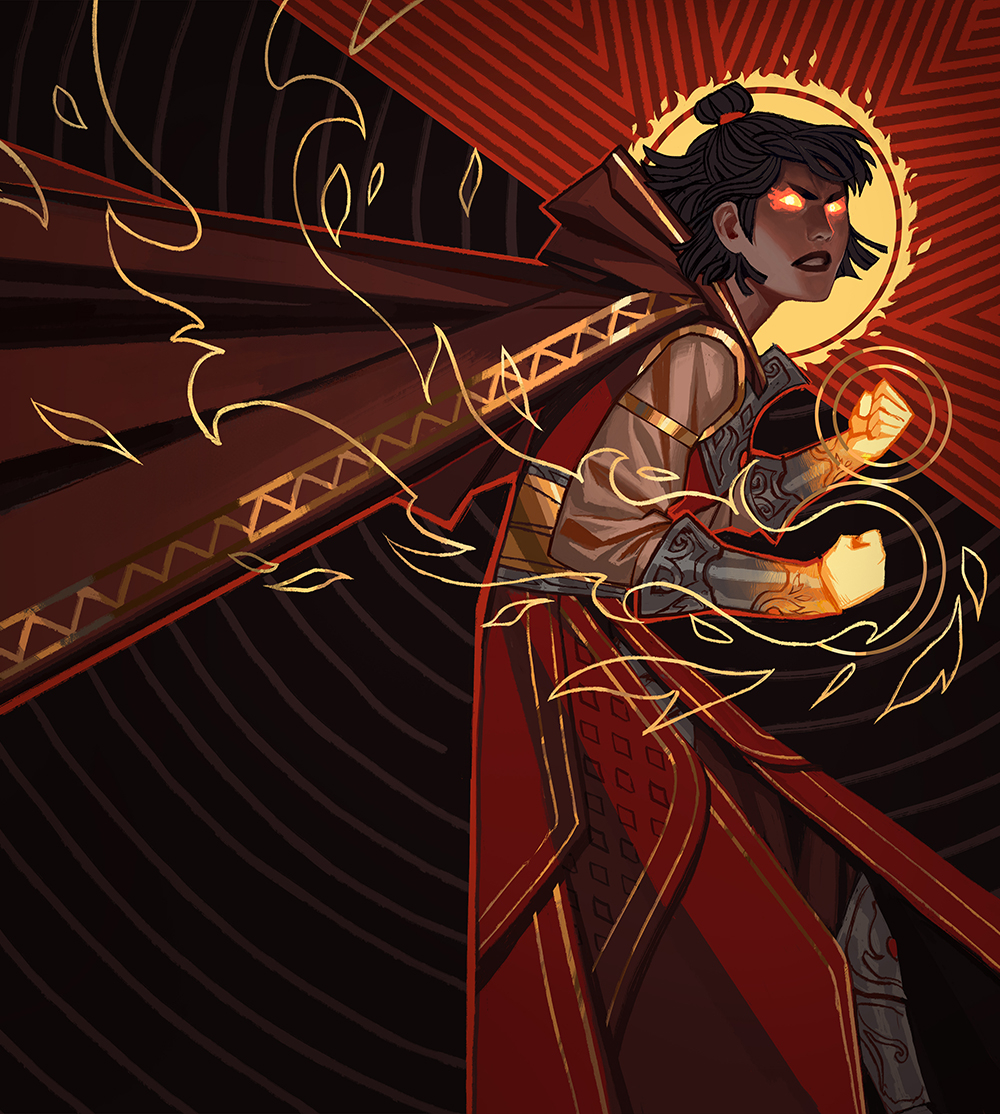
Infuriate by Benjamin Ee. Digital.
“Infuriate has those pale concentric circles that radiate all the way down to the bottom of the illustration. At around her neck level, it “snaps,” and the line becomes fragmented triangles. Obviously this is for the juxta-positioning of calmness to sudden aggression, but also the split point visually denotes the “I’ve had it up to here” feeling! It was important to show that she’s reached a whole new level of anger, enough to invent “fury magic!”
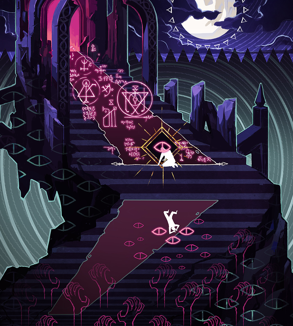
Tainted Pact by Benjamin Ee. Digital.
“Tainted Pact, on the other hand, was purposefully designed so the second half of the story was always hidden by the mechanic text! In this art, the mage is at a low point, and is about to read the demonic scroll from an ominous ruined castle. Hidden beneath the shadows are those little graphic eyes watching him, until his mind breaks enough that he “sees.” The second half, which I thought would be fun for enjoyers to stumble across, shows the mage tortured and driven mad by the eyes/darkness that claw at him! The concentric circles return in this one, but instead of calm, it gives a motion sickness-inducing whirlwind effect, as the poor mage can never make sense of the true world again!”
Ben’s penchant for telling stories in his composition is really something, and you can see more of his work on Artstation. I’m so glad he was able to fully illuminate these two works for us. Welcome to Magic Ben, and we’ll be watching for your next cards sometime soon!
Carly Mazur
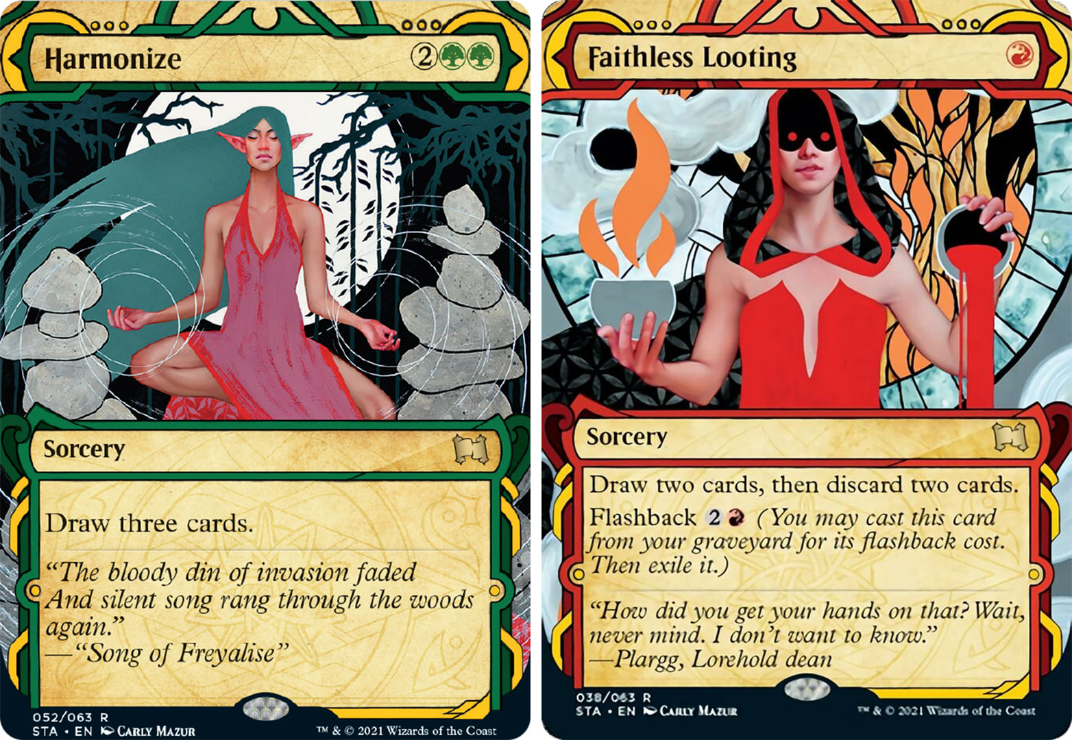
Our last two artworks made quite the buzz when they were previewed, as they are very much a stylistic departure from what we’re used to seeing, even within alternate artworks. The mastermind behind these is Connecticut-based artist Carly Mazur, and her oeuvre is very much what you see below: hyper-realistic rendering juxtaposed against solid color. This what she does, and what she’s brought to the game.
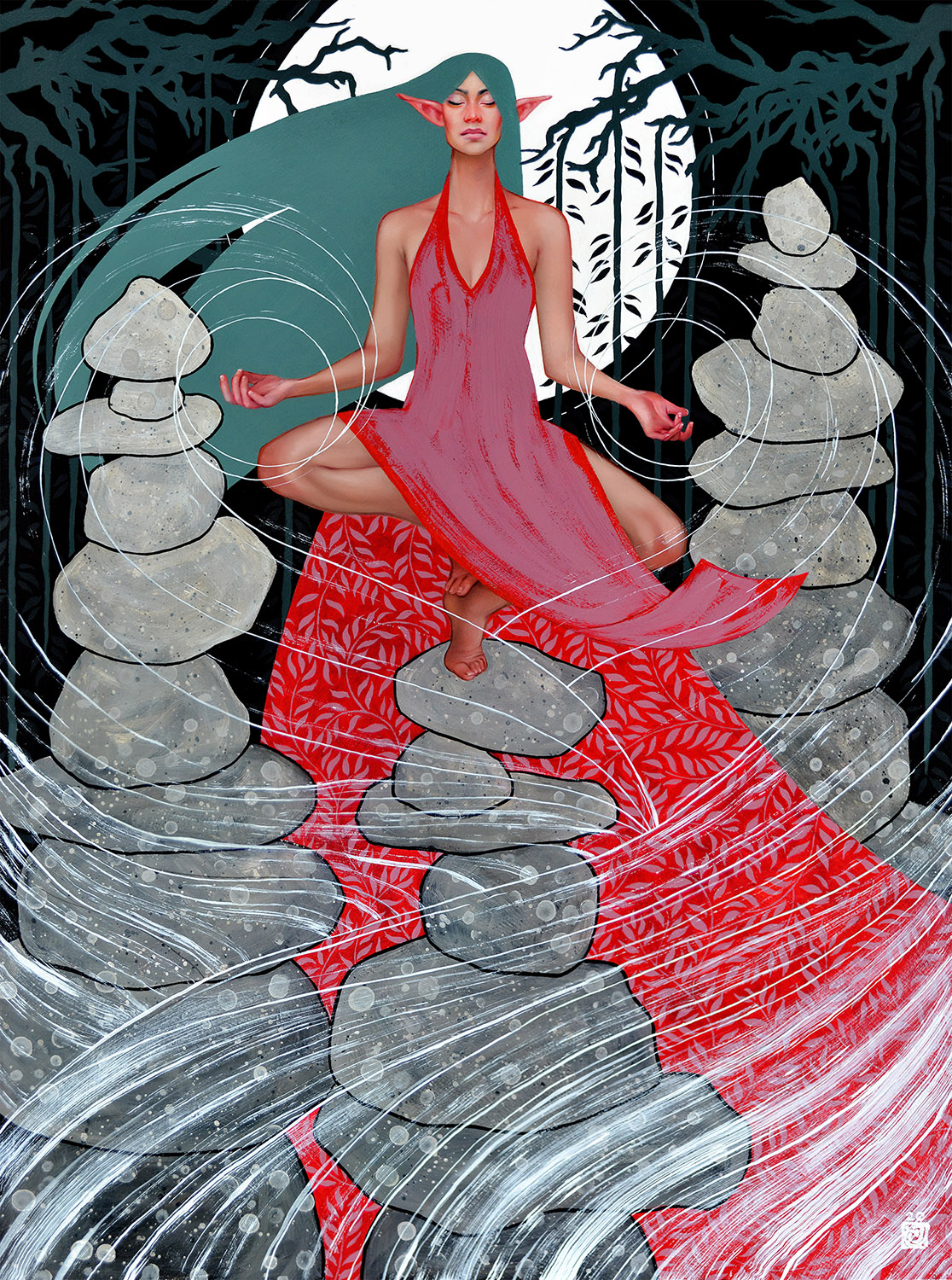
Harmonize by Carly Mazur, oil and acrylic on Masonite, 18” x 24”
Harmonize was the less controversial of her two contributions, as it effectively contemporized the original Harmonize artwork through the artist’s lens and stylistic touch. The full art is fantastic, and I’d love to see this in a borderless frame one day so it can really breathe, and give us the full effect of the meditation we’re seeing in the artwork.
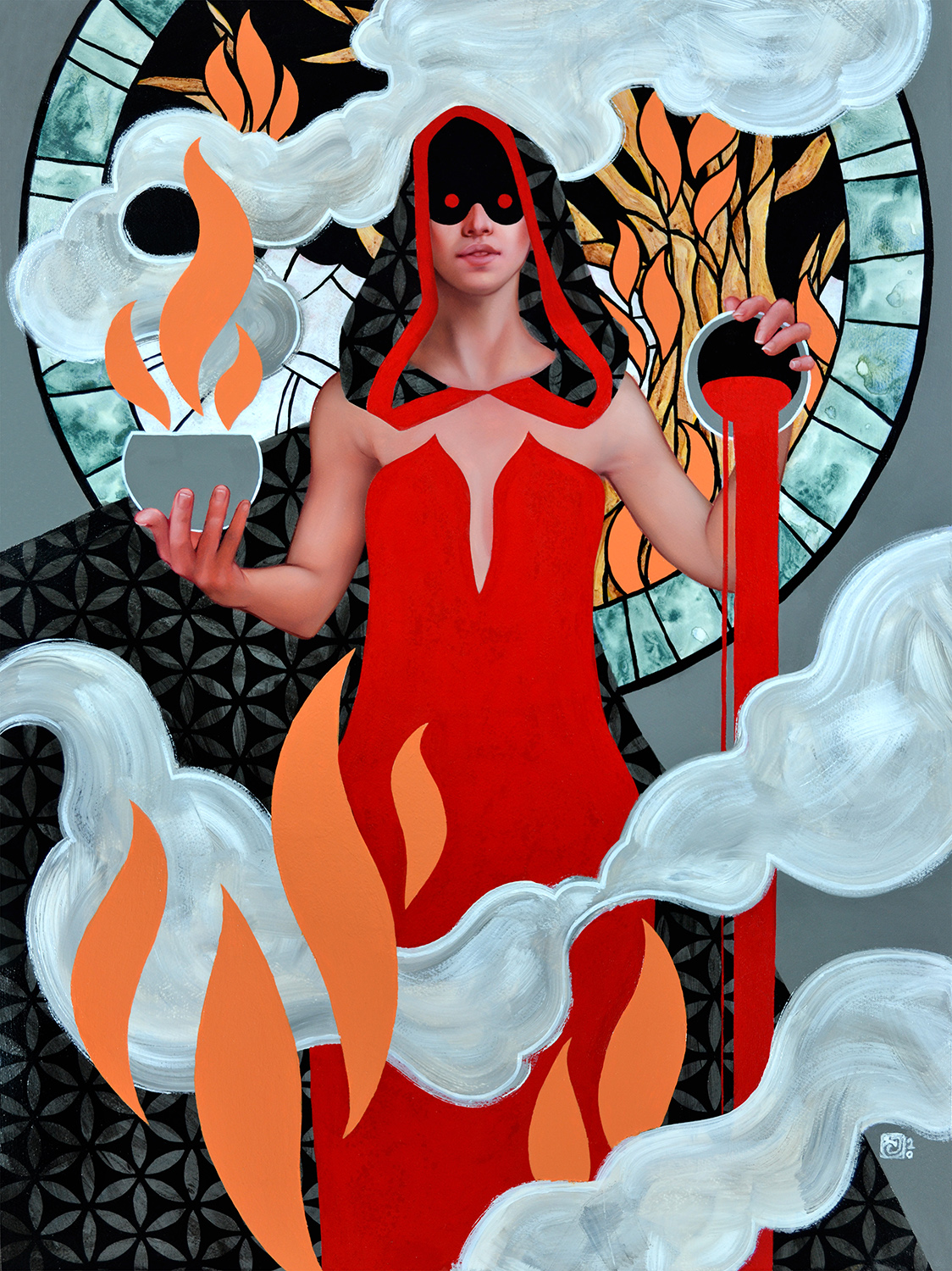
Faithless Looting by Carly Mazur, oil and acrylic on Masonite, 18” x 24”
The second is Faithless Looting, and I’m not going to talk in depth about the specifics of this piece because there has been more than enough discourse over the last few weeks. What I am going to talk about is why it’s important.
The painting is not particularly my taste, and after pouring through her portfolio, there are a lot of other recent works I think came together more cohesively in her juxtaposing style. Comparatively, I think Harmonize is stronger technical painting, and conveys tells a much clearer story; it’s one of my favorites of this whole group. But the addition of Faithless Looting to this set plays a much larger role, and has challenged our stylistic expectations of what can be on a Magic card, myself included.
It’s a pioneering step in creativity, and whether Carly realizes it or not she’s opened the door to a lot of future artists with her two Mystical Archive contributions, regardless of what social media might shout into the void. All these artists have. As she and others in this article have mentioned before, she never thought her art would jump genres onto a Magic card, but here we are, and guess what: it works. And after all that kerfuffle, good and bad, around Faithless Looting, it sure seems like she’s even more focused on creating something groundbreaking. I asked her how she felt about everything that had happened surrounding this release:
“Working for Wizards and having my own artwork on a card has been a dream come true. I always loved the sci-fi/fantasy genre and have been playing tabletop and videogames since I was a kid. However, my art took a different path than the visual norm seen in this market. I never thought I’d be approached by Wizards, but lo and behold Zack Stella asked me at a convention if I would be interested in doing work for Magic and I said ‘Uh, yeah! Of course!’
“When I received the art direction for the Mystical Archive I saw then why they reached out to me. Wizards wanted more stylized artwork for the cards and I was psyched to see my work in that context, and once the spoilers started to drop I simply felt giddy to see the cards I had done as a whole. I had not at all expected the explosive reaction by the community! I truly appreciate all the support amid the criticism. Both motivate me to continue to work, to paint, and improve. This won’t be the last of me you see in Magic!”
Regardless of your feelings on Faithless Looting, it’s going to serve an important purpose for the future of Magic art. Knocking down walls ain’t easy, but she done did it.
Congrats Carly, and welcome to the game. I’ll be watching closely for what she does next.
Wrapping Up
A lot of these artists have said their art wouldn’t normally appear on a Magic card, and they’re right. But Art Directors Tom Jenkot and Zack Stella (and the rest of the crew—it’s always a team effort) have literally changed the game with their inclusions, and opened doors not thought possible even five years ago. With any new direction there will be triumphs met with equal challenges, praise clashed with distaste, and a lot of opinions; many that matter, and some that certainly don’t. But this is the way of creative progress, and I’m excited to see where this path leads for the whole of Magic: the Gathering art.
Remember, to see original #mtgart and other #vorthos related things, follow me on Twitter. Feel free to ask questions or retweet to continue the conversation. Thanks and see you next time!
Donny Caltrider has been playing Magic since 2002 and collecting original Magic art since 2017. He has an M.A. in Museum Studies from Johns Hopkins University and enjoys telling stories about art, objects, and the intersection of fantasy with real-life. You can find him on Twitter talking about #mtgart, museums, and other #vorthos related goodness. Follow along and continue the conversation!

