Last week, I was working at my desk and paused for a moment. Without thinking, I picked up a card off one of the many stacks that clutter my workspace. It just so happened to be one of my all-time favorite tokens. And then I had a realization: art on tokens is often overlooked, and I’m not sure why. Perhaps it’s because it comes at the back of a booster pack, or that it gets tossed away if not needed for a draft. Regardless, it’s time to talk about some incredible art found on tokens. For this article, I’ve joined forces with fellow writer Donny Caltrider, who will bring his picks to you tomorrow.
Today, we’ll examine my favorite pieces of art found on tokens. Whether through composition, color, or just that “stop you in your tracks” feeling, here are ten tokens that I can’t get enough of.
Soldier by Magali Villeneuve
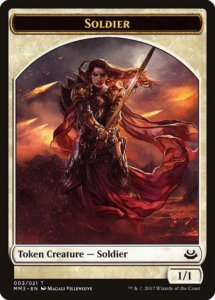
I first saw this art in a pile of draft chaff at my old LGS; it stopped me in my tracks. There’s so much to unravel with this piece, which is one of the reasons why I love it so much.
The soldier looks planted, immovable, and ready for anything thrown their way. The atmosphere around them seems like some kind of cataclysmic event unfolding, akin to the slopes of Tolkien’s Mt. Doom. Is this the end of their story, more merely a chapter along the way? I’m left guessing, because the shield on their back gives me the impression that they’ve made peace with whatever the outcome might be. But I admire the firm grip on their sword, in spite of the circumstances.
The blade draws our eyes up to what looks like the sun breaking through the clouds. It shines beautifully, catching the sword and the outer edges of their armor. Perhaps that’s a sign that there’s more to come in this story, and the fight is only the beginning of something greater. There’s an equal blend of environmental chaos and stoic determination. For those reasons, this token is truly special.
Homunculus by Howard Lyon
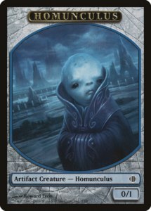
Puppet Conjurer is an innocuous card, tucked away in the memories of Alara Limited. However, I find the token art to be quietly compelling. Some tokens don’t visually align with the card that creates them, but in this case, it really adds to the story being told. For that reason, I don’t think we can fully examine this token without looking at how it relates to the art of the parent card.
It’s no surprise that Howard Lyon is fantastic at portraits. What’s striking here, though, is his ability to paint human-like emotions on a non-human being. The Homunculus draws us in with their somber expression and deep, dark eyes. For not having eyebrows, we can still get the impression that they’re focused on something. But their face is misshapen and uneven; a flaw that might cause the Puppet Conjurer to try again. His creation is both small and childlike, yet appears to carry some form of disproportionate weight on their small shoulders. While they seem defenseless in front of the large Esper backdrop, they also appear at ease with where they are.
Citizen by Michael Phillippi
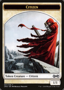
Citizen tokens first came on the scene 26 years ago, with Icatian Town. However, the token arrived years later, through Time Spiral callback Icatian Crier; it got a much-needed reprint in Ultimate Masters. Nevertheless, Michael Phillippi made it worth the wait. I can’t help but be drawn in by how vividly the red cloak stands against the gray, lifeless landscape. While Phillippi could’ve positioned the citizen facing us, this stance does far more. I love how the wind pushes the cloak across the frame, guiding us to look at what the citizen is viewing. Despite their contrast, the citizen looks as ragged and weary as the rocks around them. They have more in common with each other than what we might think.
Cat Warrior by Michael Sutfin
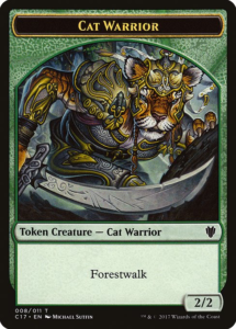
Now that we have borderless tokens, artists face fewer restrictions. Art can be wide and expansive, and tell more than the tokens of yesteryear. And yet, I miss how an artist can use the frame to their advantage. For Michael Sutfin here, the frame and art work wonderfully together. Our eyes can be guided in a circular motion, from the warriors face, down the arm, out to the tip of the scimitar, and back again. Their low posture leads me to think that they’re stalking something through the forest. Though art is soundless, this scene feels nearly silent to me, save a few insects and cracking branches.
Sliver by Tony Szczudlo
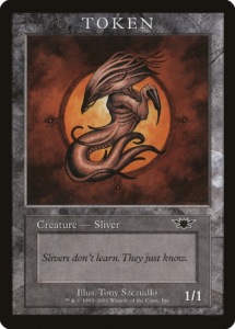
This list wouldn’t be complete without at least one from the Magic Player Rewards program. These tokens have a special place, as the only official tokens to feature the old premodern border.
For being the original alien creature of Magic, this take on a Sliver is a unique one. The way that it’s framed makes this look embryonic, like we’re looking at a newborn grow out of an egg. It lacks the more specialized characteristics of older slivers, suggesting that it’s preparing to grow into its niche. For being a swarm of noodly aliens, Szczudlo makes this look one look innocent, and unassuming. The piece feels intimate and warm, which is a feeling that isn’t normally associated with Slivers. For flipping the script on Slivers, I think this token stands among the better ones out there.
Harpy by Nils Hamm
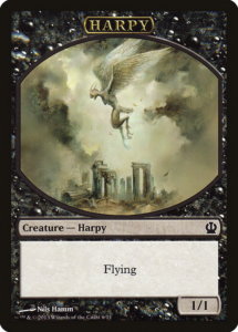
For the Cat Warrior, we saw that creature filled the frame completely. However, with this harpy, there’s a different story being told. Few token arts depict the subject as far away as this, which is why it stands out to me. By zooming out, we get a greater sense of the environment that it lives in. The charred, broken columns give me the impression that few things have lived among these ruins.
Quite frankly, it reminds me of this intro to the original Age of Empires. What’s also striking is just how few colors are used in this piece. It’s almost entirely depicted in Hamm’s use of light, instead of color. While there’s always a balance of green and purple in his work, this piece stands apart from the others, with only a hint of purple. This harpy stands out in a crowd, as well as in Hamm’s other works, so it makes my list.
Goblin by Pete Venters
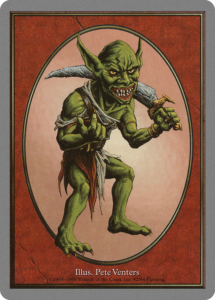
This one may have been heavily influenced by nostalgia, but it’s hard to talk about Goblins without mentioning Pete Venters. Goblin art has fluctuated quite a bit over the years, but this token perfectly depicts a goblin of its time. The simplicity of the Unglued frame lets us focus on the goblin, with their mischievous but confident posture. More Goblin Hero, less Goblin Bowling Team. There’s less of the jagged, sharp teeth depicted these days, which is part of why this smile looks so menacing. Venters is an icon for Goblin art, and I’m glad he was able to get the nod for their first ever token.
Vampire by Cynthia Sheppard
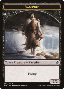
It’s easy to think of vampires with the Gothic lens, like Baron Sengir or Olivia Voldaren. This Tarkir vampire breaks the mold. Granted, you can chalk some of that up to the art direction of Khans block. Nevertheless, what stands out to me here is how Sheppard aligns the skin tone and hair of the vampire with the ice and shadows behind them. They show a visual connection to each other, yet it looks like the vampire is mentally distancing themselves from what just happened. They’ve made a fresh kill, but their gaze and levitating stance makes me think that they’re thinking of the bigger picture.
I’m cold just looking at it. Based on how much of their arms are exposed, it accentuates the cold, lifeless flesh of a vampire. This token is haunting, mesmerizing, and I love it.
Survivor by Johannes Vos
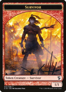
If there’s one adjective I could use to describe this token, it’s cinematic. Whatever this movie is selling, I’m buying. The survivor is charred but determined, the embodiment of defiance. Despite the inferno behind them, they’re not done fighting. Perhaps it was a Shivan Dragon who attacked their village, or a band of Balduvian Barbarians. Either way, there’s going to be hell to pay.
From a stylistic standpoint, I love how the background is much brighter than the subject. I find that it accentuates the survivor’s emotions. They know their village is destroyed; they can feel the heat behind them, but they’ve come to terms. It appears that they’ve wiped soot from their eyes; because of this, Voss pulls us in to notice their facial expression. This easily makes it the center of the piece. For being nearly all on fire, to have the main focus still be a facial expression exemplifies a job well done.
Spirit by Jeremy Enecio
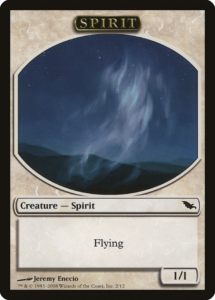
This is one of the most unconventional illustrations for any token. But I absolutely love what Jeremy Enecio did here. When we think of spirits in Magic, we generally think of human-like apparitions, floating through walls or carrying lanterns. This spirit depicts more of an idea than an actual being.
When we lose someone, we’re reminded of them in little, understated ways. Though they’re gone, it’s how we end carrying their spirit inside of us. We might see them in the way that leaves are carried by the wind, or in the sound of waves crashing on the shore. To me, this art does not depict a ghost. Rather, the viewer sees a loved one in the way that moonlight catches the clouds. That’s the human experience: riding the highs and lows of love and loss.
It’s hard to imagine a card game taking us on such an emotional trip—but here we are.
Looking Forward
Each year, we’re getting more new art for tokens, and that’s quite exciting. With the new borderless ones, they’re giving artists even more space to work with. I’m excited to see what pieces come forward in this new era for the medium. Tokens may be simple game pieces, but they do their fair share of world building, far more than putting some dice on the table. They deserve more than a passing glance, on the way to the trash with the booster pack wrapper. So take a look for yourself, you might like what you find.
Travis is a Virginia-based player and writer, who has been turning things sideways since Starter 1999. He primarily plays Commander, Pauper, and Legacy, and has a passion for introducing new players to the game. When he isn’t making people pay the Thalia tax, he can be found mountain biking or playing the guitar. You can follow his exploits here on Twitter and Instagram.

