Good morning everyone, and welcome to the Mirror Gallery here on Hipsters of the Coast. Today (as my title alludes) we’ll be looking at two artworks, but you’ve most likely only seen one of them before. Two weekends ago was Magic’s Eternal Weekend, which was held on Magic Online this year due to COVID-19. Legacy and Vintage were the formats of the day(s) with three events each. Part of what makes Eternal Weekend so special is that the winner of each event takes home an oversized Magic card, but not just any Grand Prix Prize Wall trophy—an oversized card with an actual painting framed as the artwork. You can see all the past cards and paintings given as prizes here.
This year one of these paintings was a new version Mishra’s Workshop painted by Drew Baker, and that work is our point of departure for today:
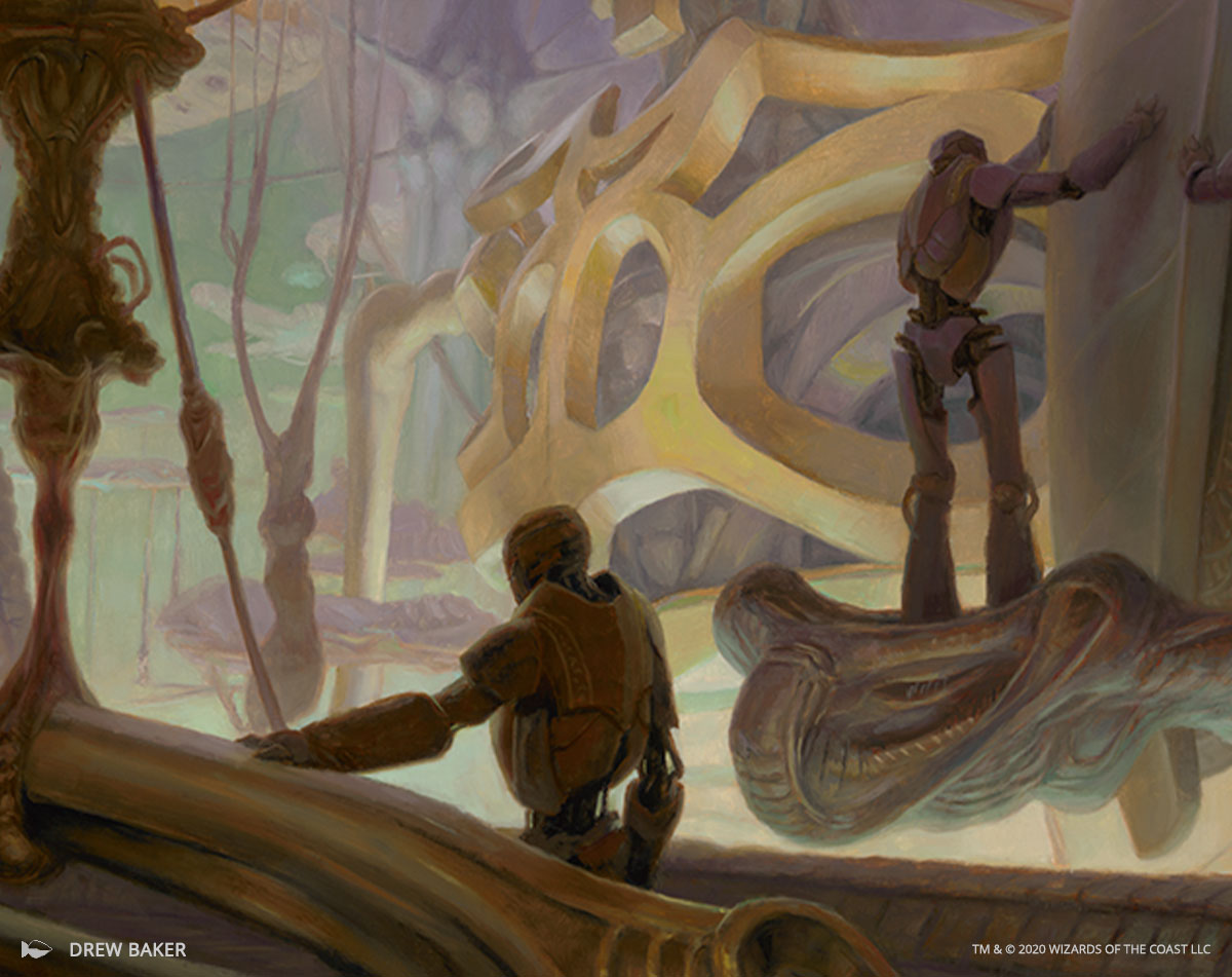
Mishra’s Workshop by Drew Baker, oil on panel, 13” x 18”
Baker has illustrated 18 cards for Magic, and among them are some of the most important reimagining’s in modern Magic, including Library of Alexandria, Karakas, and Reliquary Tower.
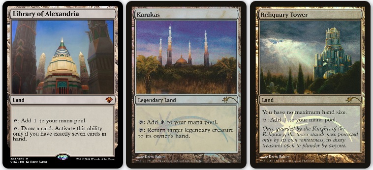
I know Drew from IX, the annual Imaginative Realism convention in Reading, PA. Last year between midnight hotel room painting deliveries and a handful of Doubletree Chocolate Chip cookies, I got to learn a ton about him as an artist. When he posted the full artwork upon Workshop’s reveal, within the Facebook comments he also posted this image, with the caption:
“There’s a story behind these. I’m not sure the best way to tell it yet.”
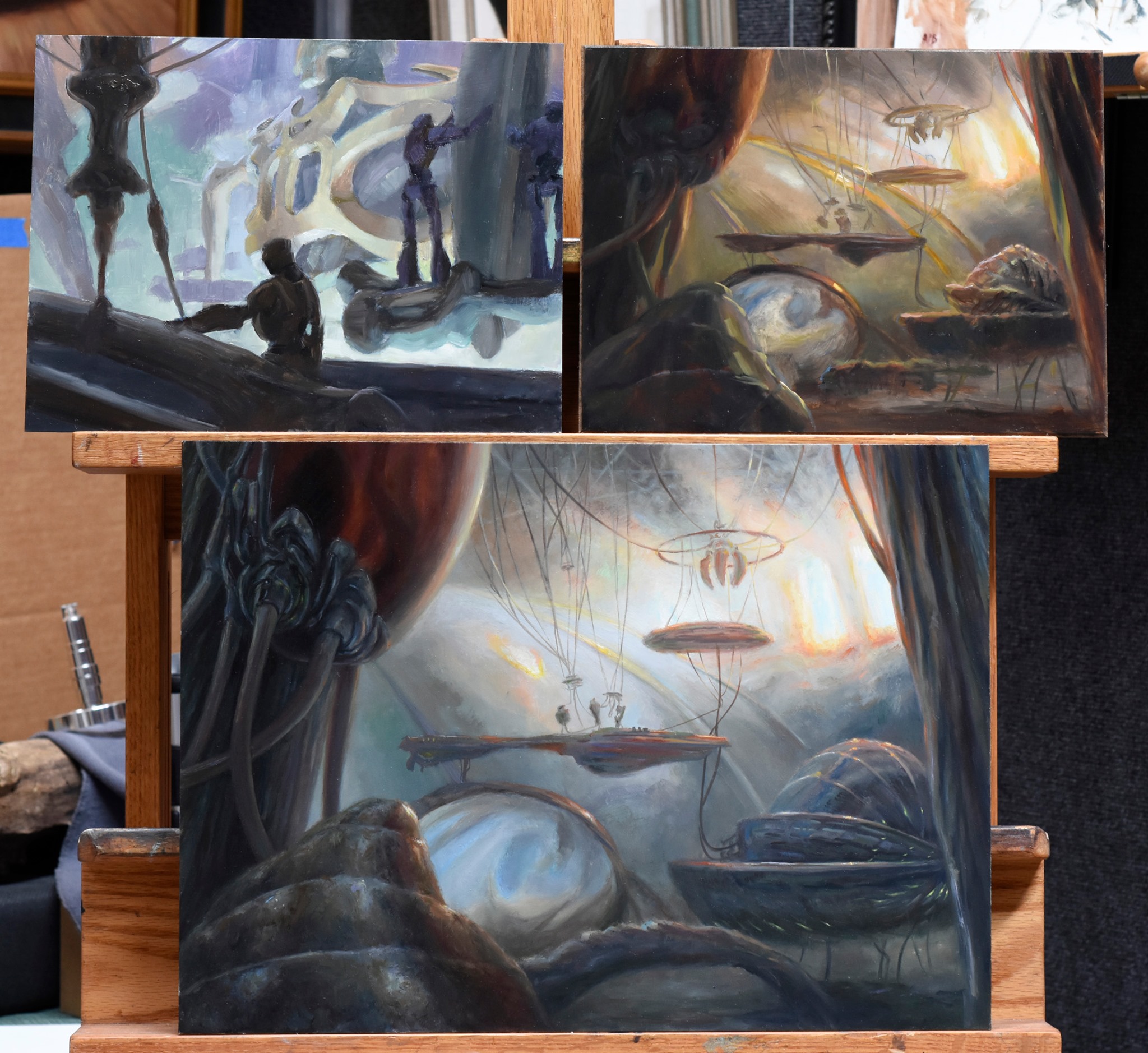
I immediately reached out, because as you all well know that’s exactly what I like to do here: tell the untold stories of Magic art. I asked Drew to give me the snapshot version first. He said:
“When I was asked to paint Mishra’s Workshop I thought about going two ways with it—either a literal workshop with automatons at their tasks, or a looser interpretation more inspired by (JMW) Turner, playing with atmosphere and steam. Both had merits and interesting, challenging bits, so it was a tough call to make. Long story short, I ended up doing both and Wizards took their pick.”
Well folks, I’m pleased to bring you the long story. This is A Tale of Two Workshops.
Hi Drew! I think you’ve got quite the story for us today. Hit us with a quick introduction of who you are, where you’re from, and what you do, and then give us some background on this commission:
Thanks very much, Donny! I grew up in the farmlands of western New York State, and ended up settling back there. I started doing freelance art for hobby games fresh out of art school, back when sketches were faxed in and scanners were rare. I got a lot of on the job training as I recovered from art school, particularly doing card art for Jim Pinto at AEG. Through the years I’ve done art for book covers, D&D, Star Wars, Magic, and so on. Essentially, I’ve gotten to do art for all the things I thought were cool when I was young.
I don’t take many commissions these days, but when Art Director Dawn Murin asked me to paint Mishra’s Workshop, it was too good to pass up. How to do it, of course, was another question!
So it seems you started with dueling ideas from the get go—is that right? Can you take us through it?
To say it was “from the get go” may be a bit generous to me. I was at least 120 thumbnails in when I hit the idea—but it was the first one that got me excited.
But before we get too far, let me set the stage a bit. To aspiring illustrators: I am not someone to emulate, I am a cautionary tale. I share my mistakes in stories like this so you can make different ones.
I’m not always the easiest illustrator to work with. I like doing new things, and don’t like to take the obvious solution or path. That can be a problem on some projects because art directors seldom like surprises. So that means there’s an additional cost to them, personally, to bring me on a project. It’s already hard enough to shepherd something through production without adding the complication of “what’s Drew going to throw at me?” But evidently Dawn and the team were willing to indulge me on this one. Don’t get me wrong, I strive to be conscientious, polite, and to meet the project’s needs—but that trouble-making inquisitive streak is still there.
So that’s what I was doing with those first 120+ thumbnails: looking at solutions. Pushing through early ideas and hunting for surprises. Let’s say it was thumbnail 118 when I started going a new direction. In 123 I saw it was interesting. In 125 I got that “Aha!” I was looking for. I tried a couple more with pencil in my sketchbook after that, but saw pretty quickly I’d need paint to explore it. So I did some watercolor sketches…
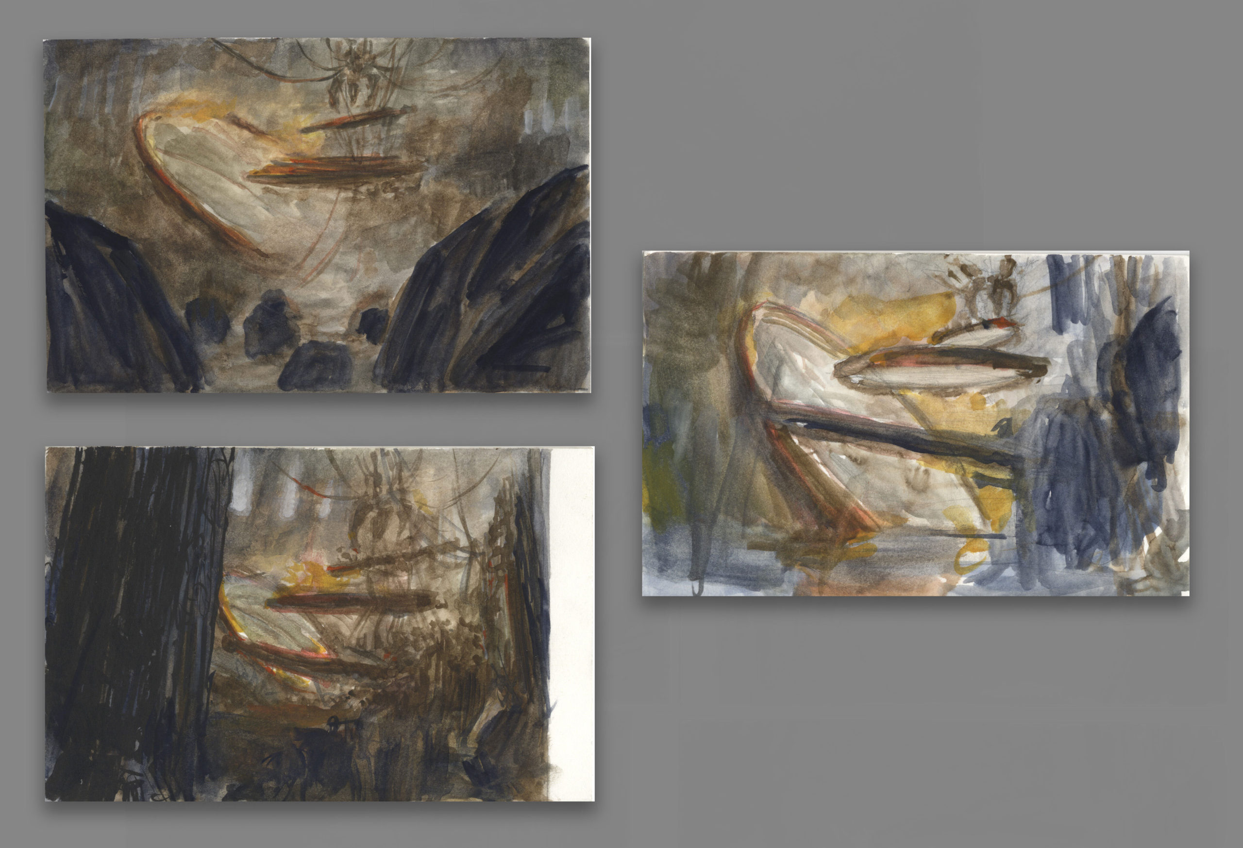
Mishra’s Workshop (alternate sketches), watercolor, 4” x 6”
And a 9 inch x 12 inch oil sketch to really figure out where I was going with that idea.
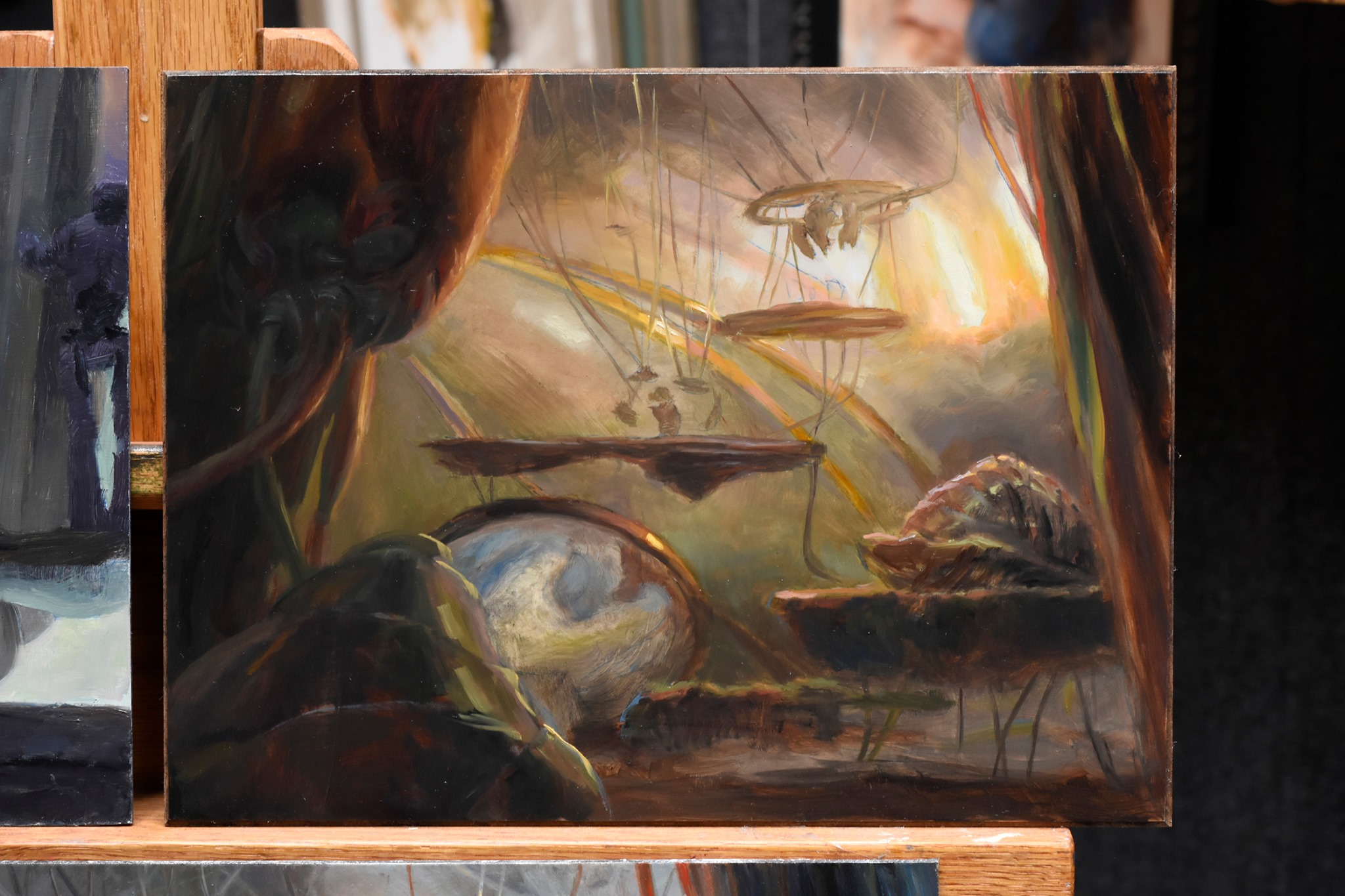
Mishra’s Workshop (Alternate Color Study), oil on panel, 9” x 12”
So what was I thinking? I knew this was an Eternal Weekend prize, and an old card. I thought folks who still play the old cards could be looking for a bit more stylistic variety (and maybe I’d seen styles loosen up a bit in some recent releases?). And, most importantly, the final goal of this project was the original painting, not a printed reproduction. The painting. That object.
That was exciting.
I thought an ominous, ambiguous scene of industry inspired by JMW Turner’s paintings—filled with smoke, steam, and light—would be a perfect way to take advantage of all the opportunities of the project. I had a folder of Turners to reference, but I think these two were most applicable. If you ever want to feel inadequate, put some of your work up next to a Turner. That guy.
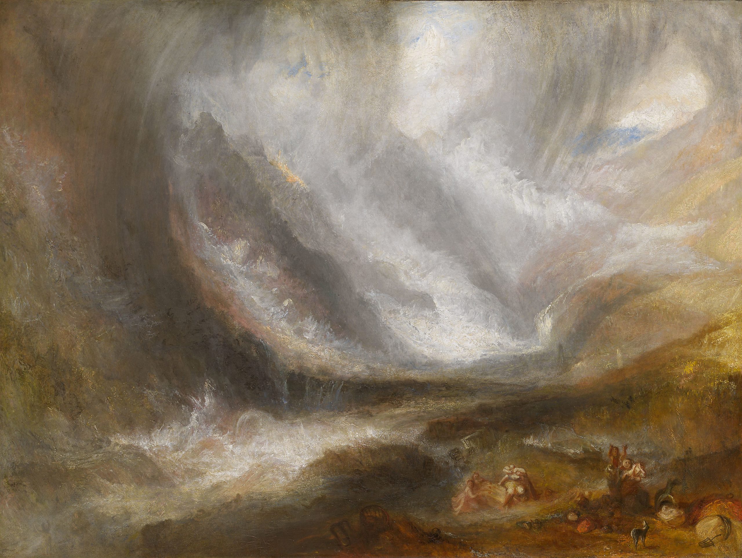
Valley of Aosta: Snowstorm, Avalanche, and Thunderstorm (1836-1837) by JMW Turner, oil on canvas, 36.25 x 48,” Frederick T. Haskell Collection, 1947.513, Chicago Institute of Art
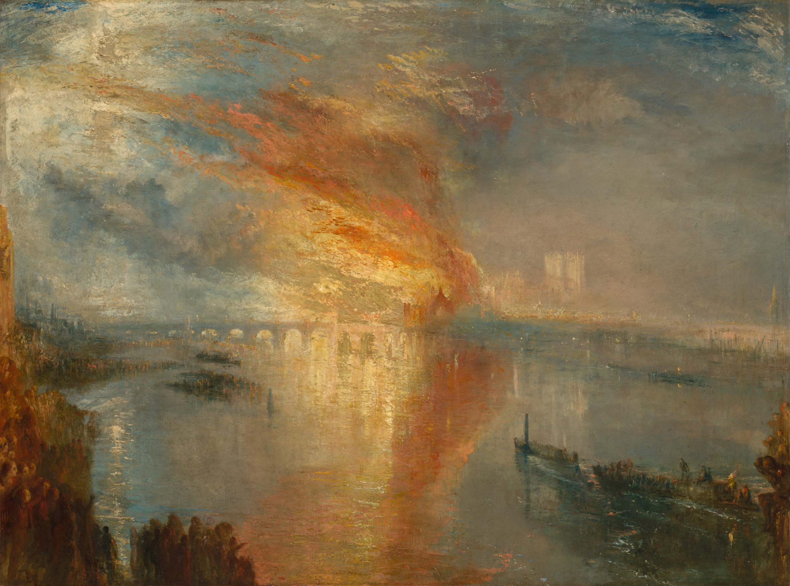
The Buning of the Houses of Parliament, or The Burning of the Houses of Lords and Commons, 16 October 1834 (1835) by JMW Turner, oil on canvas, 36.25” x 48.5” unframed, Bequest of John L. Severance 1942.647, Cleveland Museum of Art
Turner is maybe my favorite artist from before the 20th Century, so this is particularly exciting. But I can’t imagine a Turner-esque style painting an easy task. How’d you tackle it?
I’ve been doing a lot of more fine art painting over the years and this was a chance to show more of those skills off, as they aren’t always suited to reproduction. So I applied paint all kinds of ways—direct, scumble, glaze, painting into a couche (a thin layer you can paint into while wet)—whatever was necessary to get the effect I was looking for. I used broken color and hue and value contrasts around the window shapes to keep the viewer’s eyes unsettled, to make the viewer actually feel the glare. I used Stack Process Lead White to build up some of the highlights because it handles differently than typical modern paints, and would give those areas a unique texture.
I’ve worked hard developing my painting skills, and this was a chance to show off a bit. I should mention early on I’d wanted to do it on copper. I’ve done that before, and it can add another element to the piece with light reflecting and changing off the metal. I abandoned that when I decided I couldn’t plan for which areas I would need to keep clean. Looking back, that was probably a mistake. Oh well.
You really threw everything but the kitchen sink at this one. Then what?
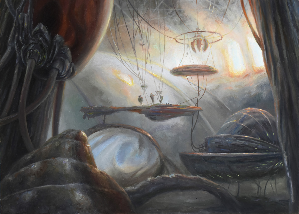
Mishra’s Workshop (Alternate), oil on panel, 13” x 18”
After I sent a photo in we tried finessing a few things, but it was clear pretty quickly the painting wasn’t the direction they were looking for on this project. I’d known I was risking that, haring off into the metaphorical weeds like that, and I’ve been at this long enough that I know it isn’t personal. Luckily, there was enough time (and patience from Dawn and the team) for me to have another go.
So back to square one, or no? You mentioned you had an idea of the other direction—where did work on the final, published version start?
Dawn gave me some more specific directions and reference material, I dug around for some more on my own, and it was back to thumbnails! I sent in a new sketch, got notes, sent in another, and we went ahead with it.
I sent in a new sketch, got notes, sent in another, and we went ahead with it.
This was really quite the journey. What are some challenges and triumphs artistically that came from that second painting?
I mentioned doing more fine art sort of painting earlier—still lifes, landscapes, figures and portraits from the model, that sort of thing, right? There are aspects of painting like that that are so much easier than making a complex Imaginative Realism piece. So to try and prove I still belonged making paintings for Magic, amongst some of the most skilled artists working today, the final painting is deliberately complicated: challenging views of automatons, layers of space, atmospheric perspective, colored lighting, colored surfaces—all to prove I could do it.
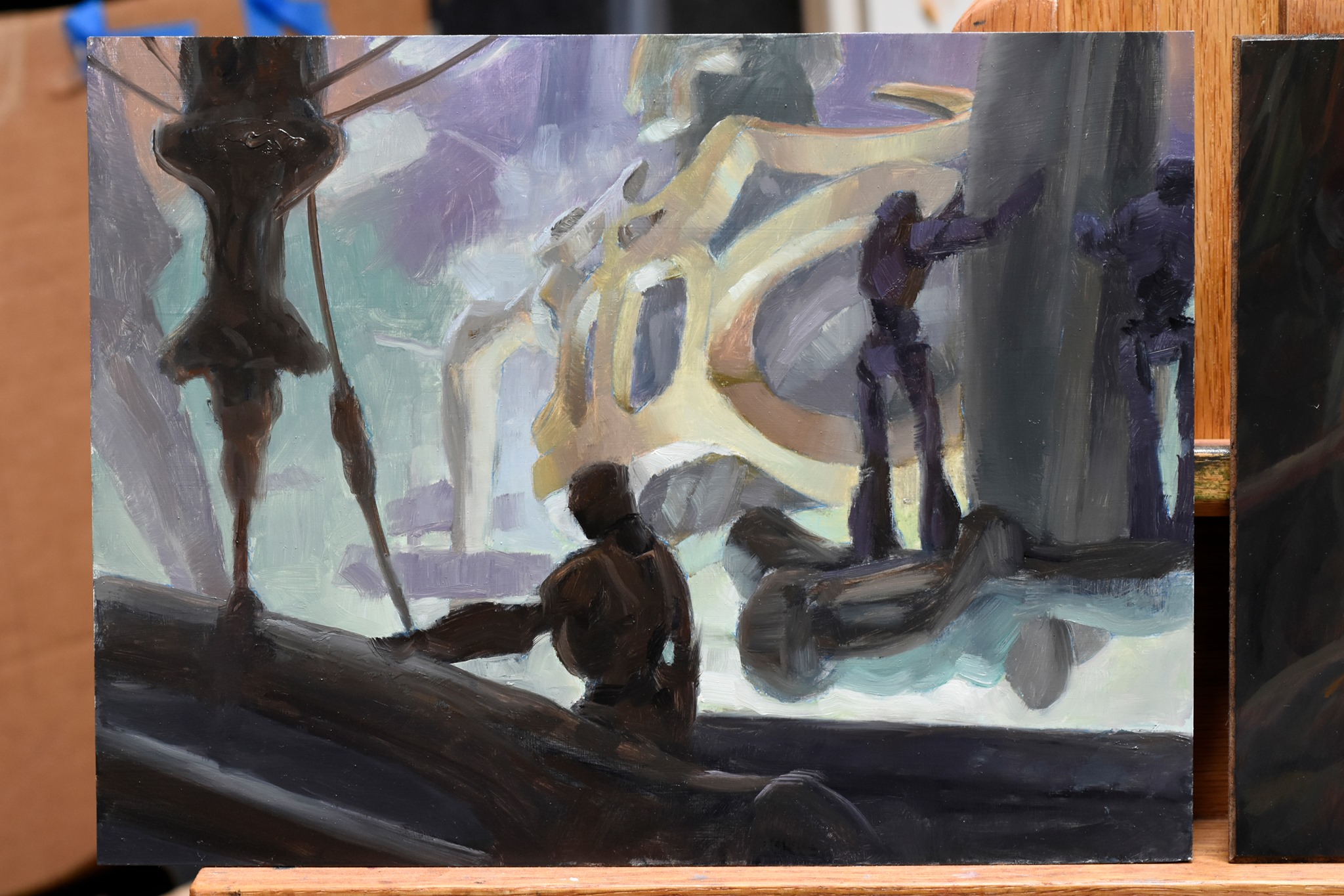
Mishra’s Workshop (Color Study), oil on panel, 9” x 12”
It’s less flamboyant than the first painting, but to make it all read correctly was a real exercise in controlling color and value across the whole painting. I had something to prove, and I think I pulled it off.
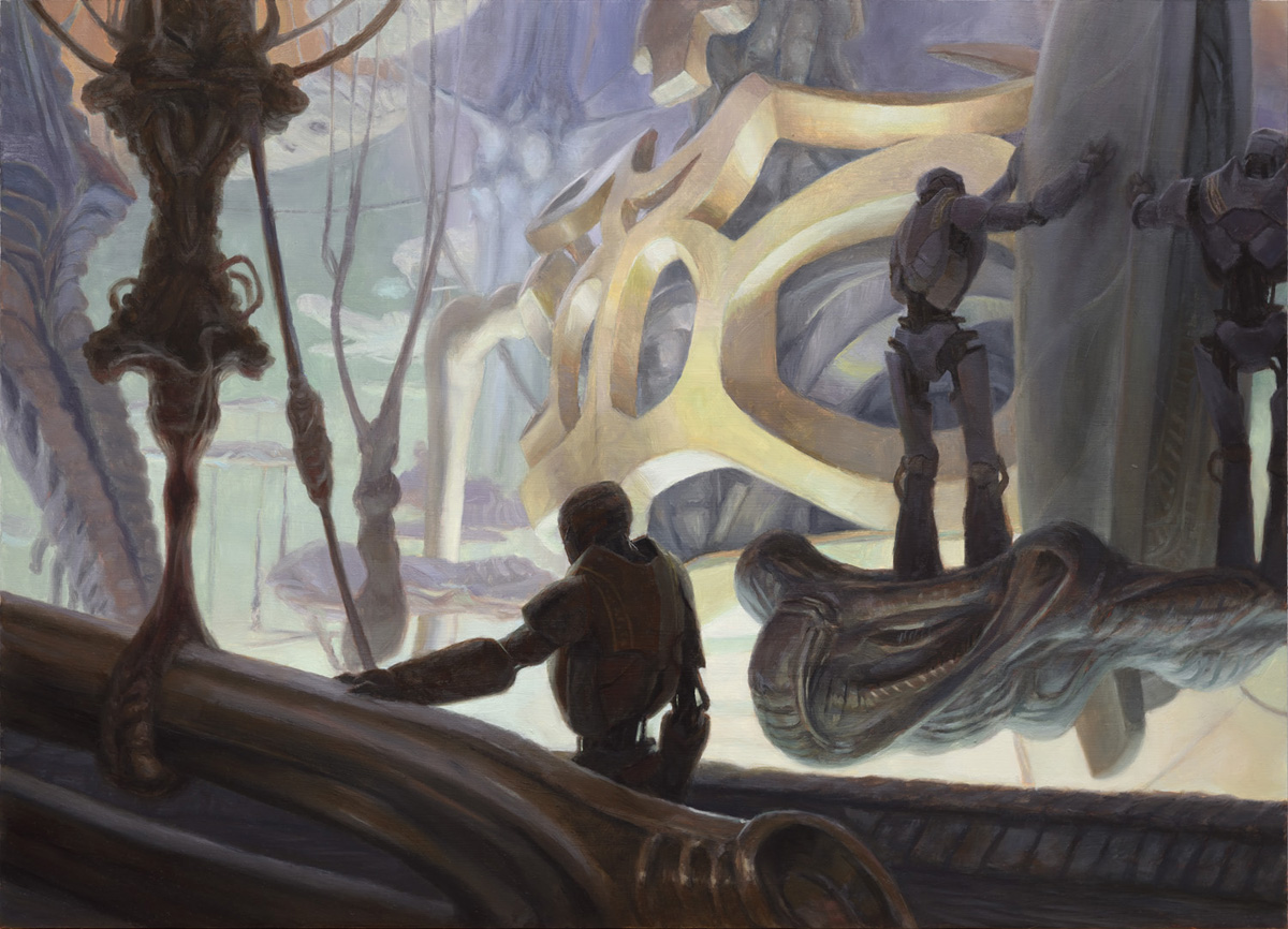
Mishra’s Workshop by Drew Baker, oil on panel, 13” x 18”
I’d agree. They’re both stunning in their own right, and I don’t think anyone knows how much you’ve put into this commission. Truly incredible stuff.
Before we go, what did it feel like to illustrate such an important card in Magic’s history, and one that would be used as an actual prize?
Oh, man. So, so much pressure! Exciting, to be sure, but so much pressure. This isn’t a scrub common that can slip under the waves and be forgotten. Everyone around the game is going to see—and judge—this one. If I made a mess of it, how could I live that down?
But it’s also a throwback to my time as a player in the early days of Magic. The local group was casual, focusing on multi-player games—if Commander had been around that would have been our format. I don’t think I ever owned a Workshop myself, but Argivian Archaeologist, Ashnod’s Transmogrant, and Tawnos’s Coffin were prominent in my decks, so I was in the right era.
And, like when I painted Library of Alexandria for MTGO a few years back, there’s a bit of heartbreak that I won’t get a printed copy.
This is certainly one that will be remembered. You nailed it.
Thanks so much Drew, it’s been a privilege to hear about this newest rendition of Mishra’s Workshop. Two paintings diverged for this commission, and we got to travel the roads of both. What a treat.
It’s been a pleasure, Donny!
Wrapping Up
I want to thank Drew again for taking the time to tell us this wonderful Tale of Two Workshops. This is perhaps the most artistically technical interview I’ve had in the Mirror Gallery, and a brilliant illumination of the both the artistic process and the utter care an artist puts into a painting, just because they can.
I certainly understand the direction this commission had to take for the project at hand, but I do personally hope we get to see a future commission head Drew’s way where he can go “full Turner” on a printed card. As I mentioned earlier, Turner is perhaps my favorite artist of all time, and to watch a master hand like Drew’s further flesh out some of these ideas, gleaned from one of the greatest artists in the history of the world, would simply be sublime on a Magic card. I could have easily written another 1,000 words on Turner, his contributions, and Baker’s work intersects, but that must be left to a future article.
And so ends our story. These works have all found their way to new homes: the final painting is with (or headed to) the Eternal Weekend event winner, and the alternate final, along with all other associated components (save for one) have found their way into another anonymous private collection. The one that was separated is a beautiful alternate sketch on toned paper I didn’t show above, and was purchased by a New York City collector whose collection is affectionately known as Bots and Baubles.
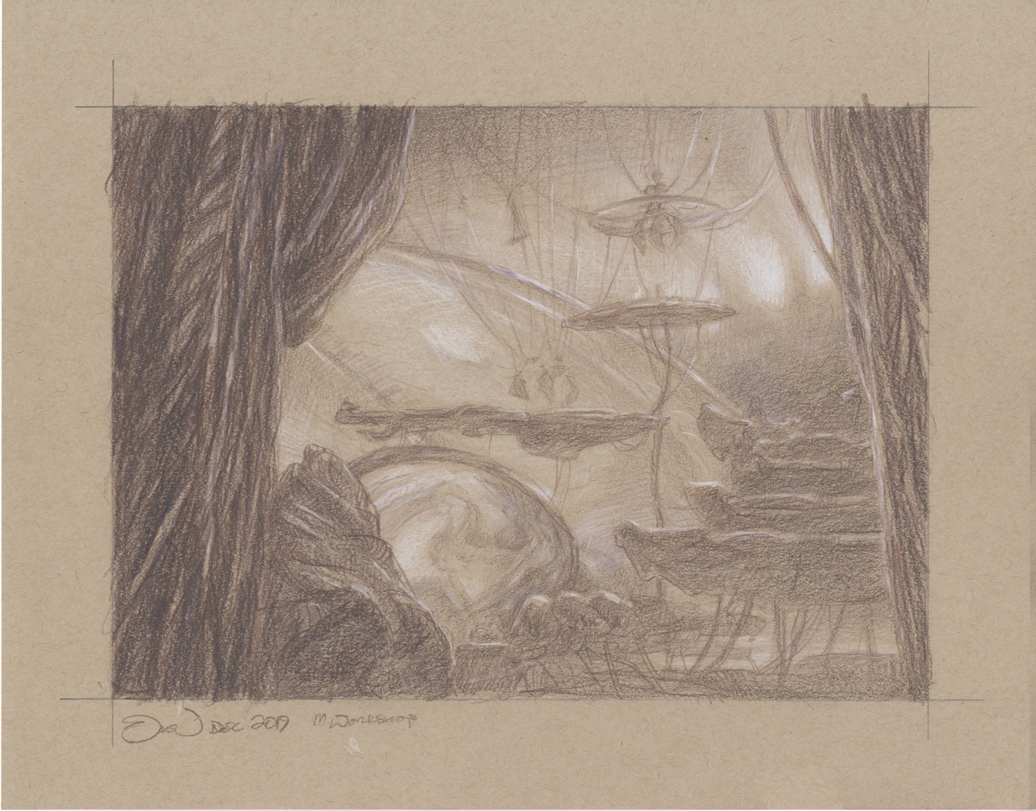
Mishra’s Workshop (alternate, sketch) by Drew Baker, graphite and white chalk on toned paper, 11” x 14”
Perhaps one day this entire suite could be reunited in a Magic Art Show. Wouldn’t that be wonderful? As always, thanks for reading, stay safe, be excellent to each other, and we’ll talk again real soon.
Donny Caltrider has been playing Magic since 2002 and collecting original Magic art since 2017. He has an M.A. in Museum Studies from Johns Hopkins University and enjoys telling stories about art, objects, and the intersection of fantasy with real-life. You can find him on Twitter talking about #mtgart, museums, and other #vorthos related goodness. Follow along and continue the conversation!

