Donny Caltrider and I have been teaming up to cover basic land art from time to time. The art of basic lands is an underappreciated part of Magic, especially in formats like Commander where they get pushed aside by flashy nob-basics. I was guilty of this myself until I stumbled across the Better Basic series by James Arnold on CoolStuffInc. While I had always been a fan of the art of Magic, for the first decade of playing the game I only ever thought about the game’s art in terms of how reprints could be a gateway to different interpretations of the same idea and be an extension of my deck’s aesthetic.
As time has gone on, I’ve started each deck construction by finding the one piece of art I think fits best for each basic land. I use that one piece whenever possible to help cement the visual themes of my deck. I’ve held myself to no restrictions compiling today’s list, and sought to capture the lands that set the best moods.
Mountains are an old love of mine, as someone who started in Onslaught and was lured into playing Goblins. While it was very common in the early years of Magic for the basic lands of each type to blend together year after year, I’ve been impressed with the basic Mountain since my early days with the game. Additionally, Mountains are often very majestic. All of this made deciding on favorites a daunting task, but off we go.
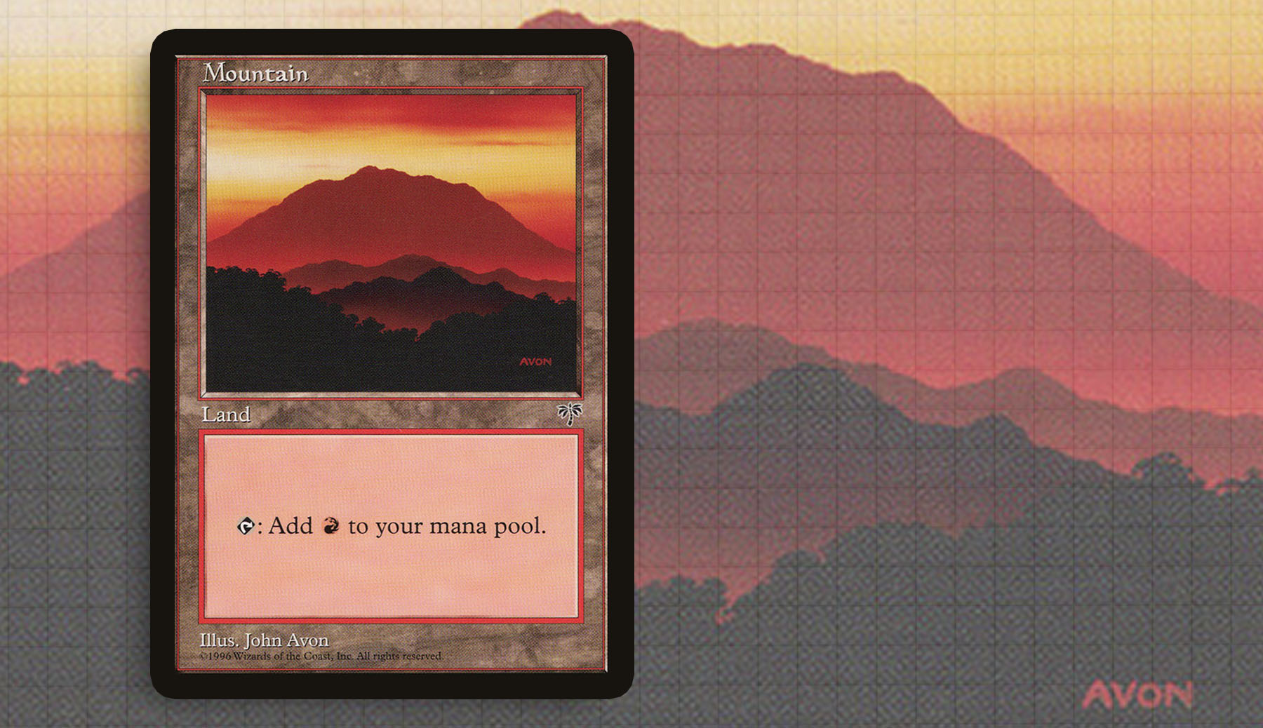
Mirage—John Avon
Every Magic player will at one point know John Avon’s name. To be honest, I don’t remember the first John Avon piece I saw—he was such an ever-present known quantity, that you learned the five colors of mana and his name. I discovered the Mirage Mountain years into playing the game, when I wanted to make an old frame Commander deck and sifted through boxes at the card shop to fill out my lands.
Unlike any of the other lands I will talk about today, John didn’t paint mountains in a literal sense, instead depicting the shape and idea of them. While the terrain in the foreground is black, so much of the piece is red and orange, creating an atmosphere. It’s powerful, calming, and beautiful. All things that should be remembered when you’re playing the color not just embodying rage and anger, but also passion.
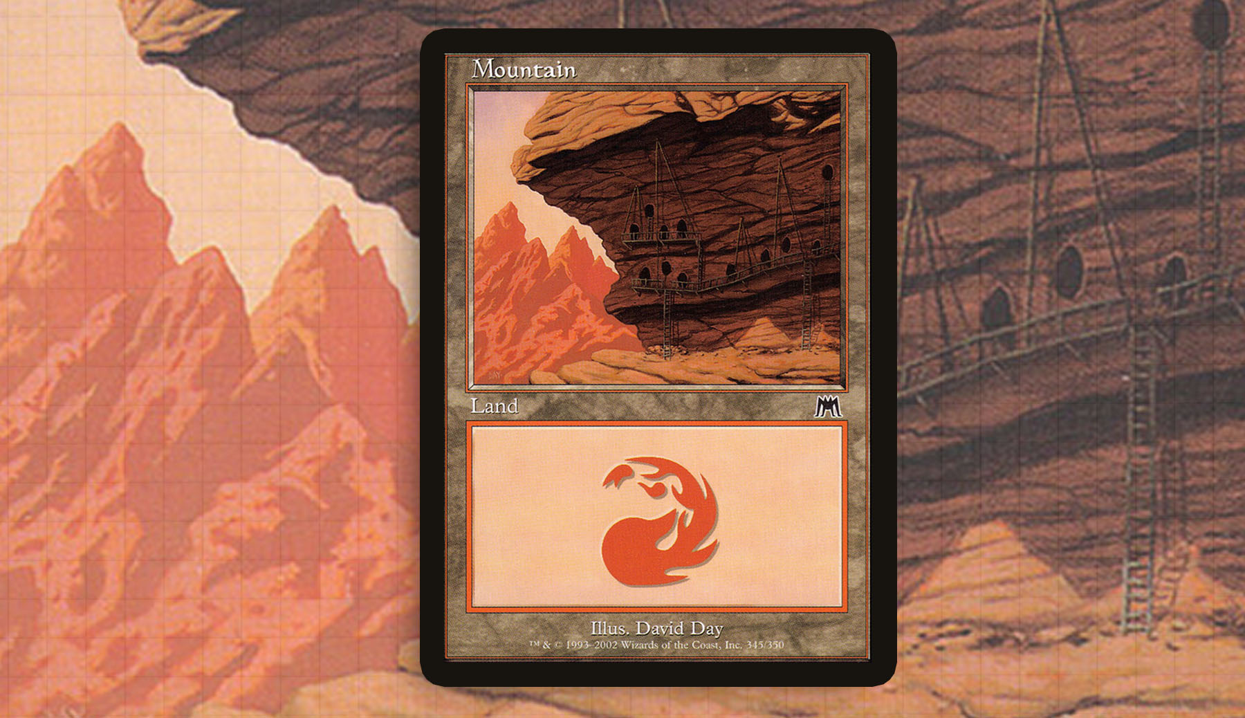
Onslaught—David Day
The Onslaught Mountain by David Day was always so iconic for me and I think in hindsight, it was teaching me about art before I really had the words to describe it. Like the last piece struck me for how the shape and idea of mountains were depicted, this did something with depth of field in connection to level of details.
People tend to draw things with everything in the picture having the same amount of detail, no matter how far away it might be from the metaphorical “lens.” Something that gets learned by lifelong artists, even subconsciously, is the idea that things lose focus the further away they are. That’s here in this piece, even for something that will be viewed at a height of an inch and half. All the details of a goblin civilization burrowed into the cliff face fell away to the shape and idea of Otarian cliffs in the distance. It’s a very simple piece, but it’s stuck with all these years.
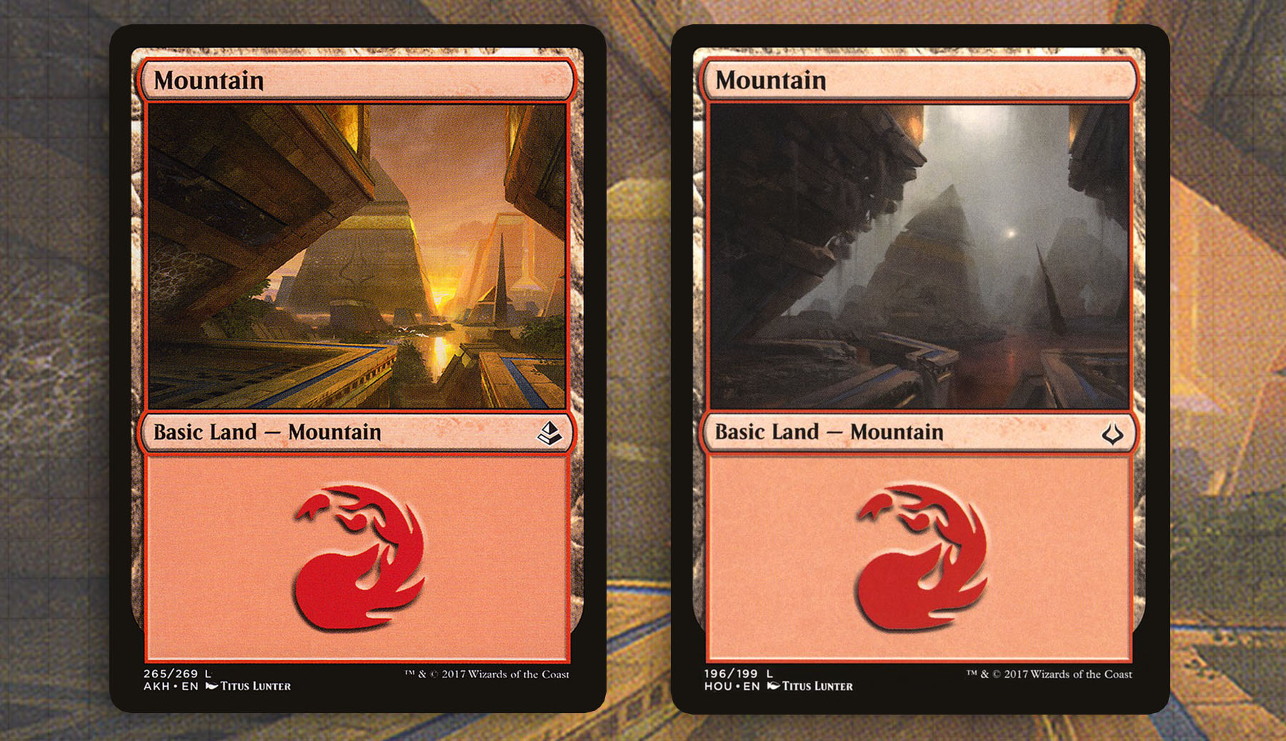
Amonkhet—Titus Lunter
One of the rewarding parts of returning to a plane is seeing how the world has changed since we last saw it. Occasionally, Wizards offers us the chance to see this environmental shift during the same visit. I think my favorite glimpses will always be the changed landscapes of Tarkir as Sarkhan messed with the history of the plane. Amonkhet’s shift, on the other hand, was extremely powerful, because the audience was aware that these changes were occurring within a matter of days.
Nowhere is this better seen than on Titus Lunter’s two Mountains in Amonkhet and Hour of Devastation. In the first, we see Amonkhet’s main city of Naktamun as this beautiful oasis. The bright sunset lighting up the sky and the clean lines help to sell just how much of a paradise the citizens of the plane believe they occupy. That, of course, is all ripped away as Nicol Bolas returns to the plane and kicks off the last stage of his plan before we see him again in War of the Spark. The sky is filled with smoke and the buildings are crumbling. It’s this doom and gloom that has made the Hour of Devastation version the ideal art for generals such as Greven, Predator Captain or Xantcha, Sleeper Agent. Titus did a supreme job here.
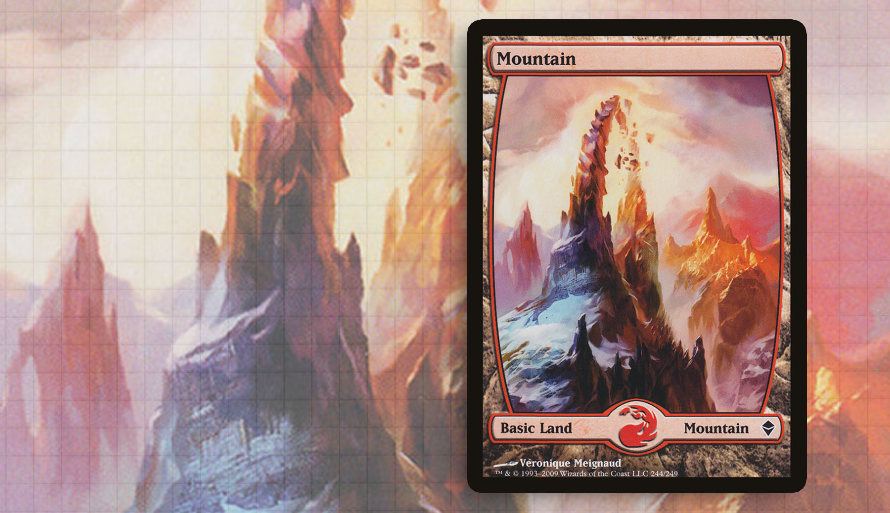
Zendikar—Veronique Meignaud
The original Zendikar was a hallmark set, with the full art lands as one of the set’s early selling points. I think the verticality of these lands are a wonderful change of pace, which always sets them apart from other lands as I’m making these lists. And for as much as Wizards keeps pushing the “full art” boundaries, this is the right frame for my tastes.
The Mountain done by Véronique Meignaud is what I think of when I think mountains on Zendikar. I’m often surprised when it doesn’t get brought up with the same passion that the “bowl Island” so often does. It might come from being a fan of the Stargate TV series, but the imagery on this land is top notch. The snow brings me back to Kamigawa, especially when I’ve built around Godo, Bandit Warlord or Kumano, Master Yamabushi. And for me, the landscape bleeds into the frame and makes the entire piece of cardboard art.
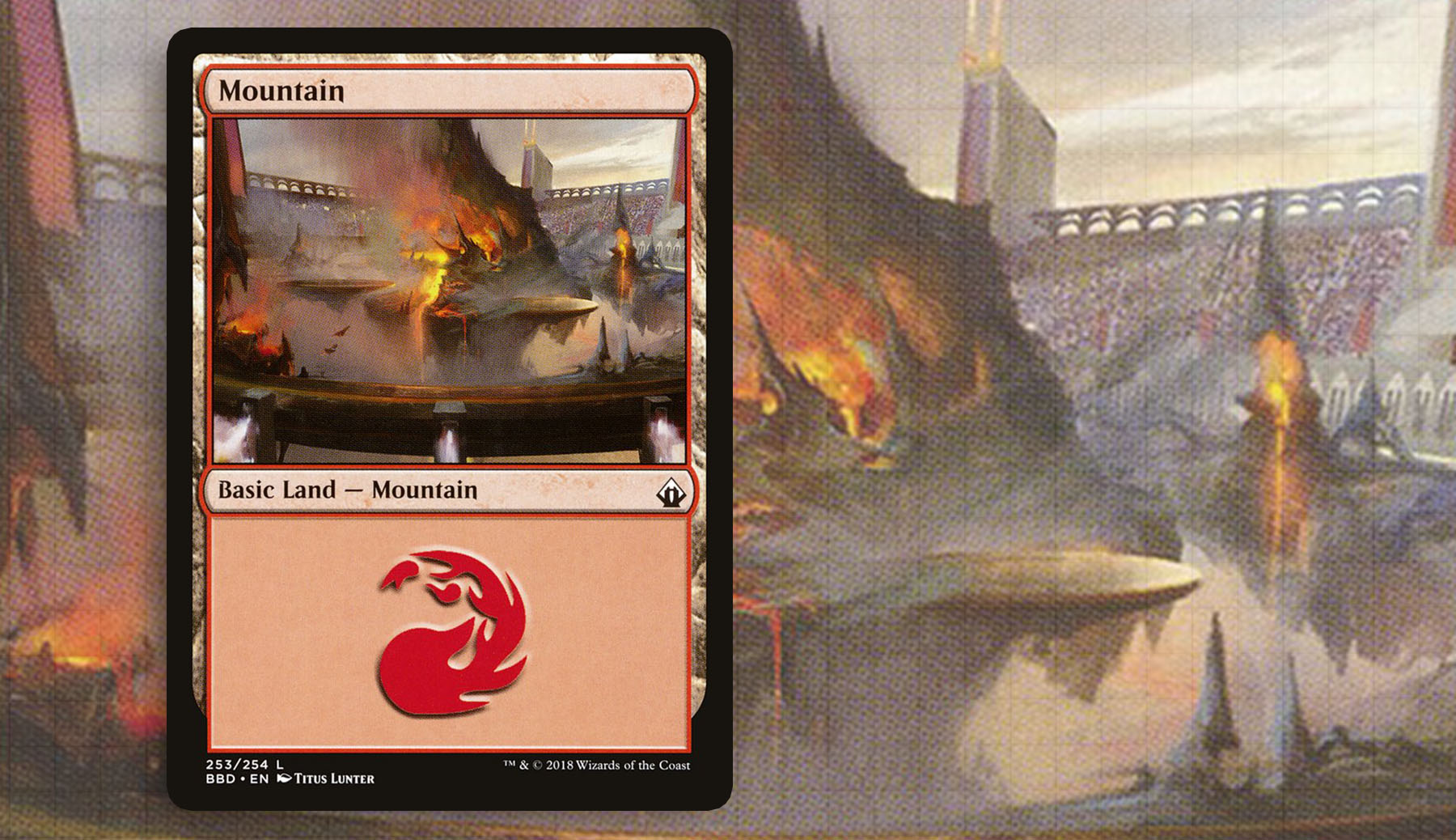
Battlebond—Titus Lunter
I will admit that I don’t often find the land selection in supplemental products to be top notch. I think it comes down to not having the unified vision in the worldbuilding in a Commander product or that duel decks often took art from the large sets they were extensions of. But Titus Lunter makes a second appearance on this list, because his basics in Battlebond were underappreciated by me during the previous three installments.
The Mountain in the cycle might be my favorite anyway, but all five do such a good job of communicating the world of Kylem. The idea of containing this fiery battlefield of floating platforms and lava inside of a stadium should take you out of the piece a little bit, but something about the whole package got me invested in this product. I need more lands like these in my life, and they would be the perfect candidates for the full art treatment next time.
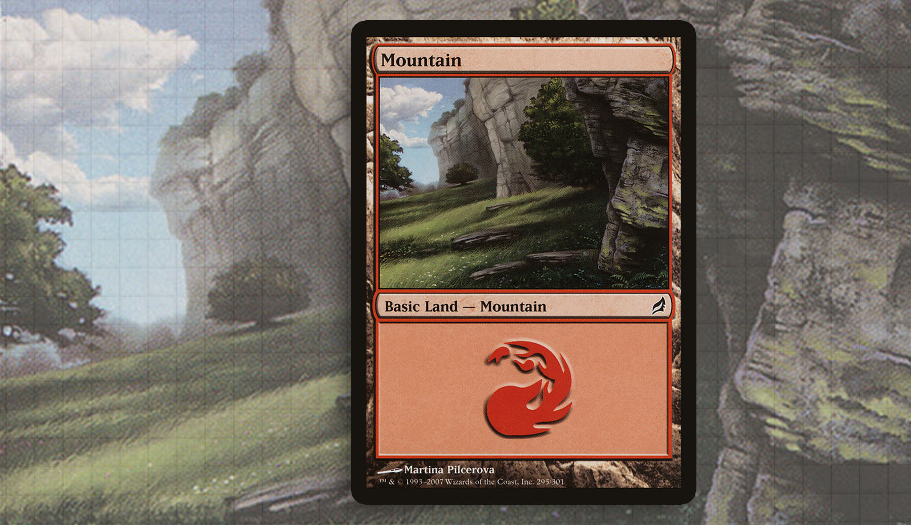
Lorwyn—Martina Pilcerova
Let’s end on the softer side. I’ve always found the Lorwyn basics to have a certain charm to them, to the point where choosing just one of them to include on this was very difficult. I decided that the Martina Pilcerova best exemplified what I liked about the atmosphere of the plane. The more European feel of Lorwyn, with rolling hills, gentle grass, and mossy rocks is a great option for any deck that doesn’t want the maddening aesthetic of most other planes.
One of the aspects I appreciate the most is its grounded feel, with a much closer perspective on the landscape. Mountains are the basic land most likely to depict a bird’s eye view, or at the very least a grandiose horizon. But here we get something I’d like to walk through, with the aforementioned mossy rocks and smadering of clouds.
I have really loved diving into this series, especially because so often I think players look past the art on the cards. Obviously there is an entire subsection of the community that adores the art, but I love being a voice for it from time to time. Once you become really invested in a Commander deck, I would advise taking a look at your lands and really working to have them become an extension of your theme as much as any other card. And check out Donny’s choice of Mountains too!
I’m excited to touch back on this topic next time. If patterns are to be followed, we should be touching on Forest soon and capping off this section of the series. Thanks for reading.
Ryan Sainio is a Graphic Designer who writes about EDH and the EDH community. He has been playing Magic: The Gathering since 7th Edition in 2002 and values flavorful and fun gameplay over competitively optimized decks.

