Welcome to the Mirror Gallery here on Hipsters of the Coast! Today is all about Magic’s recent journey to Ikoria, a brand-new world that has quickly captured the hearts and minds of players and fans alike.
This article will be part planeswalker’s guide and part artist interview, as I’m joined by my good friend, legendary illustrator, and concept artist Jesper Ejsing. We caught up early one morning this past week to chat about everything that went into making Ikoria the incredibly vibrant and vivacious domain we now see. Along with a multi-talented team at Wizards, Jesper was instrumental in creating the visual look and feel of this place, from the earliest days of concept push all the way to the final published artwork.
Today we’re going to explore Ikoria through the lens of more than a dozen pieces of the concept art he created for Ikoria, as well as his thirteen card illustrations for the set.
Concept Art—Ikoria: Lair of Behemoths
At the beginning of any set is something called a concept push, where a handful of artists are flown to Wizards of the Coast. Working with Wizards staff concept artists, art directors, and the world-building team, they create what the imaginary world will look like. Everything from landscapes, to characters and creatures, to creative consistencies that will be seen across the set is hashed out in a matter of weeks.
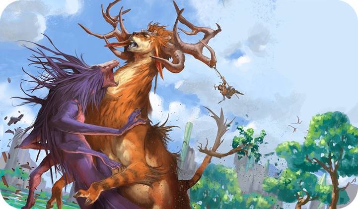
Ikoria Concept Art by Jesper Ejsing. Digital.
JE: They asked me before the concept push, even before coming to America, to pre-design a lot of creatures so they would have something to discuss and to show when we were starting the concept push. That was the most fun, because it was just completely brainstorming creatures. I did some creatures during that concept push that went all the way through to the final art.
JE: The problem was we couldn’t be very absolute. Like let’s say it was Lorwyn, and all Lorwyn elves have horns that are pretty distinctive, and hooved feet. But in this case we were supposed to create factions that would also be mixed with other factions. So I tried at some point to do one of the major characters that was a mix between a nightmare, dinosaur, and a cat, and it’s really three strange things to mix and have the three distinguished look of each.
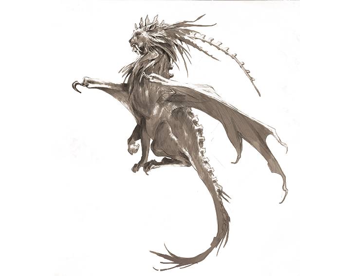
Cat Nightmare Dragon Creature Concept by Jesper Ejsing.
JE: The nightmares were the only ones they (Wizards) didn’t have a clear vision of; I think we came up with something the first day, and the difference was they can never have two eyes: one eye, multiple eyes, or no eyes was ok. The first sketch I ever did of a nightmare was the one with the weird bone head and no eyes (left, below), and they were just like “Yeah that’s creepy!’ Then I did the other one of the little critter with a lot of eyes (right, below) and this became the range we could go with for the faction of nightmares. This and the tendrils, either real tendrils or smoky tendrils.
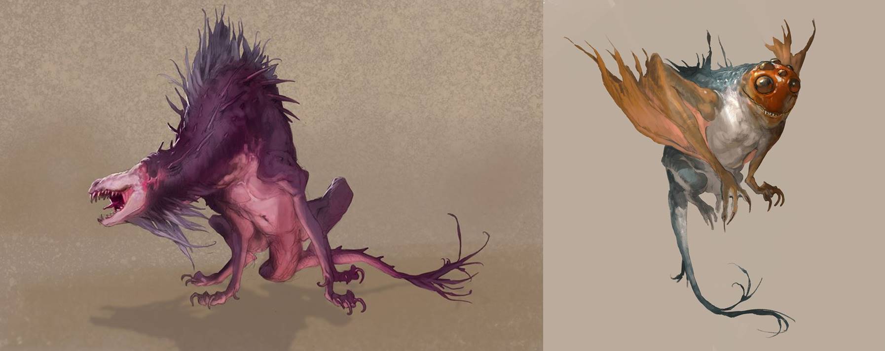
Nightmare Creature Concepts by Jesper Ejsing. Digital.
JE When we were designing the bonders, there wasn’t really a lot of things to go by except we wanted it to look like they were actually bonded to the animals. I got to work on a lot of the bonders design and a look for them that could be distinguished. I came up with this idea that if they were outcasts from the real society of Ikoria because they bonded with these beasts and huge creatures that everyone was afraid of. They were kind of like rebels in a way, so we thought about making them punk, like punk rockers; and for me that turned into cosplayers, because we wanted them to dress up like the animal they were bonded to.
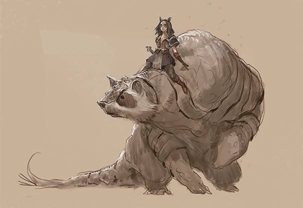
Bonder Concept Art by Jesper Ejsing. Digital.
Note the ears she has put on, and eyes colored the same way as the badger.
JE: As soon as we came up with the idea that they could be cosplaying their bond creatures, and they would color their hair to match, then we had a look: punk rock cosplayers. I mixed that with WWI airplane pilot equipment: the weird leather hoods and brown leather caps, and the leather glasses they could pull down. We imagined, they’re riding a huge owl griffin creature in the air, branches would hit them, and insects, they would need some kind of protection. This became a look that I tried to put all together into the girl with the pink fox on her shoulder, because she has all that equipment.
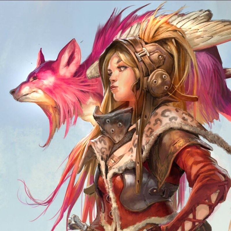
Bonder Concept Art (Zoom) by Jesper Ejsing. Digital.
JE: When we first found that angle for the bonders, then we were all talking about, well how would the hunters distinguish themselves from that. We came up with the idea of instead of weapons they would have grappling hooks, like the Middle Ages manhunter; it would let them grab onto and hurt the animal, and then kill them.
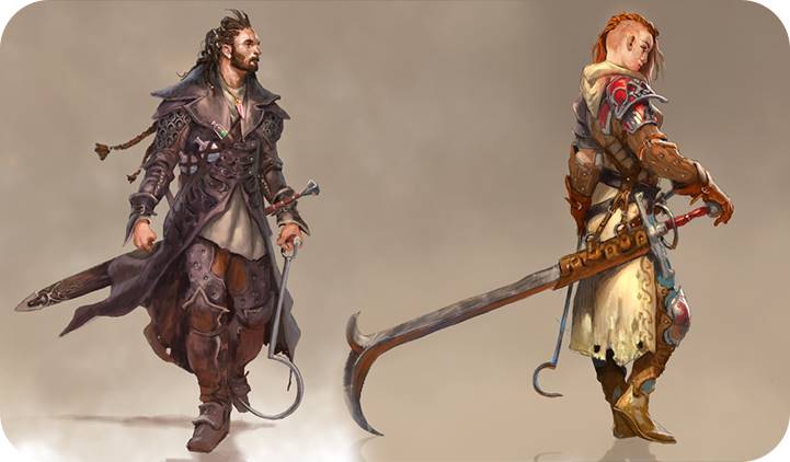
Male and Female Hunter Concept Art by Jesper Ejsing. Digital.
JE: I was hired mostly to do work on the creatures, but I ended up branching myself out to almost anything, because I was so passionate about that world.
Basic Lands—First Cycle
Ikoria is vast and beautiful, and like Jesper said above, he did much more than just creatures. He had the opportunity to create his very first full cycle of basic lands for this setting, and he told me all about this inaugural expedition.
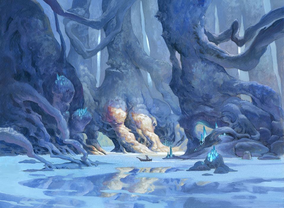
Island by Jesper Ejsing, acrylics on board, 12” x 16” Collection of Tokyo MTG.
JE: After hours, I went back in the office and made and an Island sketch and a Forest sketch; and printed them out in the frame of a Magic card, and put them up on the board of the Art Director (Andrew Vallas) so that when he came in the next morning I had done some basic lands.
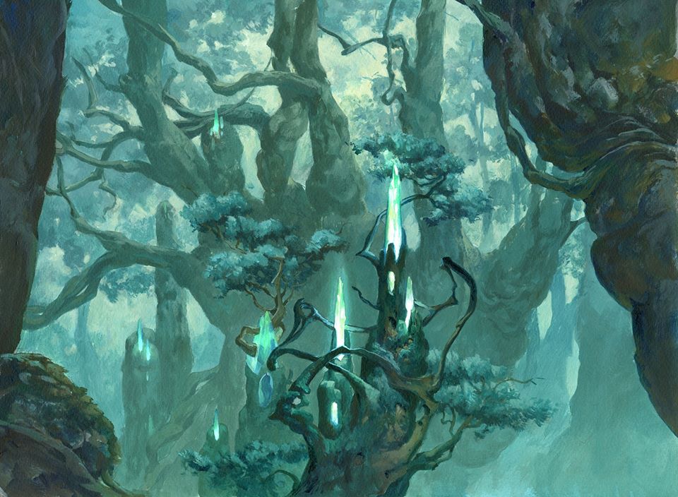
Forest by Jesper Ejsing, acrylics on board, 12” x 16” Collection of Tokyo MTG.
JE: I’m very particular when I’m painting cards that the card color fits the frame around them, so I wanted the Forest to be predominantly green, and I wanted the white to be very yellow.
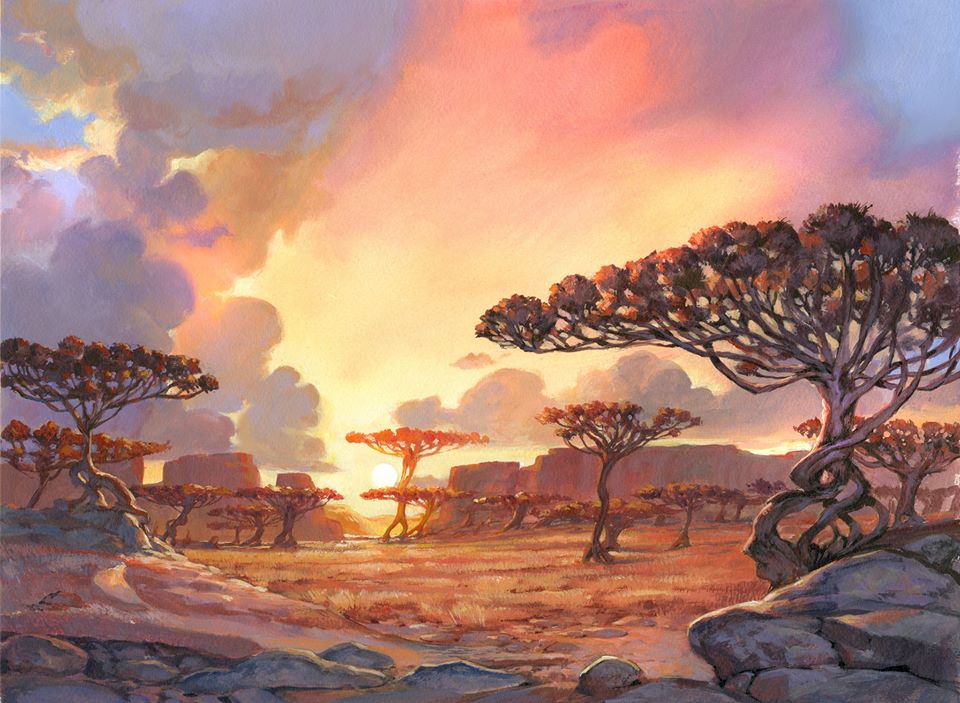
Plains by Jesper Ejsing, acrylics on board, 12” x 16” Collection of Tokyo MTG.
JE: Usually landscapes for me are what’s behind a dynamic character. So being asked to do a landscape that doesn’t have any character but needs to be a character in itself, was really new to me.
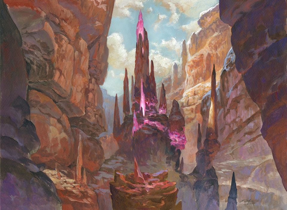
Mountain by Jesper Ejsing, acrylics on board, 12” x 16” Collection of Tokyo MTG.
JE: I came up with this idea that all of them should look like a Jesper Ejsing illustration. So I would use what I usually do in the shape language with huge forms and soft shapes, and all that; I would want crystals to be a prominent thing in all the illustrations.
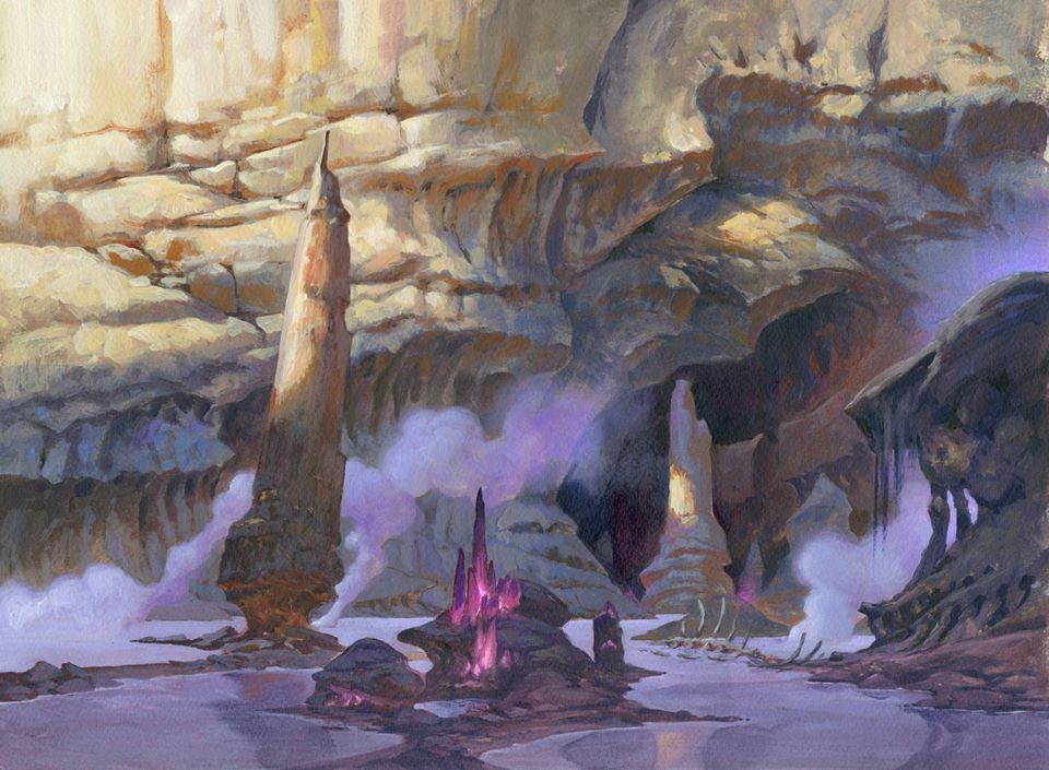
Swamp by Jesper Ejsing, acrylics on board, 12” x 16” Collection of Tokyo MTG.
JE: I was also very specific about wanting the distance to the landscape to be the same in all five landscapes, because I wanted them to be a family. So that when you placed them all together, you would see: “Ah, this is the same artist, he went to Ikoria with a fantasy camera, and he took a snapshot form the same place each time.”

The Legends
Jesper painted five legendary creatures between Ikoria: Lair of Behemoths and Ikoria Commander. He is an avid Commander player and described this group of Legends as a dream come true. We examined them one by one.
Yidaro, Wandering Monster
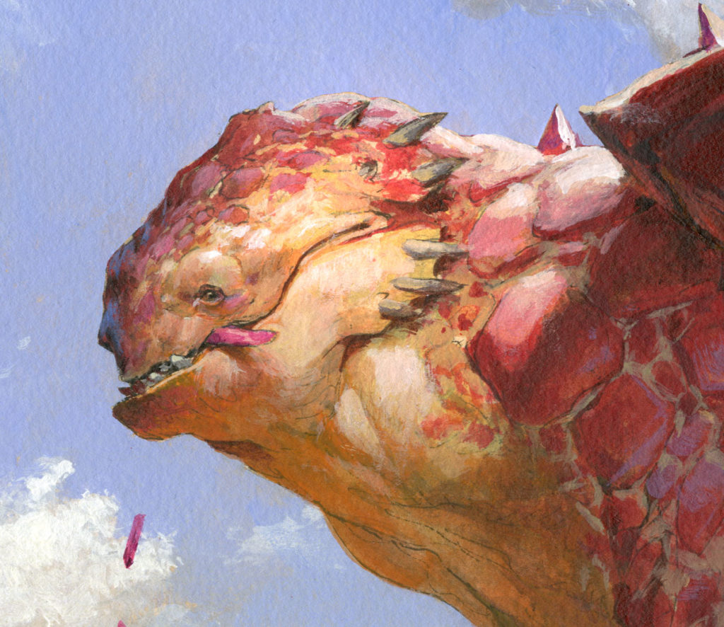
JE: I more or less committed to a whole lot of work if I got to do the lands, which was no problem for me. I wanted to do as much as I possibly could, but I got an “extra” creature on top of the lands so that they would not only get lands this set. It was Yidaro, the Wandering Monster, and considering that that was an extra piece I got, it’s one of my favorite illustrations I ever did for Magic.
This slideshow chronicles each step in the creature’s creation, and you can read more on his Muddy Colors post.
JE: It was more or less freehand to explore a lot of the things that were going to be in Ikoria. It captures everything that I like about Ikoria: the big monster, the bright, colorful candy-wrapped paper color vibe, the goofiness of the creature, and the crystals: all that Ikoria is for me.
Zirda, the Dawnwaker
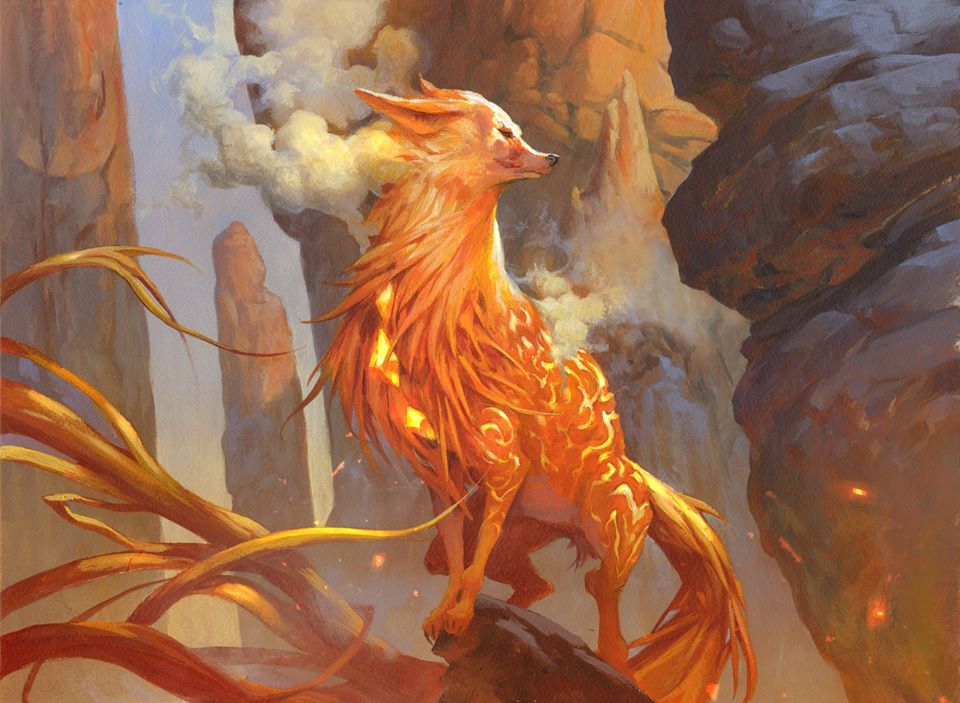
Zirda, the Dawnwaker by Jesper Ejsing, acrylics on board, 12” x 16” Private Collection, sold for $9,000.
JE: For Zirda, the commission asked for an elemental fox looking at the dawn. It was a very loose description, but I wanted it to have a very royal pose, that she’s within her element and she’s reigning over the mountain. What it reminded me of was the Slippery Bogle painting, to create a fantasy piece within its right environment, almost like it was a BBC nature program: “Oh, we caught a picture of Zirda in the wild,” or something like that.
Trynn, Champion of Freedom & Silver, Devourer of the Free
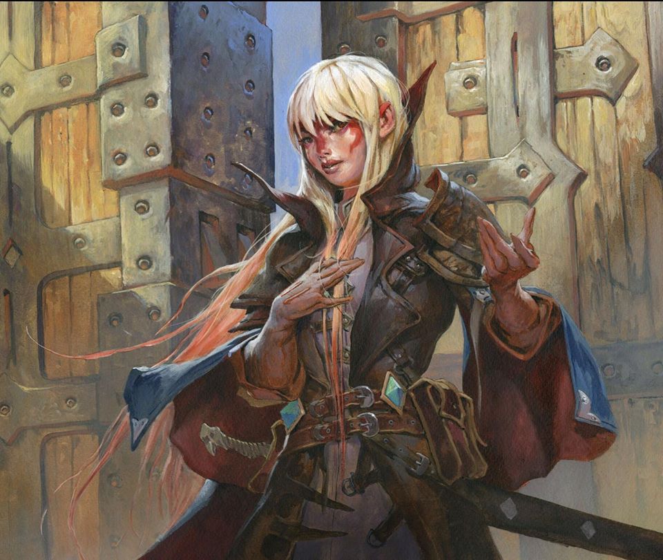
Trynn, Champion of Freedom by Jesper Ejsing, acrylics on board, 12” x 16” Private Collection, sold for $4,600.
JE: To be honest I didn’t do much with the city or the soldiers in the concept art, but for Trynn the art description is very much what she ended up like. She’s luring people out of the city into the nature, and the creature eats them, and you gain the benefit. I wanted her to look like she genuinely believed in what she was doing, and that was the hard part with her—to make her look like she believed in this idea of getting people out of the city for them to be eaten.
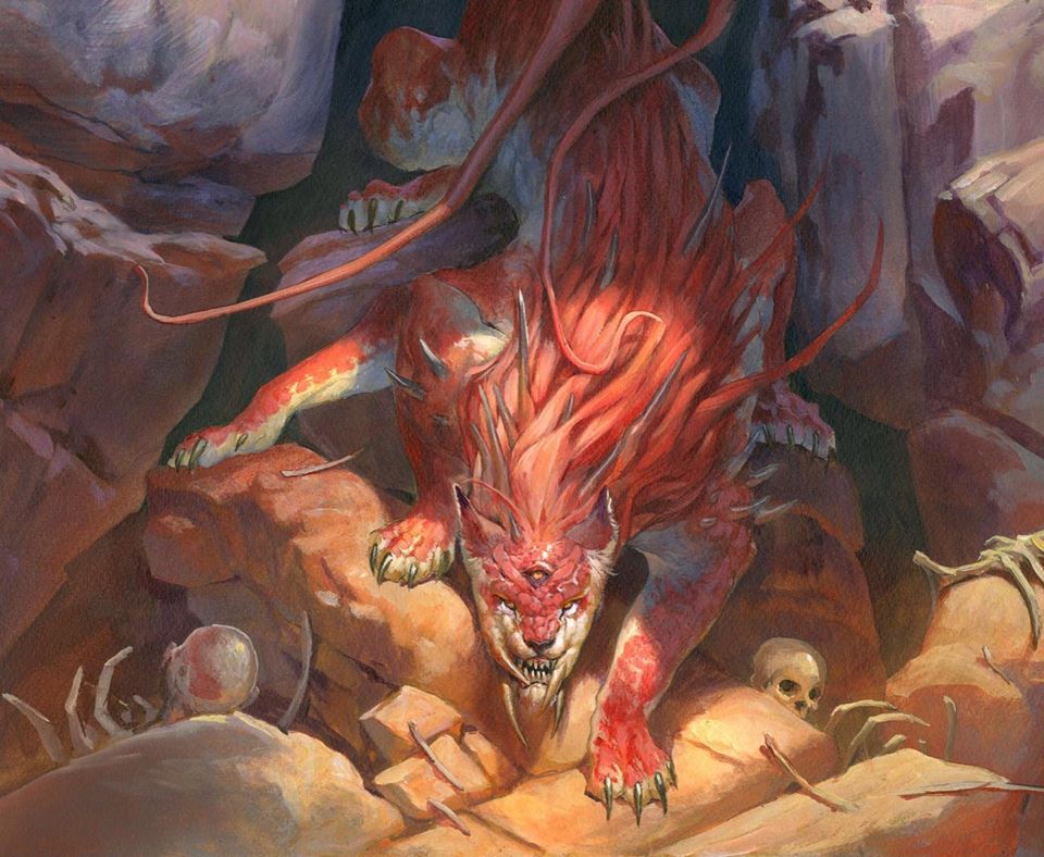
Silver, Devourer of the Free by Jesper Ejsing, acrylics on board, 12” x 16” Private Collection, sold for $3,100.
JE: It was fun doing Silver because he was a nightmare. I needed the extra eyes but also extra limbs, but I didn’t want it to look like it was deliberately full of limbs; so having the creature crawling, sneaking to watch you. I had to hide most of the limbs in the shadow, so it wouldn’t look too crowded, and I really think that worked. When you look at it you say, “Oh it’s a cat . . . wait a minutes there’s also . . . wait how many legs does it have?!” You don’t necessarily see it to begin with, but you see it when you look closer.
Gigan, Cyberclaw Terror
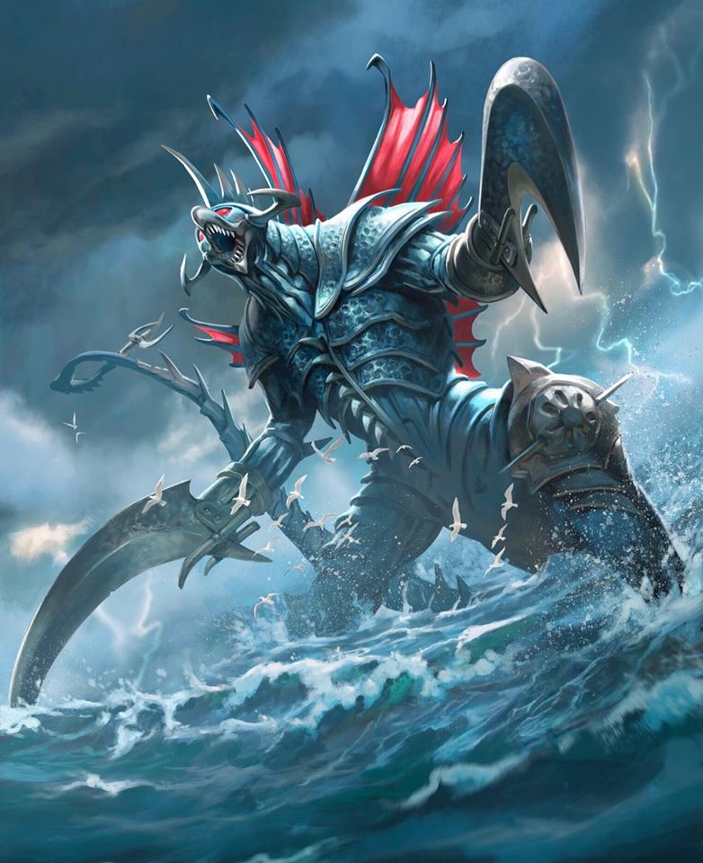
Gigan, Cyberclaw Terror by Jesper Ejsing. Digital.
JE: When they sent me the concept, it was like a very bad movie still from the 80s:
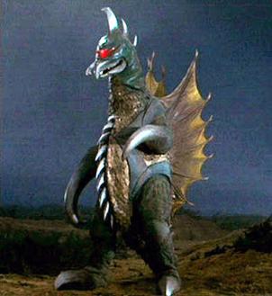
This is the first image for Gigan on Google, c.1972. Yikes!
And you look at that creature, and you say: “How can I make this look badass?” It was really difficult.
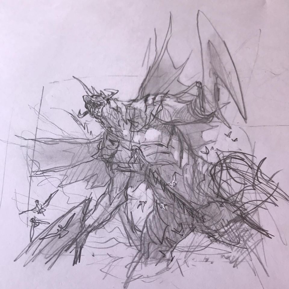
The only traditional aspect for Gigan is a tiny thumbnail sketch.
JE: I did it completely as a digital painting because it’s a shared rights product. I anticipated a lot of corrections, because it would have to go through an approval process with Wizards, and then through one with ToHo, and then back again; and that’s just easier in digital. But in the end I’m happy with how it came out.
The Creatures
Jesper also had three other cards, including two bonder-creature depictions. Each one was an experiment in new artistic techniques, and he walks us through each illustration.
Exuberant Wolfbear
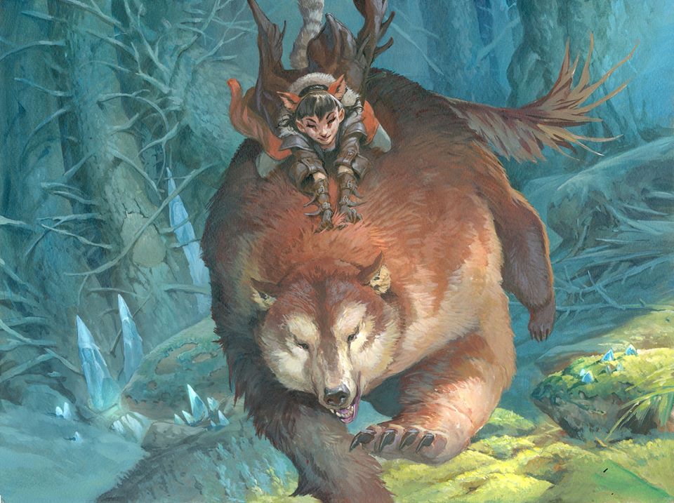
Exuberant Wolfbear by Jesper Ejsing, acrylics on board, 12” x 16”
JE: This was close to painting Ayula, Queen of Bears; and it was perfect because it needed a happy bonder riding it. I did a lot of exploration, and it was a little bit of a change painting-wise; because I’m used to having very bright rim light, very saturated colors, and having everything almost cartoonish. This one I wanted to see if I could shape the face of the bear, but with less contrast.
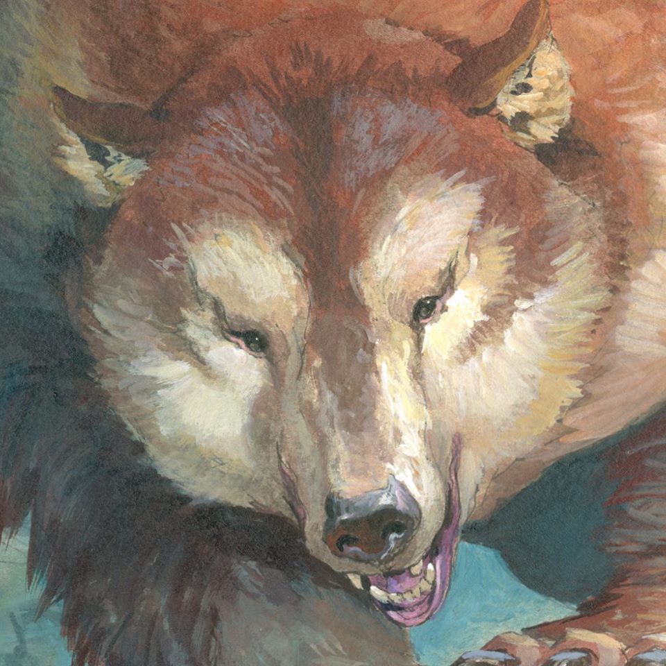
JE: I explored how I could have the angle of the strokes mimic the way that fur grows on a bear. A lot of the direction of the strokes indicates the fur, and that was really fun. You can see how little value changes there is to show shape, and I think that worked very well. That marked a new way of trying to paint for me, where I use less to gain more, and paint softer with more volume that way. It’s a taste difference, I think, or maybe I’m just growing up!
Jubilant Skybonder
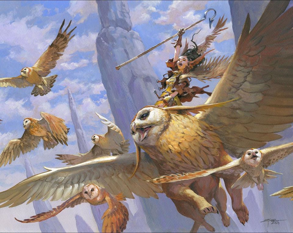
Jubilant Skybonder by Jesper Ejsing, acrylics on board, 12” x 16” Collection of the artist, NFS.
JE: I used to be a bird watcher, and I’m just taking that up recently again, starting watching birds again. So I’ve always painted birds in most of my paintings if I can. I created that owl griffin in the concept art:
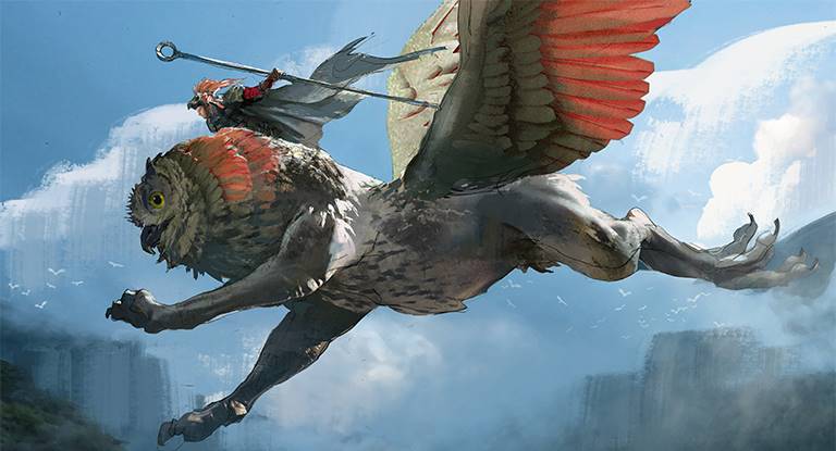
Owl Griffin Creature Concept by Jesper Ejsing. Digital.
JE: And they (Wizards) were like, “Yeah we want that girl and that owl creature,” and I was like, “Yes can I do even more owls? Like she’s surrounded by owls? It would look cool!” And they were like, “Ok you can do more owls, but don’t make them the focus of the painting.” So I added all those different owls and it was just so fun!
They specifically asked for her to look like she was having fun, and that’s not often you get that assignment. I tried to get the feeling of “Yee-haw look at me flying this giant owl-griffin!” I tried to use less of a line and shape her face more in temperature than actual contrast.
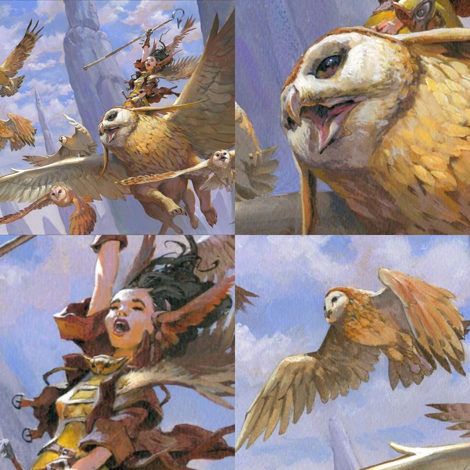
JE: A lot of it has an orange bounce light, and she has the rim light from the sun. The bounce light and the facial light is almost the same value, but the temperature shifts in the whole face and the skin tone, making it much more voluminous. And that’s a different way of painting for me, to explore temperature rather than just adding shadows.
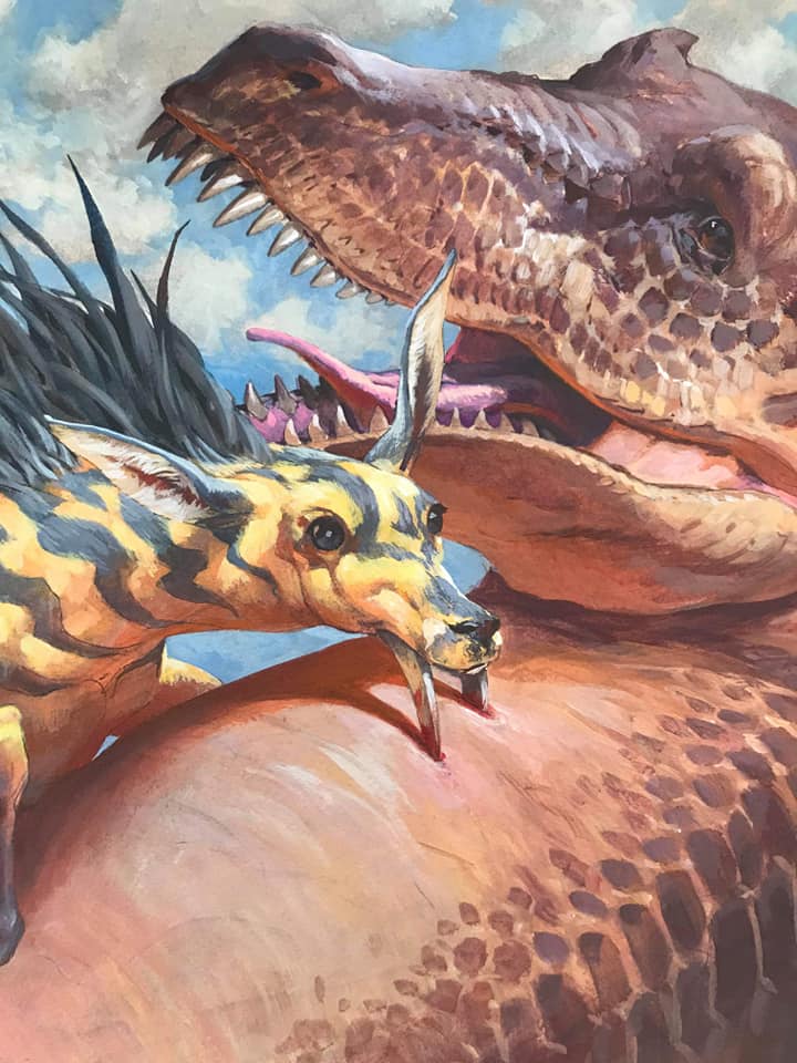
Unexpected Fangs
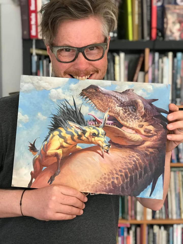
Unexpected Fangs by Jesper Ejsing, acrylics on board, 12” x 16” Private Collection, sold for $2,500.
JE: It’s difficult, but I wanted the expression of him to look like he was hurt, or sad, or afraid. It’s kind of different when you don’t have eyebrows, and you don’t have a mouth that can smile or look sad. But I think the horror in his eyes is there, and I’m happy with that. There’s a lot of stuff you can’t show if you don’t have a mouth and eyebrows!
Wrapping Up
And so concludes our personalized tour of Ikoria, the Lair of Behemoths. The artist summed up his work on this set thus.
JE: I had a very clear idea what that world could be, and I think it fit me so well because they wanted it to be colorful, and they wanted huge and strange creatures. The world has more fun in a way, it’s less serious, with the animal mixtures, than some of the other Magic sets, and I just loved it.
I like to extend a special thanks to the one and only Jesper Ejsing for taking the time to tell me all these fantastic stories about his contributions to the set. I couldn’t agree more that Ikoria fits his style perfectly, and it’s evident he really put his everything into making this world something extraordinary. He and the other artists have born a brilliant new destination within the Multiverse; even though we just arrived, I can’t wait until we come back.
Next time the Mirror Gallery will begin to wind down our Ikoria discussion with the perennial Grand Art Tour, as I explore some of my favorite pieces from the base set, Commander, and all the different alternate art in between. I’ve begun to whittle them down to my customary twelve and it’s more difficult than ever, so make sure you tune in in two weeks.
Remember, to see original #mtgart and other #vorthos related things, follow me on Twitter. Feel free to ask questions or retweet to continue the conversation. Thanks and see you next time!
Donny Caltrider has been playing Magic since 2002 and collecting original Magic art since 2017. He has an M.A. in Museum Studies from Johns Hopkins University and enjoys telling stories about art, objects, and the intersection of fantasy with real-life. You can find him on Twitter talking about #mtgart, museums, and other #vorthos related goodness. Follow along and continue the conversation!

