For much of the last year, Donny Caltrider and I have been teaming up to cover basic land art from time to time. My interest dates back to when I stumbled across the Better Basic series by James Arnold on CoolStuffInc. While I had always been a fan of the art of Magic, for the first decade of playing the game I only ever thought about the game’s art in terms of how reprints could be a gateway to different interpretations of the same idea. Suddenly, James’s series made me see how lands could be an extension of my deck’s aesthetic.
As time has gone on, I’ve started each deck construction by finding the one piece of art I think fits best for each basic. I use that one piece whenever possible to help cement the visual themes of my deck. I held myself to no restrictions as I compiled today’s list, and sought to capture the lands that I use to set the stage for my decks.
Right up front, when it came time for deciding on my favorite Swamp art, I was honestly not too enthused at first. Of all the basic lands, I’ve found Swamps to be lacking over the course of the game; not so much in skill of the painting, but a sense of diversity. While it was very common in the early years of Magic for the basic lands of each type to blend together year after year, I’ve been of the opinion that the basic Swamp took the longest for Wizards to really get their stride on finding interesting ways to concept. That said, even with my bias, I was happy to prove myself a little wrong, finding examples from all across Magic’s history.
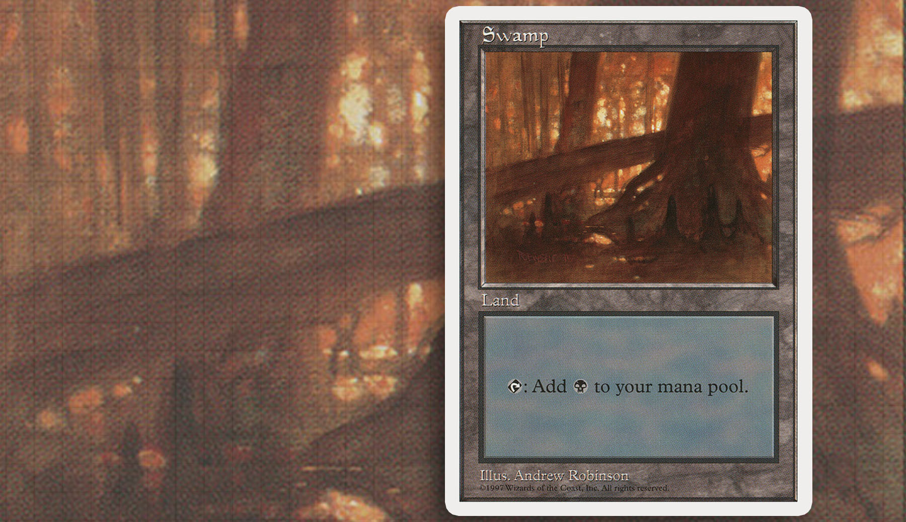
Honorable Mention:
Fellow corresppondent Travis Norman chimes in on his personal favorite:
“Drive along the Taconic State Parkway in southern New York, and you’ll find this Swamp—the Andrew Robinson piece from Fifth Edition. From inside your car its nothing more than a flicker of trees, yet the darkness hides much more. Andrew Robinson’s use of light sets this one apart from others, creating a sense of calmness under the dense canopy. We’re drawn to the light and warmth of what’s just out of reach, but the dark, rotting trees stand in our way. As a native of the Hudson Valley, the haziness of this piece reminds me all too well of those hot, humid summer evenings, where you can feel the mosquitoes circling around your breath. All we need is the sound of katydids, and the setting is complete.”
A nice palate cleanser before my seven favorite Swamps.
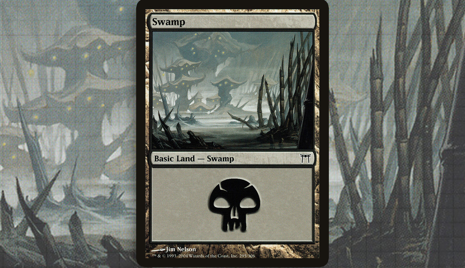
Champions of Kamigawa—Jim Nelson
As an unabashed fan of the world of Kamigawa, I find myself constantly revisiting some of the basic lands and really appreciating how much they just exude the Japanese influence the plane had. In the case of these Swamp and they’re tied to the nezumi—the rat folk of the plane—and we’re given very distinct colony structures that bring a sense of culture to Swamps in a time before they had individual identities from piece to piece. There is a sense of foreboding mystery to this piece, with this the nezumi village clouded in the mist, with heavy reeds emerging in the foreground like katanas.
The one aspect holding this land back from being used more often is just that the amount of flavorful legends that can make use of them is limited slightly by Kamigawa block being monocolored, leaving decks like Marrow-Gnawer and Myojin of Night’s Reach to get the most use out it. Though with O-Kagachi, Vengeful Kami, I have faith that we will still get representation from time to time.
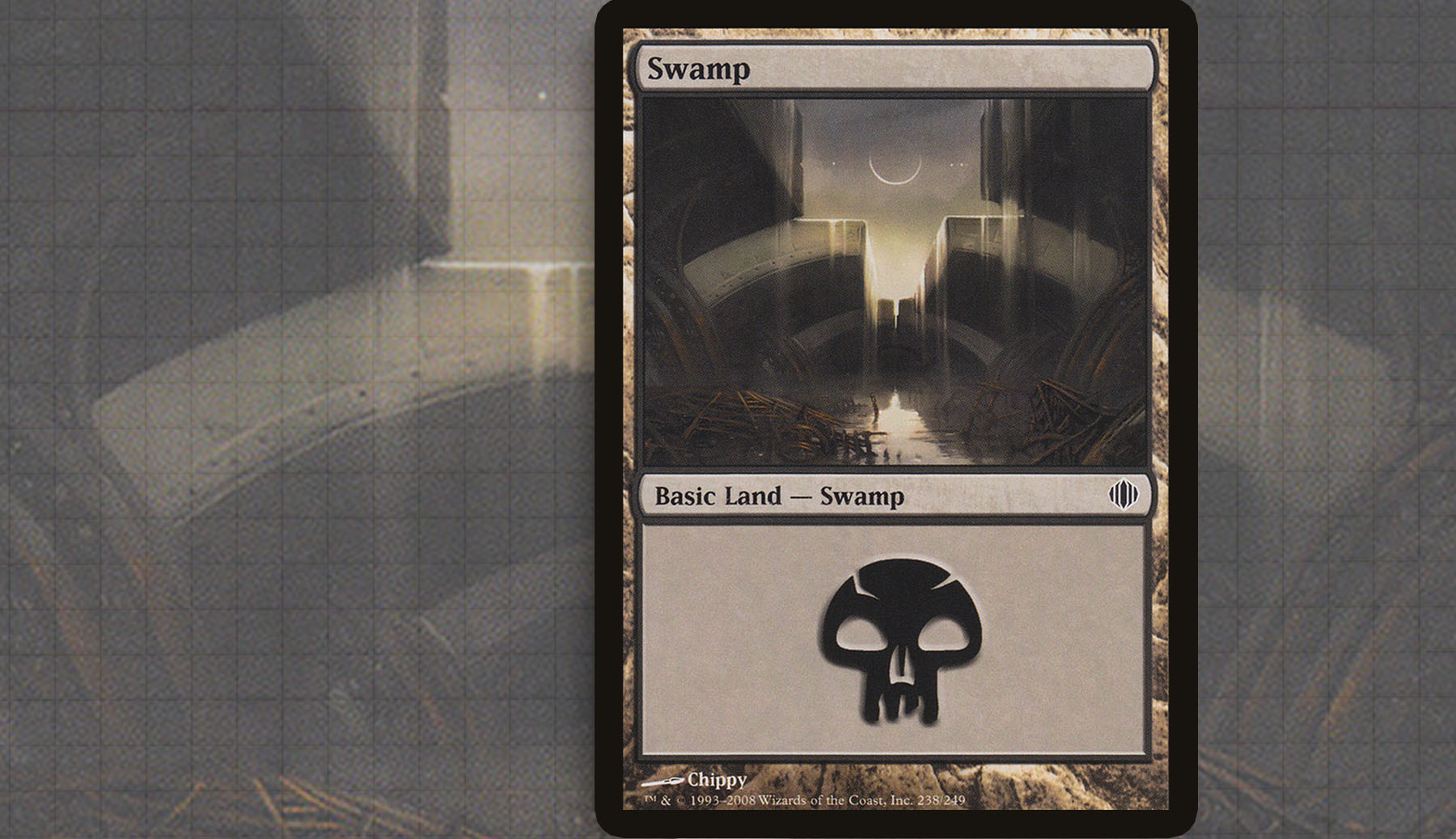
Shards of Alara—Chippy
Usually when a silhouette stands out to me, it’s not the negative space that leaves the lasting impression. This piece is an exception to that. Chippy’s land coming out of Shards of Alara was a long time favorite of mine through much of the middle 2010s in my casual decks. The mix of hard surfaces paired with an ominous stream of water at the bottom piece redefined what I had come to expect from Swamp. It’s not common that I build up an appreciation for something that leaves me so uncomfortable, but this is a piece that I love and would hate to see forgotten to time.
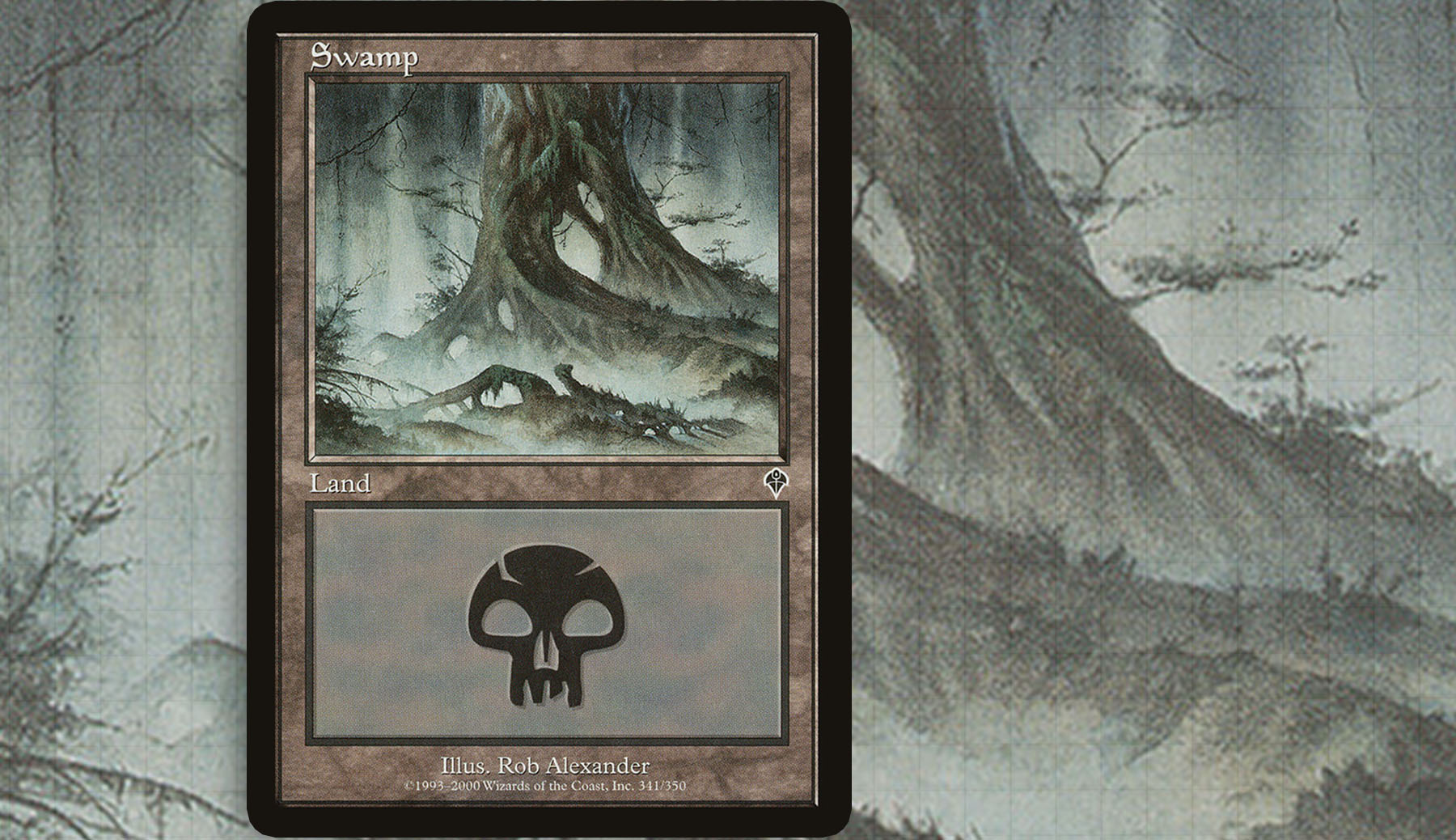
Invasion—Rob Alexander
The first time I saw Magic was in middle school. At the time I foolishly thought it was not the kind of game I wanted to waste my time on, because I had Yu-Gi-Oh cards to collect. While I didn’t care to understand Magic, the Rob Alexander Swamp was one of the first pieces that really stood out to me as I watched a few games over a classmate’s shoulder. The use of negative space, sense of fog, and the departure from what the word “swamp” conjured up in my mind has made it a very distinct piece for me.
While not the strongest piece, it is something I commonly consider wherever I have a legendary creature in the old frame that I want to build around; like Vhati il-Dal or Spirit of the Night. It helps that this art is foreboding without being gruesome. And finally, being a basic land in the old frame helps to give any deck that commits to the full suite a sense of individuality at the game table.
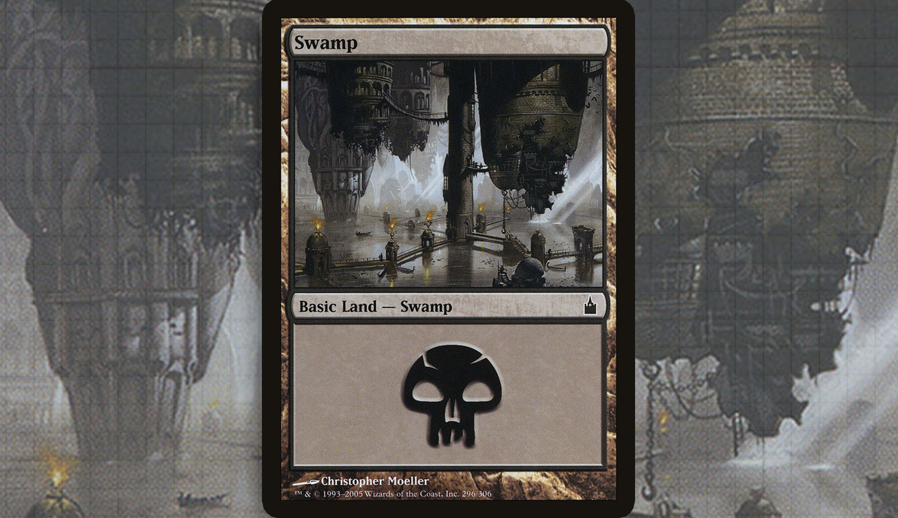
Ravnica: City of Guilds—Christopher Moeller
It should be assumed at this point that no matter which of the basic lands I talk about, there will always be some representation coming from the plane of Ravnica. I don’t think I understood how monumental this redesign was at the time; but as we look back at how Wizards has commissioned basic lands over the game’s history, the plane of Ravnica was a game changer.
This Swamp was my favorite of the block, with wonderful silhouettes to bring some dynamics to my board as they sat out on the battlefield and little details to notice during the idle moments of a game. That economical use of structures not only paints a picture of how Ravnica is different than other planes, but also helped to redefine what we should expect from a swamp. No longer were there murky grey vistas; these have been replaced by hovering stone catacombs, deteriorating towers, and a side of Ravnica most inhabitants are never meant to see.
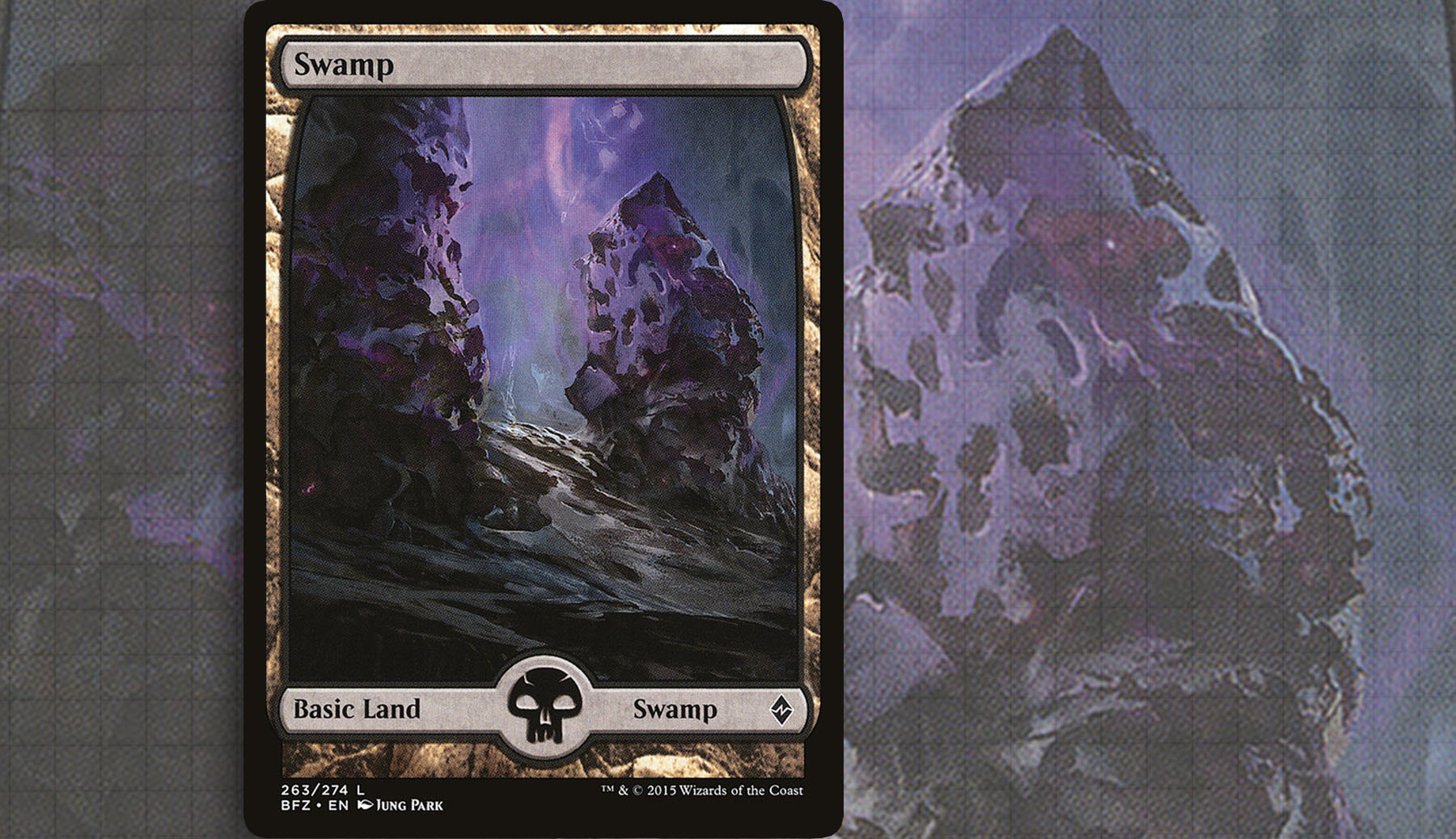
Battle for Zendikar—Jung Park
For much of my Magic career, the basic lands of Ravnica were everywhere in my casual decks, until I invested in Zendikar full art lands sometime in early 2015. To this day, I kick myself for not just waiting the six months until Battle for Zendikar. In terms of Zendikar representation, it was honestly very difficult to decide on just one piece, as the lands in these sets are iconic. But something about the unfinished and alien feel of the Jung Park Swamp, along with the purple hues, stands out in my mind. Intentional or not, I get a sense of Ulamog’s influence on the plane here and this land helps to set the groundwork for the soon-to-come Wastes, especially the Jason Felix version.
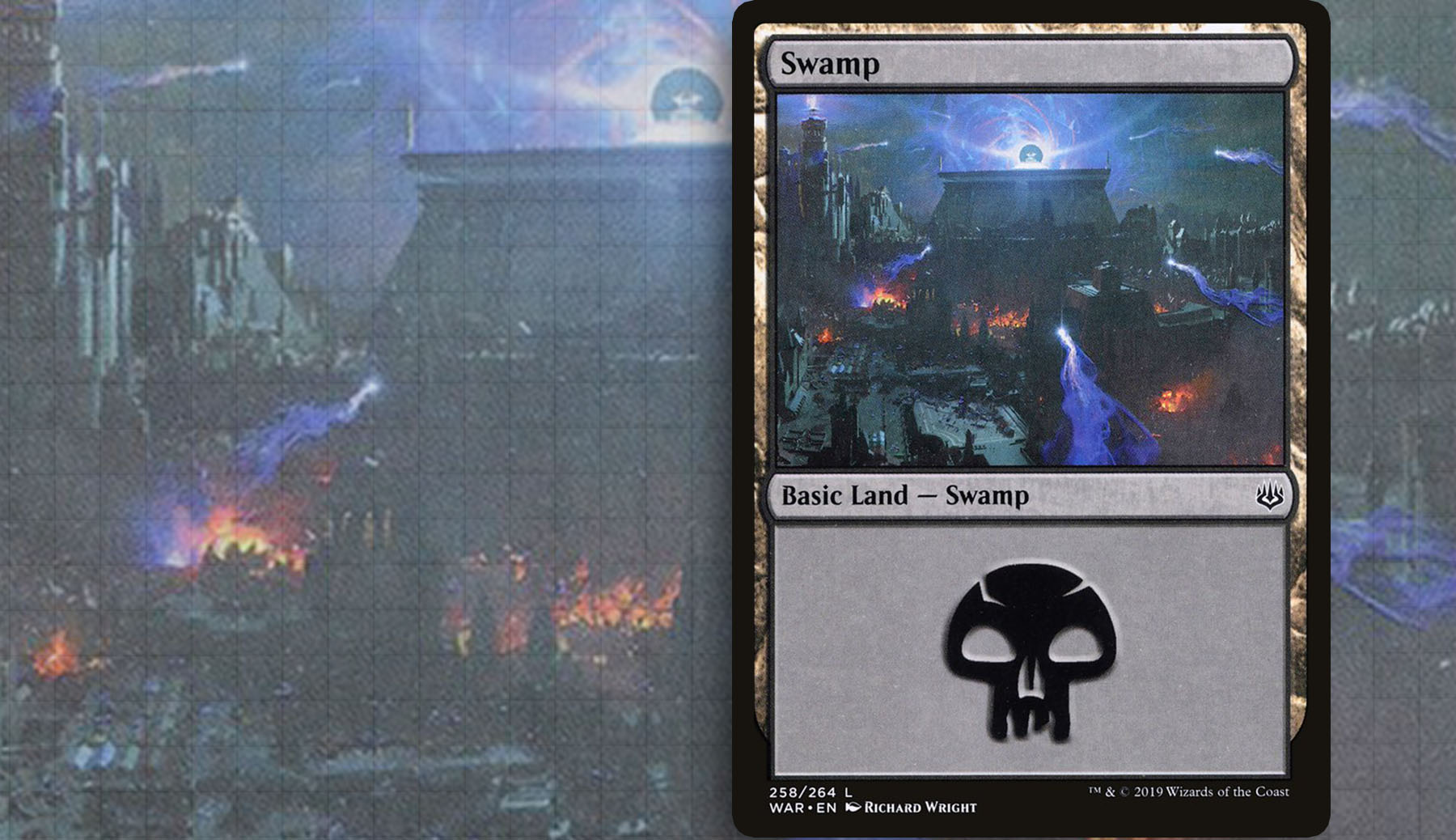
War of the Spark—Richard Wright
If you would have asked me eighteen months ago what lands were capable of doing in a Magic set, I would have said a whole lot in terms of setting the tone and helpful worldbuilding. I don’t think I would have openly said that I thought you could boldly and vibrantly represent the central plot of a set on lands, let alone a single Swamp. Richard Wright’s piece—while helped by the other basic lands in the panoramic shot—communicated War of the Spark perfectly.
Looking closely at all the details, you soon realize that Amonkhet has been interlayed into Ravnica and the trailing sparks back to Bolas’s Citadel show a moment trapped in cardboard at the crux of the story. The only real complaint I can make is that it doesn’t flavorfully link to many legendary creatures outside of Nicol Bolas himself. But I can’t be too harsh on a piece that once again redefined the purpose of basic lands.
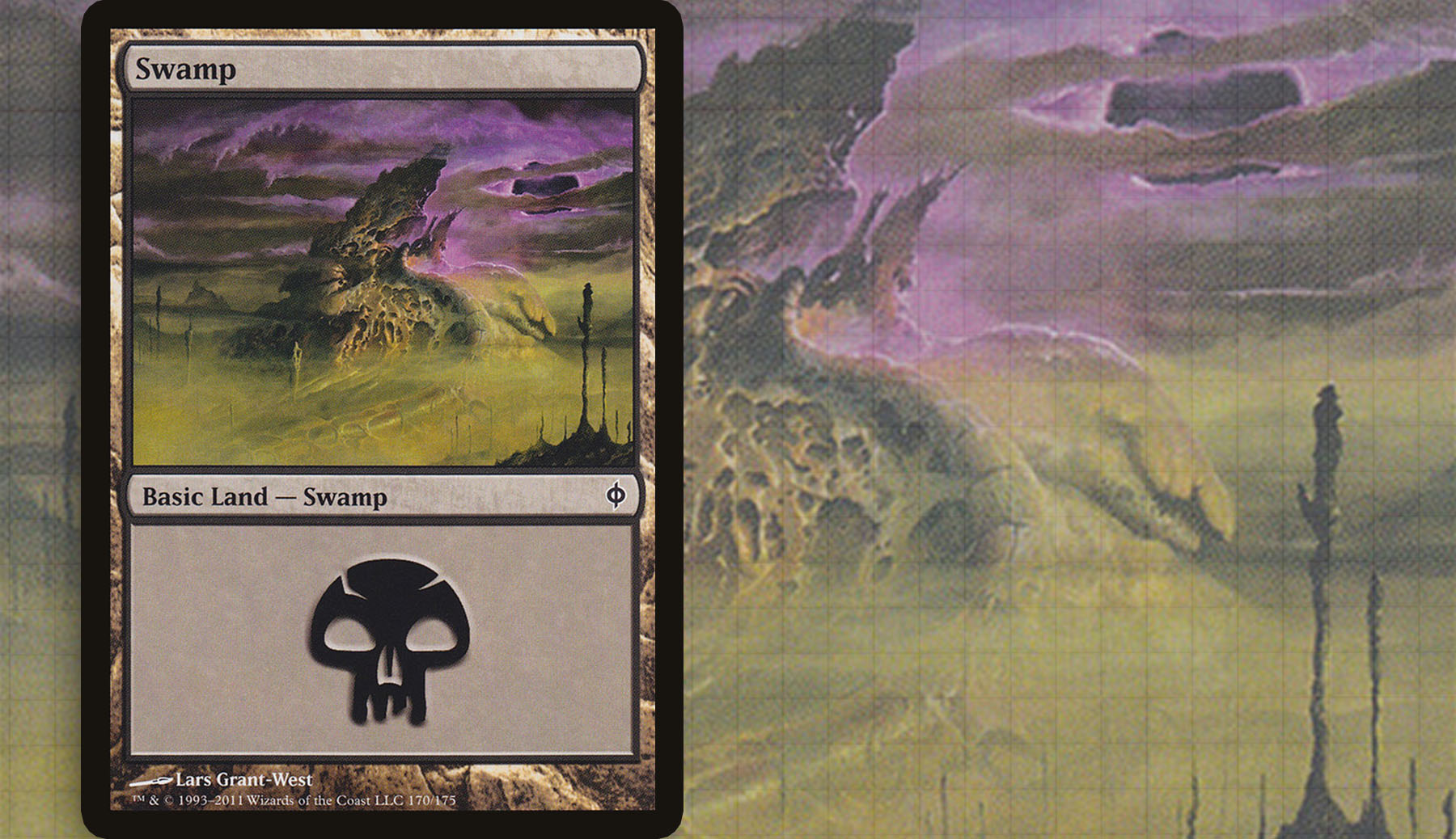
New Phyrexia—Lars Grant-West
Much like how War of the Spark did a great job to depict the event of the set on it’s basic lands, New Phyrexia was a highlight of environmental design. This piece, along with others from the set, really encapsulates how much the history of Magic can be so important to the greater narrative of the game. The reference back to Vault of Whispers set the tone and dug into my nostalgia for the world Mirrodin before the Phyrexians distorted it. This is something that obviously works for me, as someone who can remember the original Mirrodin block. But I’ve found that pointing out the easter egg to new players has often given them an appreciation for a piece they may have normally written off. I’m expecting another trip to New Phyrexia in the coming years, so it’s possible that there will be other options for all things Phyrexia, but until then, this stands as one of the most iconic Swamp for me.
This project often leaves me feeling like it’s nearly impossible to do it any justice. That said, I think the art on lands is an excellent and sometimes overlooked element that can really set the aesthetic tone of a deck. Once you become really invested in a Commander deck, I would advise taking a look at your lands and really working to have them become an extension of your theme just as much as any other card.
I’m excited to touch back on this topic next time. If patterns are to be followed, we should be touching on Mountains really soon, which I already know will mean discussing a whole host of different artistic styles and themes. For my curious readers, go check out Donny’s piece as well.
Ryan Sainio is a Graphic Designer who writes about EDH and the EDH community. He has been playing Magic: The Gathering since 7th Edition in 2002 and values flavorful and fun gameplay over competitively optimized decks.

