Last week, Donny Caltrider kicked off his half of a series of loosely-connected articles we occasionally write about our individual favorite pieces of art from a theme. We had started with the art of the Lorwyn Five from our two different perspectives back in April. When it came time for the eventual continuation, I was admittedly unsure where to go next. I was excited when the idea was tossed out to cover basic lands, as they appear with the most variety and would allow for a lot of our expressions of personal tastes.
As a Commander player, I’m naturally going to look at basic lands a little differently than Donny might. During deck construction, I look at a lot of land cards and over time have begun to lean on their art as a way of expressing the aesthetic look of a deck. By extension, I now pay special attention to basic lands as they are being previewed.
This all dates back to when I stumbled across the Better Basic series by James Arnold on CoolStuffInc. While I have always been a fan of the art of Magic, for the first decade of playing the game I only ever thought about the game’s art in terms of how reprints could be a gateway to different interpretations of the same idea. Suddenly, James’s series made me see how the lands could be an extension of my deck’s aesthetic—even the lands can tell a story.
As time has gone on, I’ve started each deck construction by finding the one piece of art I think fits best for each basic. I use that one piece whenever possible to help cement the visual themes of my deck. I held myself to no restrictions as I compiled this list, and sought to capture the lands that I use to set the stage for my decks.
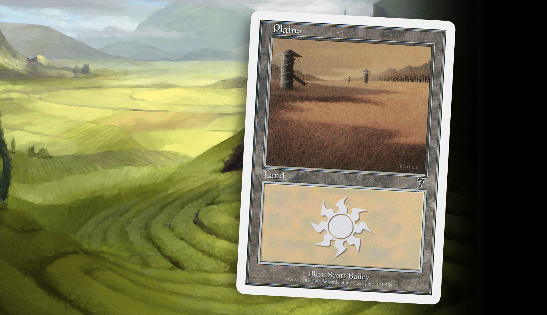
Never Forgot My First
It’s funny what details stick with you over time, and how they can paint your early impressions of a game. I can still remember that my first pack of the Pokemon TCG had a foil Zapdos, and my first preconstructed deck had the 7th Edition Plains by Scott Bailey. While not one of my favorite pieces of art on a Plains or even one I get much use of anymore, something about the gentle golden grain and the silos scattered about the landscape reflected a sense of peace and calm that sculpted how I thought about White’s motifs.
By today’s standards, the Plains of the early 2000s were very bland—mostly flat grassland with the inclusion of the mostly blue sky. This was during the time of Odyssey and Onslaught, where the lands had this toned-down, picturesque look to them, except for the inclusion of a thunderstorm. Obviously I hold some nostalgia for this time period, but it all seems so quaint now.
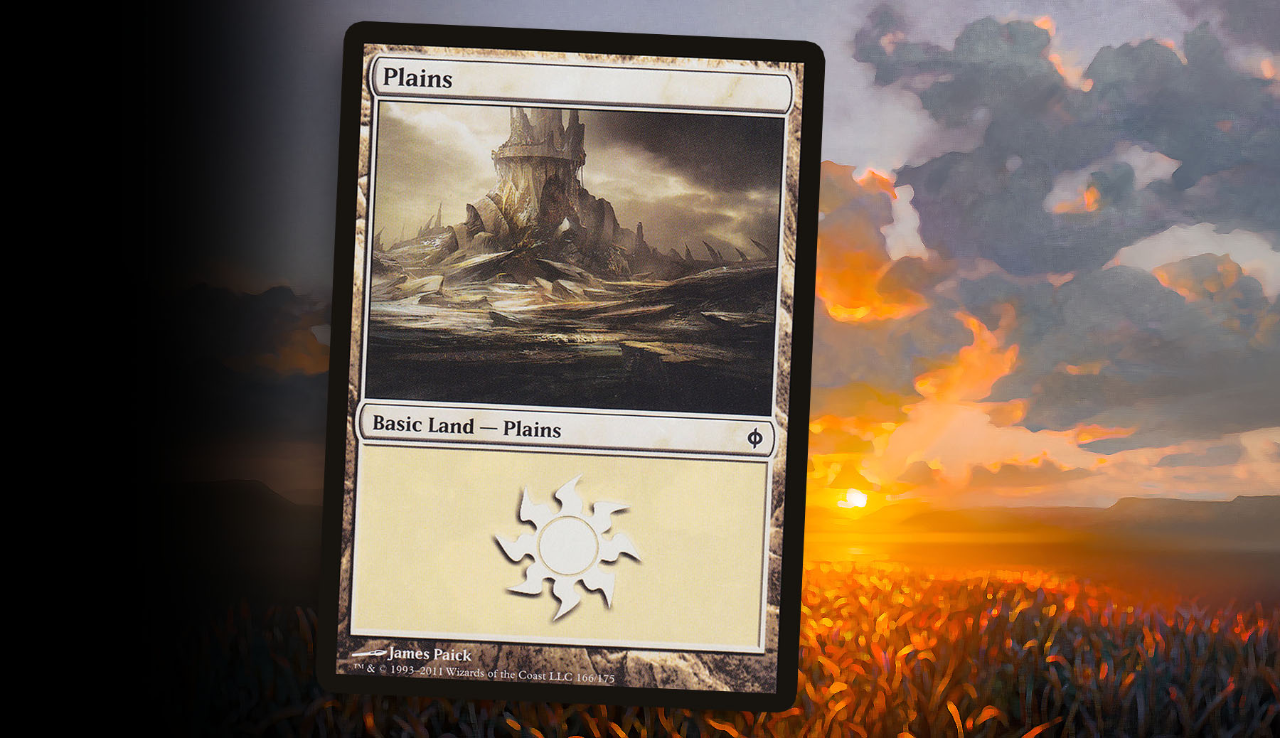
James Paick—New Phyrexia
While generals from the plane of New Phyrexia are not currently as aligned with my tastes as they have been in the past, I still find the Plains done by James Paick to be one of my favorite simply for setting the mood of a deck. This was not the first time we’d seen Plains being depicted as dark and hollow places, or even as twisted inversions of a world like Lorwyn to Shadowmoor. But the reference back to Ancient Den set the tone of the set and dug into my nostalgia for the world Mirrodin before the Phyrexians distorted it.
The limiting factor on this piece is that it is so strongly tied to New Phyrexia that it doesn’t blend well with other thematic legendary creatures. This causes it to fall out of consideration for decks led by generals outside of the plane. With a trip to New Phyrexia feeling inevitable, I’m certainly keeping this land in mind—unless something even more chilling happens to be commissioned for that trip.
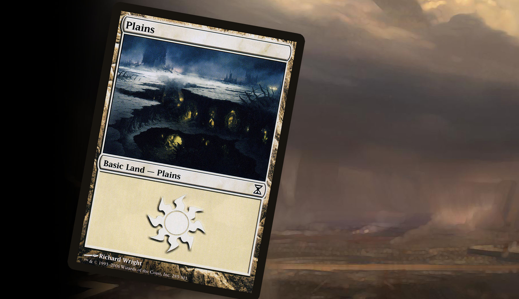
Richard Wright—Time Spiral
Time Spiral block’s basics sit in a weird middle ground for me. In some cases they are beautifully rendered, gripping looks at a world we’ve known and loved in the past broken down to its bare elements. Yet in other cases they are too stylistically tied to the dated look of Magic of the 1990s. Richard Wright’s piece is easily the former, and powerful enough that it has slowly become my preferred land when my deck has darker themes.
Without being straight horror, the art tells a story by drawing the eye to the glow of the underground settlements before pushing the audience’s view to the dusted flatlands of the surface—where you’d normally expect to see prospering life. This juxtaposition is complex enough that I often don’t mind glancing at it from time to time during stalemated game states.
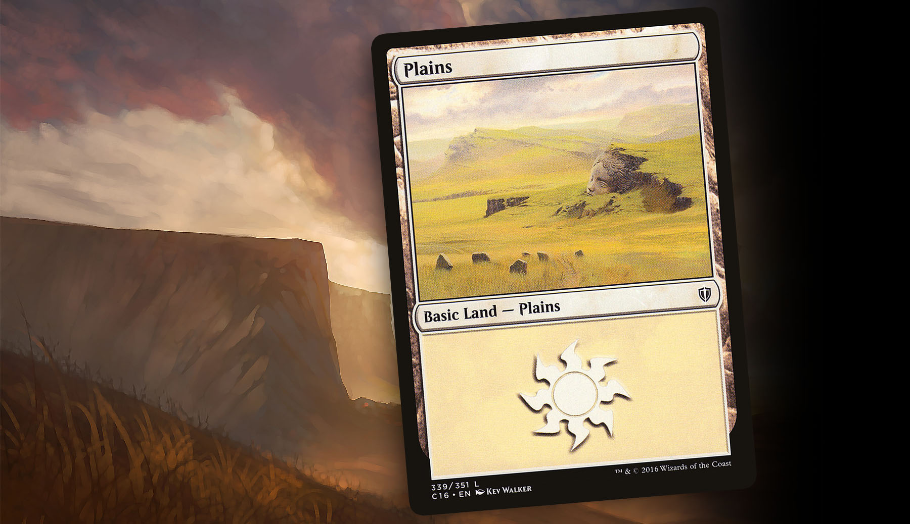
Kev Walker—Commander 2016
Turning the corner from the grim to the hopeful, we have Kev Walker’s land from the Commander 2016 cycle. I don’t know that this is explicitly supposed to be a recovered Dominaria, but a strong case could be made for it being exactly that. If it was intended to be a look into “Magic’s home,” it was a lovely sneak peak of the world we’d see two years later. Either way, this piece has stuck with me for the last three years, most importantly for use in a few hypothetical Kev Walker Vintage Artist Constructed decks I’ve never gotten off the ground.
In many ways, it calls back to the basic land of my early Magic career: rather plain and unassuming, but with the muted color scheme that Walker is known for by fans. The added detail of the statue face emerging from the side of a hill adds a bit of mystery to the piece and makes it something fun to look at during long games of Commander.
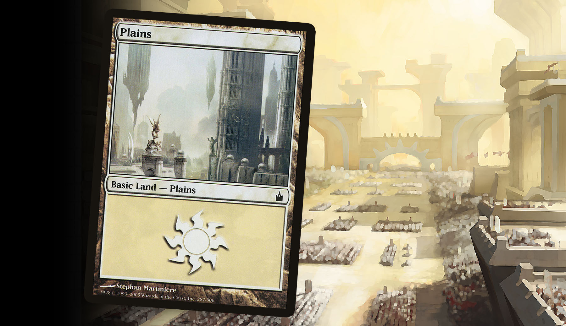
Stephan Martiniere—Ravnica: City of Guilds
To my surprise, this is the only overlapping choice between Donny and I. But it’s hard to not find something from the plane of Ravnica to like—a perfectly captured world covered end-to-end in metropolis. This was the biggest step away from what we traditionally thought of as a Plains at the time. Even Mirrodin’s hexagonal plates were accompanied by blades of metal shaped to look like the grasslands we’d seen throughout the rest of Magic’s history.
I like this piece because it drives home the striking differences Ravnica has to other planes. No longer were there breezy fields or stormy vistas; these have been replaced by hovering stone towers, skyways and guild-aligned statues. Because of the dozens of choices we have for generals, I often find myself digging out these Plains for their grandeur and beauty when working on a deck with a White-aligned legendary creature native to the plane.
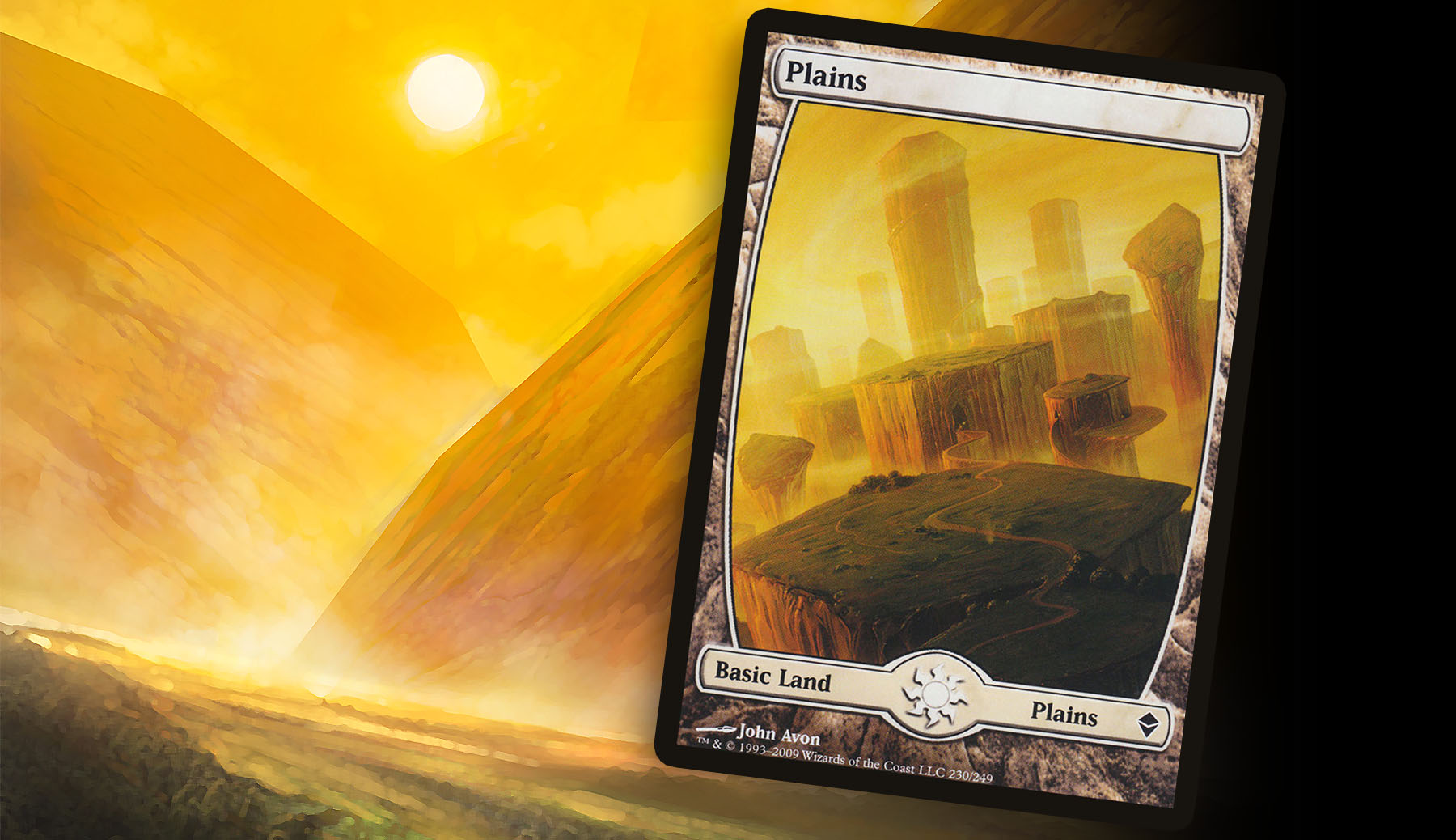
John Avon—Zendikar
For as much as I use flavor and mood as strong qualifiers for my top Plains, I always knew without a doubt that John Avon’s winding path Plains was going to be my top slot. When I returned back to Magic in time for the previews of Zendikar to roll out, one of the excitement factors of that preview season was the full art lands. This land was the majestic piece that was etched into my mind for the Plains.
Before we knew what Zendikar block had in store for us, the environment represented purely by these lands painted a world of beautiful vistas that begged to be traveled, tying in wonderfully with the plane’s Dungeons and Dragons-inspired motifs. Zendikar has a strong evocative look that highlights nature, rivaling Ravnica’s iconic city look. And what I like about this piece over the other options we have from the plane is the grand view over the broken-up horizon and the winding path making its way from the foreground into the mysterious tunnel in the adjacent floating landmass. When I want to bring that same style of grandeur and beauty to my Commander decks, this art is usually the one that I use the most—especially in full art.
What makes for a good basic land is purely personal for those who have put enough thought into how their looks all the way down to the lands. They are an often overlooked element of a deck that can add so much to the experience, whether you’re playing in a Standard, Draft or Commander event. As I had I pointed out, with the same prompt, only one land was highlighted by both Donny and myself. That should really speak to how subjective this topic can be.
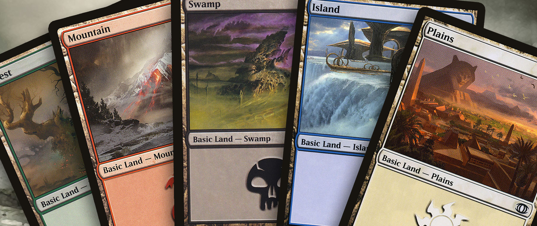
To properly prepare for this article, I looked at a lot of full cycles of basics from notable sets to get a sense of how the entire world was being depicted. After doing such a deep dive, one of my biggest wishes was that Wizards had broken convention for the time and featured basic lands in Planar Chaos and Future Sight to show off these pillars of Magic in alternate presents and possible futures.
I’m excited to touch back on this topic next time Donny or I are finding ourselves with nothing else eventful going on. With Commander 2019 just around the corner, I’m not sure that will be the case any time soon. Thanks.
Ryan Sainio is a Graphic Designer who writes about EDH and the EDH community. He has been playing Magic: The Gathering since 7th Edition in 2002 and values flavorful and fun gameplay over competitively optimized decks.

