When I rebooted Arting Around I looked up the Dragons of Tarkir visual spoilers and went down the list of artists in the set, choosing names, Googling them, and sending out emails asking if I could interview them for Hipsters. One of the very first to get back to me was Tomasz Jedruszek. He hails from Poland and has been working in fantasy illustration for almost ten years. Our interview took place over a couple weeks and his answers are sweet and true and playful. I think you’ll enjoy the dialogue.
Interview with Tomasz Jedruszek
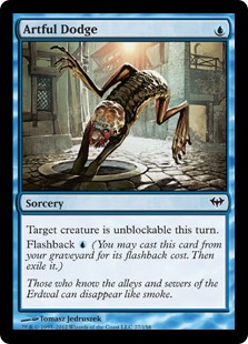
Matt Jones: Hi Tomasz! Thanks for agreeing to this interview. Let’s get right into it! Your illustration for [casthaven]Artful Dodge[/casthaven] has a great playfulness and sense of humor to it—mutant frog-lizard-leech diving into the sewer quite acrobatically! Where’d that character come from? Does it appear elsewhere in Magic or did you get a general description of what the image should look like and went for it? Can you talk a little big about this piece and the role of humor in your work?
Tomasz Jedruszek: I remember the description, apart from regular key directions to game mechanic like “blue spell” etc., was like “slimy creature disappearing in the hole” and suggestion that might be some crazy creation made by a mad professor like Frankenstein, a mix of alligator and … something, and “it is yours to design,” my art director said.
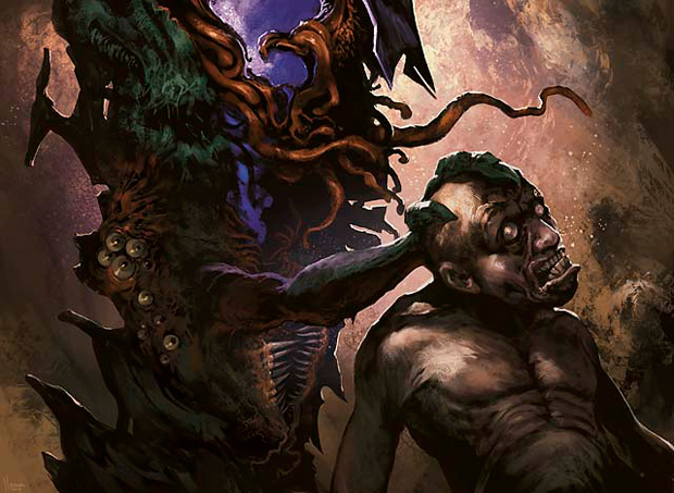
Now if you know me and my twisted ideas like Captain’s Treasure or Angel the first idea to this illustration was kind of freaky. More frog than alligator yet with a kind of human face with big lips and alien eyes … if you think final version of Artful Dodge is funny you should see the very first sketch … or you better don’t 🙂 Anyways, my art director didn’t like it either, it was too grotesque, too comic. So I’ve changed it but didn’t go too far from the original version and just changed the head to something more “not from this world”. The rest was pretty much accurate to the description: deserted street, single lantern giving back light to the creature and its legs thrown in the air as it jumped into the hole. Actually that was the main focus for this card the creature disappearing and covered in shadow so we couldn’t see too much, but I decided to light the scene more so we could see more details … and so this how it was accepted and pushed into process.
If comes to humor in my work, as you noticed, there is some, the bad thing it happens mostly when not needed 🙂 For example Inquistion of Kozilek—this guy in front has some weird face expressions, and my art director warned me not to use that kind of funny face in Magic 🙂 I took this advice … and I committed it again in Timely Reinforcements 🙂 I get second warning … so I quit doing that kind of stuff 🙂
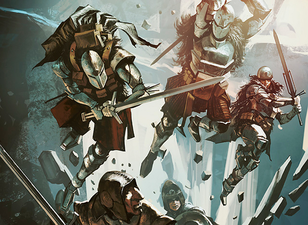
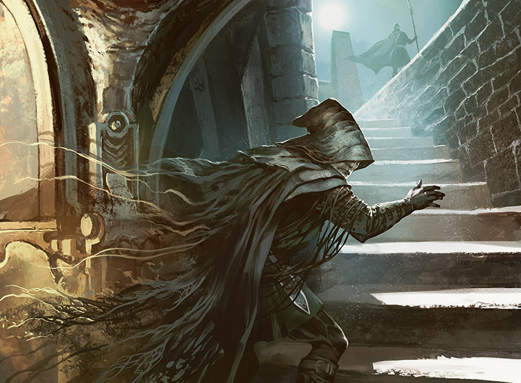
MJ: I love that you have to reign in the crazy and your sense of humor a bit. Freedom’s great and all, but finding your voice within restrictions, for an artist, is sometimes more interesting and freeing than doing whatever you want all the time. All of the cards you’ve described are favorites of mine because of the sense of humor you’ve described. Something I’ve found funny is the habit of Wizards of the Coast to do new art for Invitational cards. I don’t know if you’re familiar with this but for a while Wizards of the Coast would let the winner of the Invitational tournament design a card, always a creature, and the illustration that went with the card was always a portrait of the winner. That’s why [casthaven]Dark Confidant[/casthaven] is often referred to as “Bob” (Bob Maher’s face is on it). Chris Pikula made Meddling Mage and has since been re-illustrated to look nothing like him. Your [casthaven]Shadowmage Infiltrator[/casthaven] art is from the card originally designed by Hall of Famer and buddy of mine, Jon Finkel. He has the original Shadowmage Infiltrator art hanging on his wall at home. How aware are you of re-illustrating an Invitational card? Did you look to the previous illustration to get inspiration for yours? The first time I saw your illustration I thought it was an appropriate and funny gesture to have the figure’s head in a hood (hiding that maybe it’s still Jonny Magic). What were your thoughts when making this painting?
TJ: No, I haven’t seen it before, which was good because every time you have to redo some exciting theme and it is even worst when it was made by some famous artist, it is like taking down the King … which causes instant rebellion from the People 🙂 I mean fans love that original card already and now you have to come up with something even better? Sounds risky. So, as I said, at first I didn’t know I am redoing existing card and I’m glad for that because I’ve been able to create something very different from the first piece. Then I read the articles and players told me about previous version featuring Finkel and I found out, just what you said, it portrays a real person, which is cool I think. I wish I could have a Magic card with my own face, too.
In this particular case I had to take like five versions because, just like most Magic cards this one too, was to picture something that … doesn’t exist 🙂 I mean physical character but who “melts” into shadow at the same time … being invisible to guards … it is very difficult to show something that is invisible yet it must be the very key of the illustration. But, as I said, that is something we do in Magic all the time 🙂 [casthaven]Dissipate[/casthaven], [casthaven]Drifting Shadow[/casthaven], [casthaven]Nighthaze[/casthaven] … they are pretty much the same deal.
So, my idea for this picture was to show a Mage that is coming out of the shadow, trying to sneak out the guards, a part of him is kind of transparent, made of dust or smoke, while his head and arm starts to be visible in the moon light. And hooded? Yeah, I do hide my characters’ faces in shadows or hooded or behind the headgear to leave some space for player’s imagination. You asked about my thoughts when I was working on that card, well I do always try to put myself in my character’s shoes, try to feel his emotions, try to behave like him, this is funny because if you could see me painting this character you could see me making faces or even incline my head down just like him. Five different versions because we’d been balancing that visibility border, once he was too invisible, on the other he was too regular-like rouge, but finally we found one that clears the card’s mechanics the best way. Of course I had like another five ideas just few days later to show him other way but this is another common rule in this job, there is endless way to illustrate something but we have to just pick one at some point.
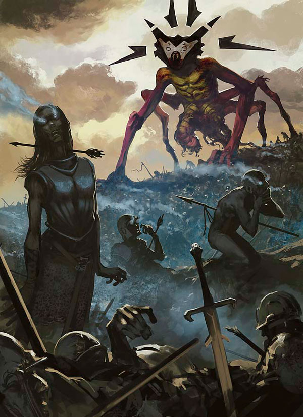
MJ: I’ve been looking at [casthaven]It That Betrays[/casthaven], the card, its abilities, and mostly your very interesting/bizarre use of graphic design-like elements on the creature’s head. Can you talk about this a bit? What made you depict the monster this way? It looks so cool.
TJ: Well ,when comes to design anything in Magic, first we need to stick a little bit to our style guide, there are lots of creatures, characters, monsters, etc. They are all very nicely depicted, very detailed, sometimes we have like different versions of the same creature etc. But then you just use those sketches as a base point, everything you design later is on your own. As I can see all the Magic artists are doing just great coming with something new, yet something very set in the the world , that doesn’t stand off at any chance, which is brilliant to consistency of the game art and it doing great to uniqueness of each card. So, when I was working on “It that Betrays” it was pretty much the same deal. I had directions from my art director, style guide and then I had to come up with something new for the unique card that of course keeps the mood and atmosphere of the current set.
Most of style guide sketches shows the creatures in standard poses ,so basically when you work on your illustration you have to put some life in those creatures or even feelings. [casthaven]It That Betrays[/casthaven] was one of my firsts cards for Magic so I still didn’t want to experiment too much on my own, so the Eldrazi is pretty accurate to the style guide but I did let my imagination going to create the rest of the scene. I was trying to show the main creature through the waken deaths in the foreground. I’m always trying to get my players thinking, so instead just showing single person or creature which might be boring or too regular I do try to show them or their emotions seen trough something else, like different point of view. So I did it here as well, I thought it will be interesting if I show THE Creature seen from the battlefield level, just like we stand between those waken up dead bodies.
MJ: Thanks Tomasz! Any news or events coming up that you’d like to share with our readers?
TJ: I am going to small convention in Poland this July. Nothing big, few hundreds players, some Magic tournament, I really like to support those small events. Then I am going to Warsaw for another convention, this one is bigger, approx. three to five thousands people. I am going together with group of my fellow artists as “Artist on Board” to talk about our work, share our experiences, bring our job to them so they could feel it. I remember when I was a kid I wish I could have chance to speak with some pro-artist to learn on his experiences, now we are trying to do that for those beginners who doesn’t know where to start.
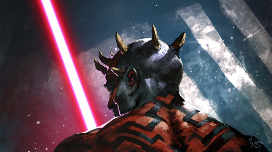
There’s a theme of artists helping artists, of a community larger than the single artist, that’s been running through these interviews. They share their experience, strength, and hope, and I love that. I try to do the same in my practice. What struck me most in this exchange with Tomasz was the energy he brought to his answers. He’s an original, thoughtful, and curious artist. After some more Google searching I found out he also made a sick Darth Maul illustration.
Thanks for reading! See you next week!
Matt Jones (born on at the beginning of the 8th decade of the 2oth century) is an artist living and working in Brooklyn, NY. Matt’s played Magic since Revised. Lately Matt’s game has become more about hanging out with friends and shooting the shit and less about competitive tournament play. He writes the weekly Arting Around column on Hipsters of the Coast, interviewing Magic illustrators and occasionally adding his thoughts on the art of various cards and sets. You can see Matt’s artwork on his website.


