Welcome to Arting Around, Hipsters of the Coast’s Magic: The Gathering art column! I’ve been asking Magic artists if they’re willing to answer three questions and a bunch of them said yes!
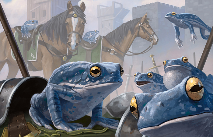
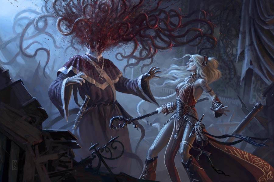
The first interview is with Craig J Spearing. You know his work from Jeskai Sage, Seeker of the Way, and Take Up Arms among others. He’s new to Magic illustration (coming from D&D illustration), initially he made work for M15 and Conspiracy. The compositions draw you in, place your eyeballs in weird places. In Polymorphist’s Jest the viewer is also a 1/1 blue frog.

The forms are dynamic, linear, active. Craig Spearing’s work is electric. It was a treat to interview him.
Matt Jones: You are fairly new to illustrating Magic: The Gathering cards (unless I’m wrong). Was the Putrid Leech illustration for the Jace vs. Vraska duel deck your first work for Wizards? Can you talk about the motivation behind the piece, your familiarity with the original artwork, what it’s like to remake a known illustration for a Magic card, and anything else you can think of relative to this work? Also, feel free to say anything you like about it and/or correct me if my information is wrong.
Craig J Spearing: Yeah, fairly new to Magic. I started illustrating for Wizards back in ’08, but it was all D&D work, it took a few years to build up the courage to submit my portfolio to M:tG. Putrid Leech and Victimize were my first two cards. At the time my familiarity with Magic was limited, and I wasn’t aware that Putrid Leech was a remake. After seeing Dave Allsop’s (far superior) original later, I realized my rendition was too focused on the foreground characters/ environment, and the leech became secondary. Card images are very tiny in print, and I learned the hard way it’s best to step back from the illustration to make sure it reads at small size. I was much happier with the way Victimize turned out.
MJ: That’s a very interesting lesson you learned when illustrating Putrid Leech. When asking you about the work I was really looking at yours, cuz I had the older art basically memorized, trying to figure out why the two figures were there and what they had to do with putrid leech. Then I saw the leech and was actually kinda terrified, something that doesn’t happen that often when looking at fantasy illustrations. It just appeared once the beast revealed itself! I liked that. The way the leech mirrors the fountain and the guys bodies is great. They are clean and blue, the leech is decaying and blue. The dudes don’t know the reality that’s about to hit them. Your illustration tells the story of the corruption and putrescence in a seemingly utopic society (of blue people) and isn’t simply a portrait of a putrid leech.
CJS: Thanks! The first part of my career from ’95 to ’08 was in children’s historical illustration, I’ve painted enough idyllic prairie scenes, covered wagons, and happy pioneer families to last several lifetimes. So after breaking into fantasy illustration I had a horde of evil things pent up in my imagination clawing to escape. When an art director asks me what kind of images I’d like to do, my immediate response is: “horrible things with more teeth than brains, or if they’re intelligent, more brains than morals”. Don’t get me wrong, the occasional band of intrepid heroes is fun to depict, but my heart belongs to painting the twisted legions that are trying to kill them.
But, dark themes don’t necessarily have to be dimly lit. My color palettes tend to lean towards vibrant, and I’m addicted to gratuitous rim lighting. This isn’t apparent in my early cards, as I was trying to tone down a bit, but it becomes more evident in later cards like Defiant Ogre and Risen Executioner. Plus, painting zombies never gets old.


