Magic art fans, rejoice! This week I interview Ryan Yee. It looks like Scars of Mirrodin is the first set painted for. He’s been very busy since Innistrad, his ghosty-ethereal style perfectly suited for all things shadow and spirit as are Theros’s enchantment creature-auras, eidelons and oreads. Ryan and I talked a lot about ideas, problem solving, and technique. He’s painted some well known cards and we started with easily his most well known.
Matt Jones: Command Tower. That’s the illustration that pulled me towards interviewing you in the first place. Can we talk about that one? It’s so screwed, the perspective and angle is so weird. I don’t even play Commander, I’ll never be able to play with the card, and I own multiple copies because I love the art so much. It’s powerful and foreboding. It’s an architectural stronghold amongst the ruins of an ancient civilization. It’s tapping into the sky like when the ecto-containment unit in Ghostbusters gets shut off. It feels like similarly magical ancient places in Skyrim. Can you talk about this work? What were you thinking when you painted it? Do you have any preparatory sketches you can share with us? I’m asking this as a pretty serious fanboy.
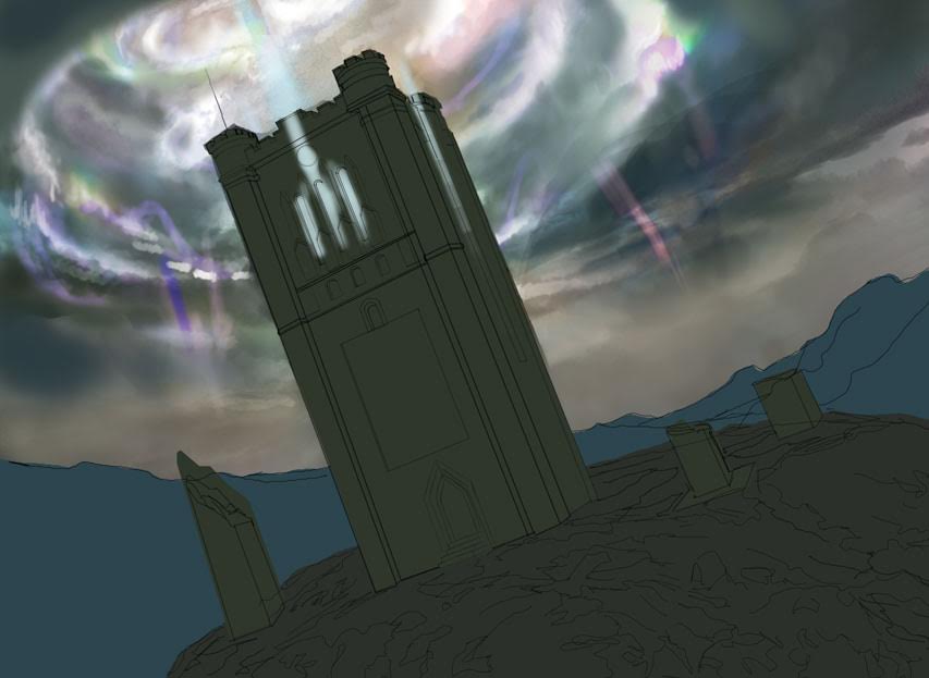
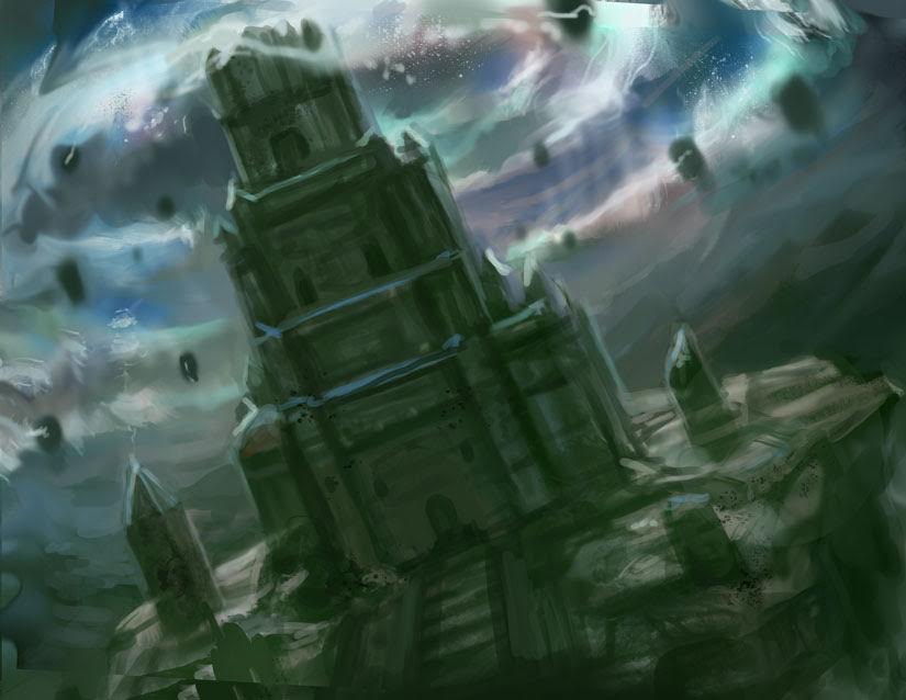
Ryan Yee: Ha ha thanks! As much as I love Ghostbusters as a child I don’t think I consciously referenced Ecto-Containment Unit , but now I wish I had! When I created this image I had no idea what Commander was and no clue this format would be as popular as it is today. This was also the first land card that I was ever commissioned for Magic, so I was terrified!! The description asked for a tower radiating colored pools of mana energy. I was a little confused on how to portray that without it looking cheesy, so I asked the art director if he needed to clearly see each color. He replied that Magic the gathering has done alot of images with rainbow effects in the past and he wanted to steer away from that direction, he asked me to to approach it more as throwing off energy, warm in places and cool in places. Here’s the description, rough sketch and refined drawing that I submitted.
ART DESCRIPTION:
Color: All (land spell)Location: Hilltop or cliff of your imagining
Action: Show a stone tower that has some heft to it as if it could also serve as a fortress. From its peak radiate streaks of pure, varicolor mana energy.
Focus: The command tower
Mood: Power radiates from here.
(two preliminary sketches for Command Tower, Courtesy the artist)
MJ: If your first land card commission was terrifying, what was it like when you got your first creature card commission? When I think of Magic I think of creatures. So there’s gotta be some pressure there, eh? Which card was it, what was that like, what’re your thoughts about making it, and, again, if you have any early imagery behind the making of it could you please share?
RY: My first two cards I ever painted were creature cards. Fire servant and Phantasmal beast. Creature cards are tricky, but as a concept artist I get to design creatures pretty often so I feel comfortable with them.
ART DESCRIPTION:
Color: Black creature (unguilded)
Location: Under a stone archway in Ravnica
Action: A “shade” is a ghostly creature made of pure shadow. This one lurks around archways and gates. Its shadowy body looks like the bars of a gate or portcullis in some way — perhaps it’s humanoid in its upper body, but its lower half is a “skirt” of shadows that look like bars, trailing down to the ground.
Focus: The portcullis-like shade
Mood: A malevolent creature of pure evil
Notes: This creature can’t fly, so be sure it isn’t hovering more than a couple inches off the ground.
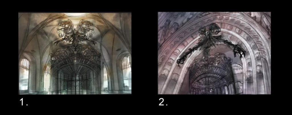
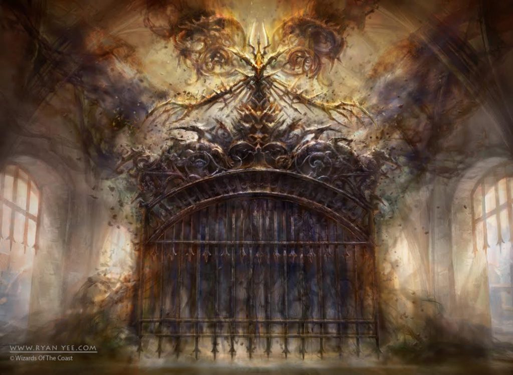
There was one specific card for Return to Ravnica that was difficult for me, Gateway Shade. As you can see the creature is up to me to design. Ghost gate character, humanoid upper body, skirt made of shadows, piece of cake right? I thought no way that sounds ridiculous! How am I going to pull this off? I did a bunch of sketches, some with human features in dresses that looked like cages, but they just didn’t seem right. At one point I bought some ink that I dropped in water to study how smoke might unfold as it sinks. I was satisfied with the final, but I feel a sense of accomplishment with getting past that tough design challenge.
(two preliminary sketches for Gateway Shade, courtesy the artist)
(final art for Gateway Shade, courtesy the artist)
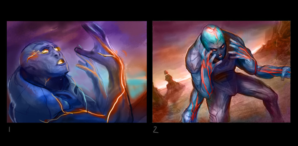
MJ: You’d be amazed at how ignoring a note like this: “This creature can’t fly, so be sure it isn’t hovering more than a couple inches off the ground,” can be devastating to players. I can’t tell you how many times I attacked with a Breaching Hippocamp thinking it had flying only to have it blocked by a much more powerful, and also not flying, creature! I really appreciate your thorough answers to my questions. I keep coming back to [casthaven]Molten Psyche[/casthaven]. I don’t really know what to ask you about that card but man, it intrigues me. Usually I’m not so into “dynamic” diagonal compositions. My color teacher freshman year at Cooper said he’d fail us if we ever cheated on our assignments by using dynamic diagonal compositions, ‘cuz he wanted us to try and explore color without the distraction this kind of formal set up. So, I guess it’s ingrained in my mind that diagonal compositions are cheating and I almost never like them. But I like this one and I can’t figure out why. It’s probably because the figure is so weird, four arms, anonymous head about to burst with lava-brain energy, obviously in some kind of pain but also a kind of quiet peace. The color involved in the digital paint is sweet, too. Purple is a very good friend to red, orange, and blue. I’ve already written notes to use this foursome in an upcoming painting of my own! Can you talk to me a little about this work?
You hear that?!? Never stop learning!
It’s amazing to me how much impact certain people have on our lives. “Diagonal compositions are cheating,” is such an intense thing to have in my mind forever. Most of my own painting and drawing has an all over composition. The space paintings, the sorceries, even the enchantments, all over. Irwin S Rubin! You bastard! Rubin was my color professor. He studied with Joseph Albers. He died a few years ago (Albers died a million years before that). Rubin’s wife came up with the pink-purple and orange color scheme Dunkin Donuts uses. How cool is that?
Ehem, sorry about that. Ryan’s been very giving with his time and his work. Learning about how ideas get translated from ART DESCRIPTION to finished illustration is something I can’t imagine tiring of. I hope you guys n’ gals enjoy it as much as I do. Ryan allowed us access into his creative process and that’s some beautiful generosity. Thanks Ryan!
Matt Jones (born on at the beginning of the 8th decade of the 2oth century) is an artist living and working in Brooklyn, NY. Matt’s played Magic since Revised. Lately Matt’s game has become more about hanging out with friends and shooting the shit and less about competitive tournament play. He writes the weekly Arting Around column on Hipsters of the Coast, interviewing Magic illustrators and occasionally adding his thoughts on the art of various cards and sets. You can see Matt’s artwork on his website.


