I have still not managed to play in a M15 Limited event. I was planning on hitting up a release event this week, but then I asked myself, “why?” and I didn’t have a great answer. I don’t tend to love core set limited environments in the best of times, and the middle of summer is never the best of times. Maybe it’d be different if Magic stores had better cooling and ventilation, but best case scenario there’s another smelly person playing with you, and worst case scenario it’s me. I sweat a lot. It’s maddening.
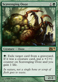
Instead, I’ve been trying to get my M15 fix through Duels of the Planeswalkers 2015, the most recent iteration of a product that has achieved great heights in the past. The first Duels was a great game, and the second one was pretty solid as well, but the third wasn’t memorable. Last summer’s iteration, the fourth if I remember correctly, was kind of a bummer once you got past the promotional card (a Scavenging Ooze, which was more than worth the purchase price). But D15 doesn’t even have a good promo linked to it, and it’s loaded down with annoying micropayments. What it does have is a creaky engine that runs poorly on both my iPad 2 and my Xbox 360. I get that I don’t have the most up-to-date systems to run this thing, but there’s really no excuse for all the different ways in which this game manages to be slow.
Because it’s more than just technical limitations that make the game feel unpleasantly slow to play. There are many inexplicable design choices that make the experience worse:
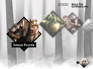
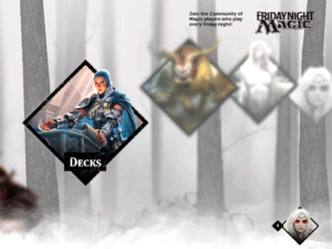
There are second-long animations for everything, including moving between screens. These animations all add up to a fair chunk of time, and they’re occasionally jerky in a way that shows the underlying strain they add to the program.
The “thinking” animation, their equivalent of the pinwheel in the Mac OS or the hourglass in Windows, does not make a full circle. I can’t explain why this makes it feel slower, but it really does! Also, it’s really obvious when the thinking gets stuck for a second, and the inconsistent speed of the animation makes the strain all the more apparent.
Every time you load into a new duel, there’s a loading screen. There’s a nice picture and a brief paragraph about the flavor behind the deck you’re about to play against. Fine. But the loading bar is on the right side of the screen, and once it’s finished loading, to enter the match you have to press the A button. This is located on the right of the screen, and only pops up after the thinking is complete. This means there are plenty of times you’re waiting for a game to load, only to realize it’s been loaded and it’s just waiting for a prompt. I don’t get why you would ever want to wait on that screen, though, and I really don’t understand why they’d put the continue icon on the opposite side of the screen from the loading animation that is otherwise drawing your attention.
These load screens get super annoying. I get the ones that are also ads, although as a consumer I hate them, but most of them are just weird mods of card art.
When you beat another deck, you are given a booster pack to add to your pool of cards. I like this, as it reminds me of a higher-powered Shandalar, where you’re just tooling around and getting cards to up your power level. The problem is, when you open your pack after each game, they give you a prompt to go to the Deck Manager. If you follow that prompt, once you have finished with your deck the game spits you back out into the top-level menu. It takes several animation levels to get back to the Campaign mode you were playing, which again adds time to this process. What makes it inexplicable is that you can access the Deck Manager from the Campaign screen, without it sending you back to Go. If the game has the technical capacity to go to the Deck Manager without losing your place in the thread, it seems like a terrible design choice to not make that the default when you’re going to the Deck Manager from the booster pack prompt.
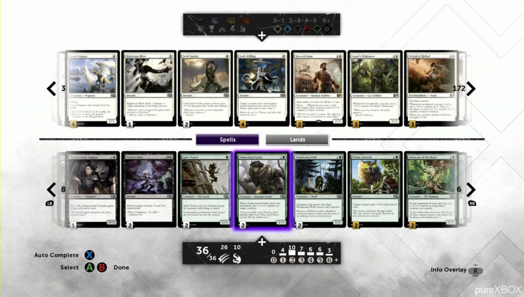
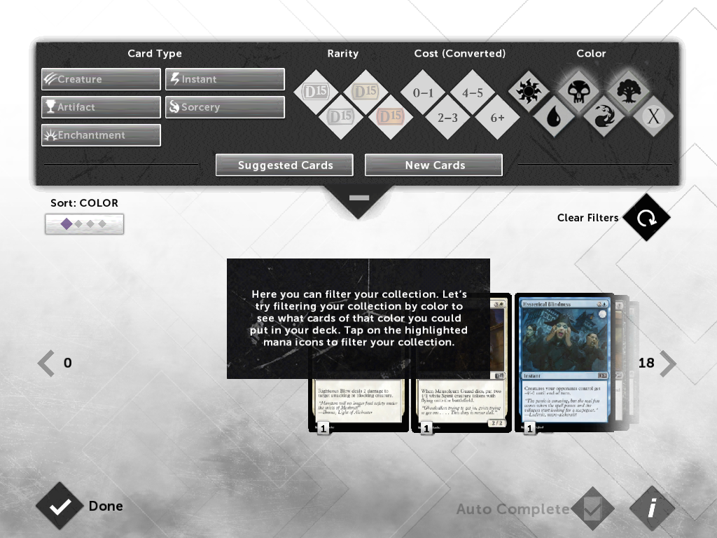
Every time you go into the deck manager you have to reset the filters so that it’s not displaying every single card you own. So, if you don’t like playing white cards, you’re still going to see them a lot!
The Deck Manager is fairly incoherent, as usual. For starters, pressing B closes you out of the entire Deck Manager, no matter which of the three pages you’re on, which is not intuitive. I’m used to the B button taking me back when I go deeper into a UI, and breaking that habit took a little while. You move between the three screens using the right thumbstick instead, but it’s otherwise pretty useless; you have to use the left thumbstick to go left, right, and up and down within the same page. Why the left thumbstick doesn’t govern everything is beyond me.
The decks they spit out at you aren’t much better. You start with a single deck, but down the line you can make others based on the card pool you’re unlocking during Campaign mode. Of course, that pool is fairly random, so often you’re left with decks that aren’t perfectly balanced between two colors. The Deck Manager seems to choke when it’s providing those decks with mana. It seems to go with a fairly even split, which has lead me to lose several unpleasant games due to color screw or flood. My Izzet deck, for example, is easily two parts red to one part blue, and the red cards are all double

I found this hillarious. I’ve owned this game for like a week, and it’s still listed as not being out on the official WotC web page. Great job!
That’s not all. It’s not even close to all. But I had a choice between dropping an article twice as long as usual on this subject, or breaking it up into two pieces. I chose the latter. So join us next week when I rant even more about a game I’ve spent hours playing! It’s a nice interlude for me, since I’ll be hanging out at GP Worcester next weekend, and if I get one person to wait to buy the game until after what I hope is an inevitable patch, then I’ve made a difference. A tiny, tiny difference.
Jess Stirba loves playing Magic against a computer, because real life opponents don’t let you restart when you’re not having fun.

