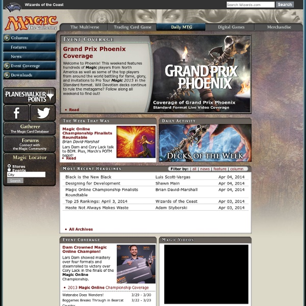
This week, the community got a bit of a surprise when the Daily MTG site, the home page of Magic the Gathering, was completely re-designed. The new layout, intended to solve the problem of viewing the site on mobile devices, was at first jarring to look at. The community response was varied, so we decided to take a deeper look.
The New Daily MTG
The Good
Let’s start off by taking a look at the best parts of the improvements which were unveiled earlier last week. Firstly, the site is much easier to navigate than it used to be. Let’s take a look at how the site used to appear.
The navigation on this page was atrocious! Let’s start with the five links along the top. What does “The Multiverse” even mean? How am I supposed to know that “Trading Card Game” is where I go to see product information? Not only are these tabs confusing, they’re not the only navigation panel. In addition to the top-nav, we have the left-hand-side navigation. The links here are a bit more straight-forward, but then things got confusing again if you expanded Columns, Event Coverage, and Downloads. All-in-all it wasn’t very pleasant and you basically needed to learn how to get to the things you wanted.
Now let’s look at the new navigation.
This is much more pleasant and easier to understand. The six headline navigation tabs are all clear and concise, and the sub-tabs are also written out in plain English. There’s no more confusion around how to get to where you want to go. More importantly, this header is present on every page and does not change the way the side-navigation changed on the old page. If I want to go from the event calendar to the top player rankings, I can do it in one click where it used to be several. This is a massive improvement over the old design.
The Bad
On the other hand, the new layout will take some time to get used to. To an extent, viewing the site on a non-mobile device is now an experience in scrolling. This seems to be the trend of the internet these days. Instead of reading sites from left-to-right (or right-to-left) they are now read from top to bottom. The layouts that result from this can be clunky, with large chunks of information in bands moving down the page. For example, the “What is Magic?” page looks like this on a desktop computer:
The layout results in having to scroll through three bands of information. At the top we have the “What is Magic Band” followed by the “Hunt Bigger Game” and the “You Wield Unimaginable Power” bands. The objective is for each band to appear on its own in the full view of a mobile device, but on a desktop the effect is strange, with multiple bands of information drawing attention away from each other. I suppose this is the price of catering to one platform over another.
What’s a bit surprising is that Wizards didn’t feel the need to just create a standard and mobile version of their site. This has been the standard for many years now on the internet. For example, here are the main page and mobile main page of the New York Times:
It’s a pretty big difference due to the change in platform. It would have been nice if Wizards did something similar instead of trying to make a one-size-fits-all design.
The Ugly
Do we really need everything to be black, white, and gray? The old site was so vibrant and colorful while the new site looks like my closet in high school. Everything is just so dark and gloomy. Was this intended to make it easier to read on a mobile device? Possibly, though I can’t imagine why. I won’t harp on this for too long, but honestly I can’t imagine spending too much of my time reading a website that has a color scheme package that WordPress would likely label “Edgar Allen Poe.”
Pro Tour Update
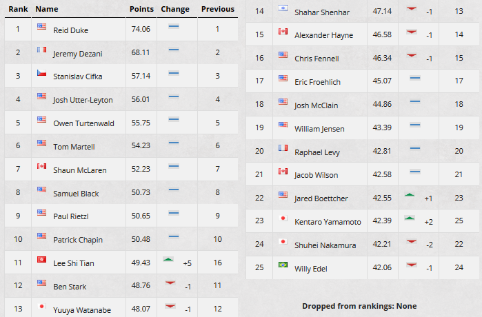
Top 25 Update
The biggest waves this week were made by (11) Lee Shi Tian. His top-8 performance at Grand Prix Moscow was enough to send him up five places in the top rankings, almost making it past (10) Patrick Chapin into the top 10.
Grand Prix Chicago

Just over 2,000 planeswalkers descended upon the Windy City to battle it out for the title of Grand Prix Chicago champion. Just over one in ten made it to the second day of competition, 239 in total. Among the top pro players making the cut were (5) Owen Turtenwald, (9) Paul Rietzl, (13) Yuuya Watanabe, (14) Shahar Shenhar, (15) Alexander Hayne, (19) Huey Jensen, (21) Jacob Wilson, (22) Jared Boettcher, and (25) Willy Edel. There was sure to be some impact to the top rankings once the day was done.
Halfway through day two, Wilson and Boettcher found themselves both with 33 points and sitting in the top eight places in the standings. Wilson would slip in the final rounds, finishing in a respectable 11th place while Boettcher was the only ranked player in the top 8, finishing in the #1 seed. Also joining him in the top-8 was longtime pro player Adrian Sullivan. In the quarterfinals Boettcher’s day came to an end at the hands of Jadine Klomparens’ mono-black devotion deck. Sullivan managed to make it out of the quarters, but also succumbed to Klomparens dark magic. She became the first woman to advance to the finals of a Grand Prix in recent memory. On the other side of the bracket, Canadian Pro Tour regular Tyler Blum defeated student Steve Rubin, a relative newcomer playing mono-black devotion with a green splash. He met Japanese pro Yuta Takahashi who was also on mono-black devotion (a popular choice this weekend), in the semifinals, and emerged victorious.
Blum, who by the way was also piloting mono-black devotion, took the finals two games to none becoming the GP Chicago champion. Five of the top eight decks were some variant of black devotion. Two decks were Azorius control and the final deck was mono-blue devotion. The format remains powerfully skewed towards devotion decks of the blue and black variety, mostly thanks to Nightveil Specter and Pack Rat. It will be interesting to see if Magic 2015 can change any of that for the Pro Tour at the end of next month! In the meantime, congrats to Tyler Blum, GP Chicago champion!
The Quick Hits
- Mark Rosewater shares a heartwarming collection of community stories of the huge impact Magic has had in the lives of its players [Making Magic]
- Ben Stark talks about the Battle Box/Danger Room format and shares his list for it [Stark Reality]
- Doug Beyer updates us on the current whereabouts of all of the multiverse’s known planeswalkers [Daily MTG]
- Ant Tessitore looks at what makes Magic such an exciting thing to share with our friends and loved ones [Gathering Magic]
- Mike Linnemann reviews the artwork of Conspiracy [Gathering Magic]
- Michael Martin shares the experience of taking his son to their first father-and-son Magic tournament [Star City Games]
- Alex Ullman kicks off a new series talking about how to write better Magic articles [The Red Pen]
- Jason Alt bravely scours social media and reddit for opinions on whether or not [casthaven]Liliana of the Veil [/casthaven]will be reprinted in M15 [Quiet Speculation]
- Dark Challenge is aiming to build up a UK/European tournament circuit that would serve as the overseas equivalent of the Star City Games open series [MtgUK]
Wallpaper of the Week

No words can describe this squirrel’s rage
- This week’s wallpaper comes to us from the Squirrel token from Conspiracy. Squirrel’s have always had a special home in the hearts of many older Magic players. Long before 1/1 saprolings were the standard green token, the Squirrel was very popular. 14 different Magic cards, including two from Un-sets, reference Squirrels. The new Squirrel token is forthe Conspiracy reprint of [casthaven]Squirrel Nest[/casthaven]. Odyssey, it seems, had quite the Squirrel theme. These days it seems that supplemental products are the only way for Squirrels to make a showing.
Grade: B
The Week Ahead
In the last weekend of high-level play before Magic 2015 hits shelves, Wizards brings us a Grand Prix double-header with Theros block limited tournaments in Milan and Washington, D.C. Milan last hosted a GP event in 2011 when the format was Innistrad limited. Previously, Milan hosted one other GP way back in 1999. The American capital on the other hand just hosted a Legacy constructed event last year and has hosted five Grand Prix events and a Pro Tour dating back to 1997.
With next weekend being the 4th of July in America there are no major tournaments scheduled. The following weekend is the M15 pre-release and then the release. This means there will be no high-level Magic to follow for a month! Don’t miss out on these two events.
What We Learned is a weekly feature here at Hipsters of the Coast written by former amateur Magic Player Rich Stein, who came really close to making day two of a Grand Prix on several occasions. Each week we will take a look at the past seven days of major events, big news items, and community happenings so that you can keep up-to-date on all the latest and greatest Magic: the Gathering community news.


