There’re a lot of new and old illustrations on Modern Masters cards. The cards come from a variety of different sets having little thematic relation to one another. There’s no singular style like there is in Innistrad, Mirrodin, and Ravnica, where the art needs to fit the feel and attitude of a plane.
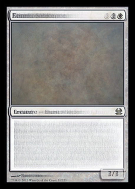
So, what do the Modern Masters cards look like averaged out? Something like this:
I can’t wait to draft white 3/3 creatures!
All the best,
Matt
MTGO: The_Obliterator


