In attempting to find things to write about for Arting Around I asked, at Hunter’s suggestion, the Hipsters’ regular contributors which cards contain the best and worst art. This is the first in a series of columns that will be dedicated to me talking about their choices.
My roommate, Vincent, asked me what I thought would make Magic a better game. I took this to mean, “What do you dislike the most about Magic,” which isn’t what he was asking. I said “blue cards” and almost walked away but realized further analysis was in order. It’s not blue cards so much as the power available to blue cards in the form of card draw and countermagic. We talked for a few minutes, a little bit about a topic I’ll address in next week’s Power and Toughness, but mostly about balance.
On the whole MTG is a pretty balanced game. I don’t like countermagic because I don’t like controlling another player’s ability to play their game. This, itself, is countered by playing fast, aggressive, or uncountable creatures that’re immune to wraths, etc. This is how balance works. While I make all sorts of judgments towards control magic players, I love them for playing this game, and try to be as playful with my hatred of their chosen style of Magic as I can be (despite it INFURIATING ME). Different strokes for different folks.
Art is much the same. It’s super interesting to see what my compatriots at Hipsters think of the art on M:TG cards (as it is interesting, at least initially, to hear the feelings and thoughts of anyone on works of art).
We’ll start with Jess (quoting her response to this topic on the Hipsters Google Group):
Favorite arts: Particularly the GP Lotus Cobra, but also Descendant’s Path, Lifelink, Enter the Infinite, Silverskin Armor, Visions of Beyond… basically all of those cards where Terese Nielsen does weird patterned things.
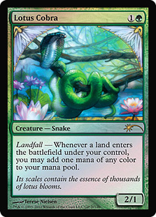
This card is a M:TG artistic rule-breaker. It’s highly decorative. It appears to be aware of its existence as art in referencing the card frame (and the image’s boundaries) via the lotus blossoms in THE upper corners of the illustration. Grand Prix Lotus Cobra is a gorgeous card. Arguments against the work of Terese Nielson are hard to come by. Look at how beautiful some of the other cards Jess mentions are:
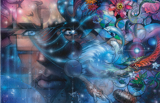


She’s very design-heavy, very illustrative, and, particularly in these selections, a little heavy-handed with the color blue. Her work reminds me of the paintings by Mucha and the illustrations of Winsor McCay. Nielson has a style and she’s sticking to it. It’s not really my thing, though I get why people are attracted to it. I want less detail and more iconicly powerful imagery out of my M:TG art.
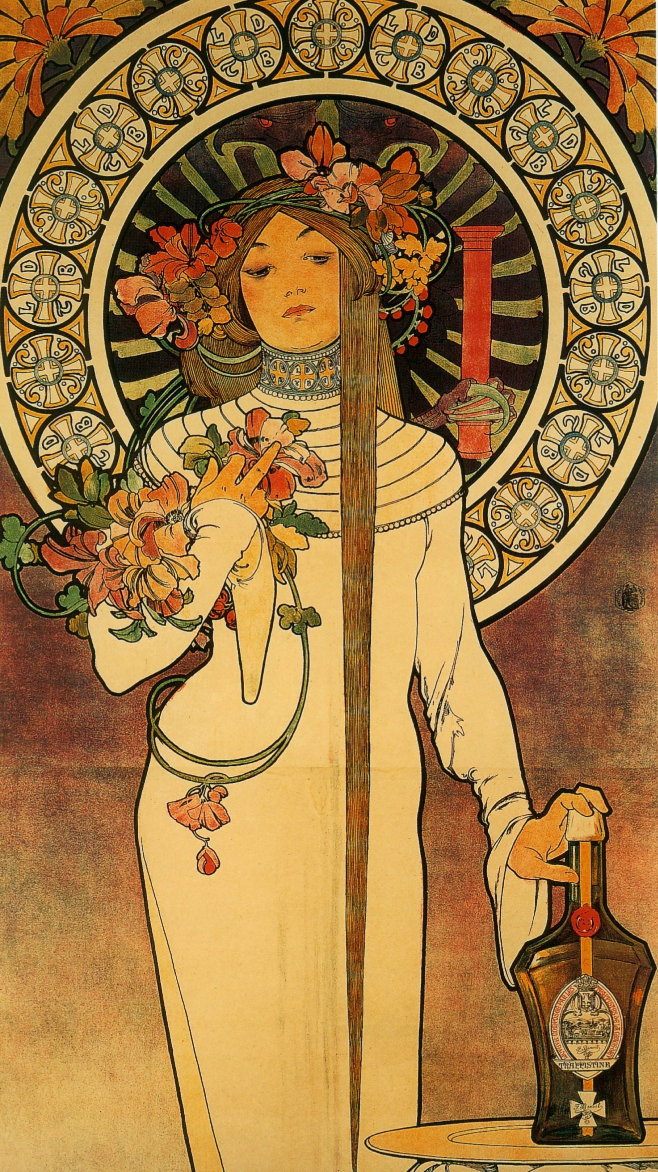
Mucha’s “La Trappistine” from 1897
Mucha’s paintings combine the iconic with the decorative and details (though less so) and are much less visually confusing than Nielson’s illustrations for Wizards. Still, beauty is beauty, I get it, and respect it. I can’t get over how awesome Mucha’s work is so here are a few more.

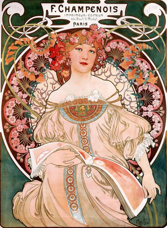
and this one ↓

All things considered, however, I’ll take my Lotus Cobras with the original art. The absence of decorative detail makes these sorts of things sing for me, you know, in a voice that I enjoy hearing.

Onto Jess’s least favorites.
Least Favorites: I think Mold Demon is particularly atrocious, but in more recent sets I have grown annoyed by overuse of scale birds and I think the planeswalker art has just gotten annoying. Like, do a visual spoiler search for planeswalkers on gatherer and just look at them next to each other. They’re all from the same perspective, they’re all wearing the same clothes or in the same pose, and they’re all boring. Change your damn clothes!
Hunter responded with, “Jess we said the exact same thing w/r/t planeswalkers! I totally agree.”
We’ll get into the planeswalkers shortly but first things first, I love the art for Mold Demon and every piece Jesper Myrfors has done for Wizards, ever.

Similarly to Nielson, Myrfors is a truly original artist within the realm of fantasy art. Sure, it’s janky as all get-out, but it’s exactly this kind of flavor and variety that current Magic card art is missing! Let’s look at some other Myrfors home-runs.
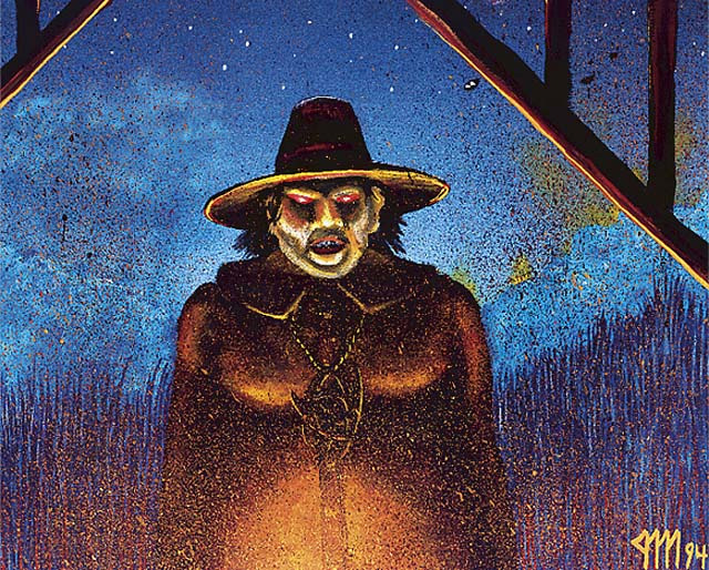
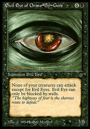

The diversity of skill and imagery available to Myrfors and executed with his work for Wizards is profound. It directly relates to the second part of Jess’s least favorite Magic art response. Planeswalkers are almost always the same scale, in the same pose (or similar pose), and dressed in the same clothes. Let’s look at them all, as she suggests.
Ajani has 1.5 different ways of standing.
I hate Jace so will refrain from commenting on the way he looks beyond how shitty Mind Sculptor’s boomerang magic is. Architect’s hands aren’t glowing at all. Neat?
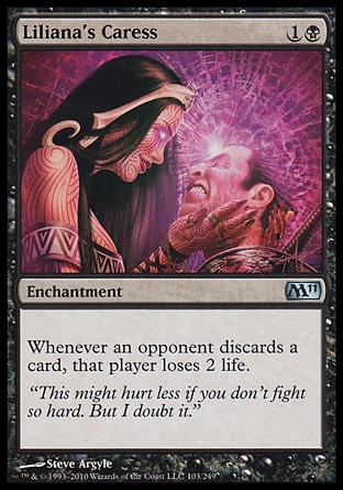
I don’t know what to say about Lily. There was quite the uproar about Liliana of the Veil and I get that. The other two look pretty cool, though. I’m not sure that I have any non-offensive things to say about the art on this card. Argyle doesn’t gain much visually by putting Lily at an angle.
Chandra has one mode of standing and is either excited about it or hipster about it.
Garruk is especially guilty of being almost exactly the same. Primal Hunter and Relentless are in almost the same stance from the same point of view. This is mimicked in the formal visual relationship between Wildspeaker and Veil-Cursed, crazy!
Meh.
Sarkhan, like Tezz, has two distinct poses he can strike and has been printed twice. They are 100% varied but their scale remains the same as most other planeswalkers.
I have a pretty serious crush on Elspeth so I’m pretty biased. Tirel is my favorite of the three cuz she looks so “I don’t give a fuck” bad-ass. It’s also nice to see how well dressed she is and how populate her actual clothes are.
M13 and Conflux Bolas are pretty zoomed-out due to the need to show his mondo wings. Duel Decks Bolas puts him back in in regular planeswalker scale.
Meh.
Really close to being the same illustration. Fun fact: for a long time I thought Markov was aiming a Wild West–style pistol at us, but he’s just Bonding his cufflinks.
